Get Your PPC Reporting Right

Reporting can be a tedious part of a client relationship. Either you spend too much time building custom reports or your client spends too much time reading between the lines. However, through considerate planning and automation, you can regain control of your calendar and reinvest that time in creating the perfect dog memes.

There are a few stages to creating a meaningful report:
- Know your audience – what they want to see and how to structure
- Know how to splice the data – time frames and forecasting
- Know when to trim unnecessary data
- Know how to ELI5 (“explain like I am 5”)
Know Your Audience
In the first stage, you want to consider your audience and answer the following questions.
- What metrics do they care the most about?
- What are they being measured on?
- To whom do they report these metrics?
- When they talk about PPC, are there any areas that they focus on?
If you don’t know the answer to these questions, take a minute to ask the team that will be using this report. It might seem like an extra step, but if you get the report right you can avoid many questions in the future.
Armed with this information, you can develop a mission statement for your report. Ideally, a mission statement is 1 – 2 sentences that summarize the ultimate point of your report. If your mission statement is “the client wants to know how their account is doing” then you should stop what you are doing, take a 15-minute nap and through the power of Inception, think of a more detailed answer.
For example, the mission statement for an ecommerce client report might be to present a weekly report that shows the ROAS of the various paid search platforms. Furthermore, reporting on revenue and spend data to make sure they are going to hit their goals for the end of the month and if they are performing better or worse than the same time period last year. For a weekly report, this information is enough to stay aware of performance but a monthly or quarterly report might require more details about the campaigns, keywords, and ad copy.
Lastly, you can use this knowledge to determine how to segment your report because no one wants to just see an aggregate report. It will not help you identify red flags or green flags, or if you are color blind like my father-in-law, beige flags and slightly lighter beige flags.
Will the client want to see how Google is performing versus Bing? Or perhaps they want to know if their brand campaigns are outperforming their non-brand campaigns. Maybe they want to see their Search ads split apart from their Display ads performance. For good measure, they might want to know how many calls turn into sales versus the number of chats that turn into purchases.
Chopping Up The Data
Looking at data on a daily basis is usually only good for dayparting analysis. But looking at clicks and impressions per month for the last 12 months or more is overwhelming. A rolling report that shows the last 4 – 6 weeks of data on a week to week basis is enough to give a window into current performance trends to head off any declines that might present themselves.

For a more historic view, comparing the current month to the same month last year will help a client understand the growth or decline of their account year over year. If there are external factors that are suppressing the expansion of their business from last year to this year, a YoY view can help visualize the impact to the bottom line.
Finally, forecasting and predicting what the key metrics will be at the end of the month can help steer away from accidental overspending and prompt good conversations about reassigning predicted unused spend to other opportunities.

Trimming The Fat
Eventually, all reports need to be edited, especially weekly reports that are viewed so frequently that there are always components that get skipped over. Avoiding information overload can be a part of your report creation process when looking at frequently used, but often unhelpful reports such as weekly keyword, ad or campaigns lists.
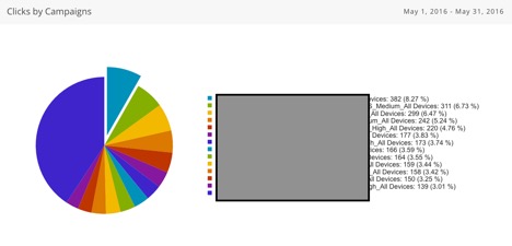
It is common to see weekly reports with long lists of the top or bottom 10 – 30 keywords, but there is usually not an action item associated with this type of data review. In the case of a keyword report, it is time better spent to schedule a monthly search query report with suggestions of words that need to be added to the negative list, or what bid adjustments you recommend. For clients that want to see the top campaigns each week, perhaps a more useful suggestion would be a pie chart that picks a key metric and the performance in the top campaigns.

Make It Simple
The final piece of advice comes from the reporting experts at one of our partners, Ninjacat. They recently told me about a client that renamed all the graphs and tables in his reports from the defaults of “Top Ads” and “Executive Summary” to more meaningful titles such as, “Ads with Highest Return on Investment” and “What Campaigns Need To Be Reviewed.” The title gives even the most novice team member an understanding of what actions need to take place.
These are some of the many tactics to simplify your reporting from the beginning. The best advice that will supersede anything mentioned in the post above is to ask yourself “what actions will this report help me justify?” And the time-honored wisdom that you probably heard from your Mom, “keep it simple, dear.”


