Is Your Responsive Design Meeting The Needs Of Your Mobile Visitors?

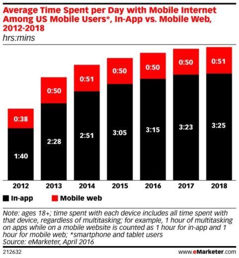
The “rise of mobile” continues to be a hot topic for marketers. It’s important to understand where people are spending their time and where advertisers are spending their money. So, how much time are people spending on their phones?
Four hours.
That’s how much time people are spending on their mobile phones today. According to eMarketer, mobile now accounts for about 60% of digital ad spending.

This information shouldn’t be a shock to any of you, so why are we bringing it up again? With a solid mobile strategy in place, we need to ensure we have a solid mobile user experience in place as well. You often hear questions like, “Is your site mobile friendly?” or “Do you have a responsive site?”
Today, we’ll learn the importance of your mobile experience and why a responsive site might not be enough.
Understanding Mobile Behavior
Even though mobile devices are used more than desktop, we’re still seeing lower conversion rates. We need to understand the user journey of our mobile visitors. People utilize different devices for different reasons, purposes, and with different intent. Understanding what our mobile users need is vital in delivering the right content in the right way. Think about these statements.
- Mobile users in today’s society are distracted. We’re all multi-taskers – we’re on more than one device at a time, we’re on our phones while we’re grocery shopping or talking to a friend.
- People typically use at least 2 devices before converting. Our focus shouldn’t be strictly on getting that mobile conversion. We need to direct our focus on assisting and encouraging that conversion, whether it’s now or in the future.
- Not only is it more difficult to complete a purchase or fill out a form on your mobile device, people are hesitant to complete this transaction on their phone because it feels less secure.

The Responsive Web Design Approach
A common approach to ensuring your site is “mobile-friendly” and usable for your mobile visitors is to launch a responsive web design. All your visitors will see the same website but reoriented depending on the device you’re using. However, site responsiveness doesn’t consider the intent and goal of your mobile visitors, as we just discussed. For example,
- Will your mobile visitors read all the content?
- Is it clear what the main goal of the page is?
- Are you answering their question(s) right away or do they have to dig for the answers?
- Is it easy for them to complete the conversion or are there obstacles?
- Does it feel secure or is there an easy way for them to continue this transaction on another device?
With responsive web design, many of the decisions are made for you and these won’t always work in your favor.
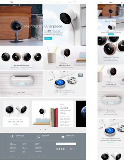
The following example from Nest brings to light a couple of interesting points. The first regarding the call-to-action. As you can see, it’s pretty tiny for those mobile visitors. An even bigger point to make is the proximity to the next image. All of these images are links further into the site, causing a few of problems for our mobile users:
- It’s difficult for mobile users to ensure their thumb clicks on the right area. If they click towards the bottom of this call-to-action, they’re likely to accidentally click the following image instead, introducing friction into their journey.
- While our desktop users have a cursor indicating the hyperlink, our mobile users have no clear indication that these will lead them elsewhere on the site.
- Mobile visitors may accidentally end up clicking these links as they scroll, causing even more friction so early on in their journey.

Paying close attention to the mobile experience is important if you’re implementing a responsive web design. Nest’s site is super sleek and modern, but a quick visit to the mobile site introduces potential hiccups in the mobile experience.
What’s Missing From The Mobile Experience?
What do we need to do improve upon our mobile experience? Research and analysis is key. This will help you understand your mobile visitors and your mobile experience. Do what’s best for your visitors. Maybe that’s a responsive site or maybe it’s a dedicated mobile page. Whichever you choose, continue to optimize and improve.
Earlier we discussed a few points that are important when thinking about how our mobile visitors browse the web.
They’re distracted.
Ensure you know what your mobile visitors need. Knowing they’re distracted, present the information and make it as easy as possible to navigate. Identify what decisions your responsive design is making for you and combat those that will have a negative impact on your mobile visitors. Is your design pushing your form to the very bottom of the page? Is it making your text or call-to-actions tiny and hard to read?
They use more than one device.
Cater to your mobile visitors and make it easy for them to go from one device to the next. Maybe it’s easier for them to give you their email address so they can continue from their computer. Maybe they have begun shopping from their phone but would like to save the product for later. Give them these simple prompts that will allow them to do just that.
They feel less secure on their phones.
Providing them with the option to save their cart or give their email address will allow them to easily continue their transaction where they feel most comfortable.
Is Responsive Web Design Enough?
The simple answer? No, but it’s a start. Responsive web design is enough to ensure the site is usable for those mobile users. It’s not enough to provide them with the experience they need. It’s not enough to provide them with the information they’re looking for. It’s not enough when we think about the ultimate end goal: the conversion.


