Stop Whining. Start Winning. Swiftly Navigating the New AdWords UI

The new AdWords interface is here, and everyone has an opinion about the new layout. This blog is not an opinion piece. You won’t find me crying into my pillow about the AdWords interface updating by the end of 2018, scrapping our old AdWords dashboard navigation for good.
This blog will teach you the more technical side of actually navigating the interface, for those of us who have been slamming the “Return to previous AdWords” button shamelessly for months. You’ll also learn features that Google has built into the new interface that will make your life easier and help you to save time, and the bottom of this post includes a cheat sheet, highlighting those fresh features available in the new interface by the type of marketer you are and the type of feature offered exclusively in the new experience.
If you’re an “old timer” like me, you may find the new layout difficult to navigate technically. I first encountered the AdWords interface in 2007 when it looked like this and started using the AdWords UI in earnest at my first PPC job in 2012. And here I am, sitting in trainings with the new kids at Hanapin Marketing and they reel back when I open up the old UI. “Wait, what is this dashboard? I’ve never seen this before…” Get with the picture, granny.
Let’s cut through the strategy and get right to the heart of what’s in the interface, how you can use it more efficiently right now. Like, right this moment.

1. Problem: Everything moves too slowly, and the flip-out menus are driving me nuts.
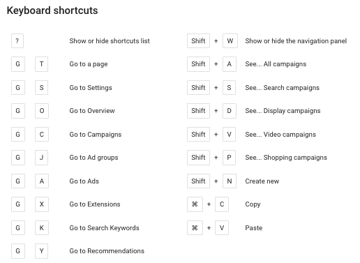
Solution: There are shortcuts, so please use them! You can show or hide the navigation panel with a quick stroke of Shift+W. Blow it away to focus on the task at hand. This feature is especially useful when using a narrow screen.
You can find the shortcuts by pushing the ? button while in the new interface. Here is a list:
You can also click the “Expand table” button.

Here’s a gif of the little button in action. I could swear I heard angles sing the first time I clicked it:
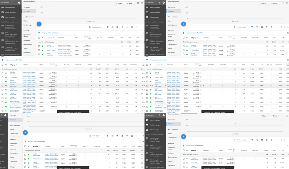
The “Show less space” row narrowing button right next to the “Expand table” button allows you to see more rows without scrolling as well.
2. Problem: The filters and column selections are all in different places. I’m not used to weeding through my choices in this layout.
Solution: We’ve all been clicking the cute little filter icon and the striped column icon to break down our data properly. But once it’s clicked, you have to hunt and peck for exactly what you want. Well, actually you don’t. Do you know that you can type your desired filters now in the filter bar? Stop scrolling through filters trying to find the perfect one. Say you want to filter by campaign name. Just type in what you’re looking for and it Google will auto fill your choices:
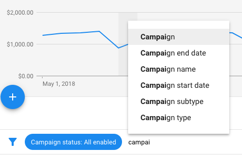
As a bonus, Google remembers the filters you used recently so you can pull them up again. They’re shown just above the auto-fill options when you’re typing.
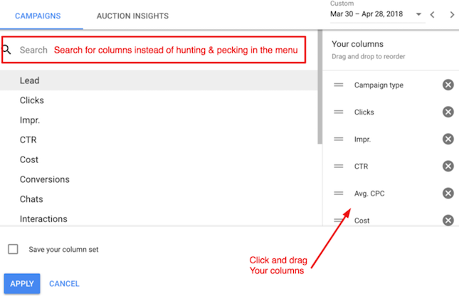
You can similarly type a search for columns, but this system is much more clunky. The search bar re-sets every time you select a new column choice. I’d recommend using the “Save your column set” feature more than ever in the new interface, to avoid ripping your hair out in frustration.
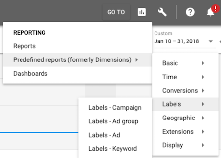
3. Problem: They took away the dimensions in the new UI.
Solution: Yes, they did. But dimensions came back! They’re now called “Predefined Reports” and be found under reporting.
4. Problem: Selecting dates in the new UI is awkward.
Solution: Flip between dates easily with the backward and forward buttons. For example, looking at the last 30 days:

Click the backward button and you can thread back in time.

Admittedly, I continue to find the date comparison selection tool a bit janky, especially when I’m trying to compare to the previous period and the interface doesn’t want to compare to an entire previous month. At times, typing dates can be easier than playing with the little blue and yellow highlighter in the calendar, which I’ve been wont to do until I simply give up and just type the dates into the custom date view.
Bonus! Cheat Sheets:
- This is the big daddy blog post about the new AdWords experience – what’s leaving, what’s staying, and exclusive features.
- And here’s a timeline of changes, month by month, provided by Google support.
If you ever feel unsure about new features, these pages are a great place to start. Bookmark these pages and refer back to them when you can’t find something. It will be your translation key in the coming months before October hits.
Changes that may put a hitch in your giddy up:
- Most automated rules will easily pass over from one interface to the other, but there are some exceptions you may want to check – notably, if you have a rule that is dependent on a retired AdWords column – listed here – you’ll want to update accordingly.
- I recall my old peers drilling into me the wisdom of using “Target and Bid” when choosing display audiences, to ensure only the selected audience is targeted. This terminology has now been retired and the new settings are called:
- “Target and Bid” = Targeting
- “Bid Only” = Observations
- Ad Extensions now have a fresh associations view that may confuse the seasoned PPC marketer, since the view is more designed to look at performance of the same extension across multiple associations. One can change the associations by ticking the boxes and clicking Add or Edit. But you can schedule extensions now – nifty! You can also get a quick rundown in a pop-up menu from Google stating, “This extension is associated with the account, 6 campaigns, and 17 ad groups.” It’s a nice summary for auditing extensions. Also the sitelink URL shows in the pop-up menu as well, eliminating the need to click in to every single extension to check destinations!
Can’t-Miss ad features for e-commerce and retail marketers:
- Promotion Extensions integrate promotion dates, occasions (select holidays), promo codes, and more into your ads – and you can schedule them in advance.
- Showcase ads for those of us with the recommended 1,000+ products in our feed. This ad type allows a variety of products to be shown in a storefront format.
- Household Income targeting has been available for a while now in the new UI.
- Import in-store sales into the interface for additional reporting clout if you have physical store locations.
Bid changes for call-focused marketers:
- Call bid adjustments (for call only campaigns and call extensions) are now available in the menu under Advanced bid adj. – I’m excited to see if and when this feature is extended beyond call bidding!
New reports and targeting for all marketers:
- In general, reporting download options in the new UI is rad. You can compress the file, select whether or not you want title and date range or summary rows. It’ll make your job easier when you’re crunching numbers and pivoting in Excel.
- We’ve all heard about the new opportunities and recommendations tab, the at-a-glance reporting, and n-grams. These features are at the top right and featured front and center when you log in to your account.
- The ad version history report can be accessed on an ad-by-ad basis. Marketers can now see the ad performance for previous versions of an ad in the new interface.
- Landing page performance reports where you can test mobile friendliness and see which landing pages drive the most sales.
- The Audience page and display network campaigns have been updated so you can get a top level insights and a view of which audiences are showing across all campaigns, or those you filter. And speaking of audiences, you can now target In-Market Audiences on search!
- Drafts and Experiments got a facelift. Notice that you can split test bits and pieces of your ad copy now, using Ad Variations.
New optional settings for all marketers:
- The Global Insight Tag will track all things seamlessly across multiple Google products. But never fear! If you are using the AdWords tag it will not be retired in October. If have a preexisting global site tag on all pages of your website, you can configure your existing tag to send data to multiple AdWords or Google Analytics accounts, which is pretty sweet.
For those of us looking to get into video:
- Outstream Ads show beyond YouTube – Video ads are now available to show on the Google Display Network. Note that these placements beyond YouTube are focused on users scrolling on their mobile and tablet devices only.
- Trueview for Action Campaigns – a new campaign format
The new user interface has had a rough start, but I’m actually starting to like it, thanks to some of these shortcuts and navigation tricks. Be sure to print out the shortcut menu and slap it on your wall. And remember what Alan Watts said:
“No one is more dangerously insane than one who is sane all the time: he is like a steel bridge without flexibility, and the order of his life is rigid and brittle.” – Alan Watts
So create a little space, give yourself a lot of time to learn, and have fun with the new AdWords interface. Make lots of fits and starts, and eventually you’ll get into the groove of things. And thanks to Google, the new UI is improving every day. If you see something that keeps tripping you up, be sure to Tweet at Google support or submit feedback through the “?” icon next to the bell in your AdWords account, so the Google team can continue to improve the new interface.


