How to Create Thumb-stopping Social Ads

We all have been there, where we have been patiently waiting to see the results of a newly launched paid social campaign that we have worked hours to plan, design and build. We had audience personas, the right campaign objective, a few high quality audiences and a few ads that we thought would resonate with our target audience. You even went the extra mile and used creative optimized for your key placements. But, a few days later the results are not there, low volume results with high cost per action isn’t what we expected from all that hard work. We dig in to figure out what’s wrong starting at ad level (hint, hint) and the first thing we notice is poor click-through rate and high cost per clicks. Knowing that the rest of our campaign design is correct, it’s obvious that the ads are not working. They’re getting lost in the middle of a never ending feed of cute pet photos, witty cartoons, and hot political news. Let’s be honest, the photo of a group of smiling business people with the overlay text that shouts the title of our whitepaper not going to cut it. Just think about similar ads that show up in your social feeds that you skip them without thinking.
No one is really looking forward to seeing another ad. In the modern world we are exposed to thousands of ads per day and over the course of the last few decades our brains have developed an internal ad blocker system (known as banner blindness) to simply ignore anything that looks like an “ad”, anything that distracts us from the actual content.
But, what if we design our ads to be less of a “commercial” and more of an interesting piece of content that makes the user pause and maybe even engage with it? This the key in creating high quality paid social ads considering the interruptive nature of the advertising on social media platforms. In this post we’re going to talk about a few ideas to make ads be more organic looking, deliver real content value, and of course, generate results.
Provide context
The first thing that comes to mind when designing an ad is to show the product in the creative, very similar to the weekly ads that you get from your local grocery store in your mailbox and discard in the recycling bin without even thinking about it. Well, the same thing can happen for digital ads too! As digital marketers we have some advantage over our direct mailer counterparts though. First, we can see engagement metrics to realize that product shot is not working and second, we can test new ideas and measure the difference.
In order to go beyond the product (or service) we can think about providing some context in the creative. Talk about why our product exists, the problem that it solves and even showcase its usage in real use cases.
- Use photos or videos of users interacting with your product and using it in action.
- Show the product in environments that resonate with the user and their real life use cases of the product (like the Super ATV ad below)
- Make your copy and visuals about the problem you solve.
- Leverage user-generated content or minimally use models in your creative visuals who resemble the demographics of your target audience (or the users of the product in case the buyer is not the end user, the ad below from Target exactly does that)


Put a face on your business
It’s very common for businesses to focus on brand elements in their creatives to look serious and formal as they believe this is the way to create trust with their audience. We’ve all seen ads from SaaS or B2B advertisers that’s all about their latest webinar, whitepaper or blog post and while all of them are potentially valuable content pieces, there are better ways to promote B2B content than showing a mockup of a book with the whitepaper title. After all, we want to create a human relationship. Let’s see what we can do if we think about our brand as a collective of caring and intelligent people who have something valuable to offer versus a building with a logo on it.
- Show off your team! Use images of people who are behind your brand, the brains behind the solution, and the faces that your clients would make an emotional connection with.
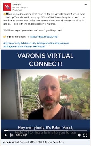
- Use videos of your team members to talk about your upcoming webinar or event. Bonus points if they’re the actual webinar presenter or the author of the content that you want to promote.
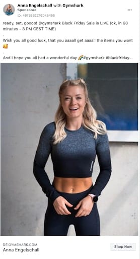
- Collaborate with influencers as your brand ambassadors. Take this to the next level by leveraging “Branded Content” features of different paid social platforms to promote your offers through their profiles.
Make your ads look “Organic”
This point ties back to what we said earlier about ad blindness. The last thing that we want to do when designing our ad is to go with a cookie cutter ad template that screams “THIS IS AN AD”. Instead we want to look organic and very much integrated to the nature of the content on whatever platform we’re planning to advertise on. Here are a couple ideas.
- Check out the performance of your organic posts and use the best performers as your ad. Now, I’m not suggesting you run “Boosted Post” ads as they will limit your control over managing and analyzing your campaigns. What I’m saying is to identify the elements of your organic posts that have generated positive results and replicate those in your ads.
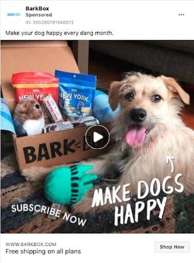
- Take advantage of UGC (user-generated content). Unboxing videos, testimonials, reviews are just a few of the examples. Consider running contests to encourage your users to generate and share their content with you and pick the best ones to use in your ads.
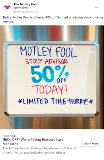
- Learn how to be crafty with your visuals to gain attention. Sometimes a polished professional looking ad is not the way to go instead you may need to look more relaxed and natural.
There you have it! I hope you can implement some of these ideas in your campaigns and make your ads less “ad”-like and get wonderful results.


