I’m a big believer in the power of landing pages and conversion rate optimization. But, to run your conventional multivariate or A/B test, you have to have traffic.
Lots of it.
In fact, just to prove that a new page design improves your conversion rate by just 20%, you need to split test thousands of visitors. The only problem is, for many paid search landing pages, it could take months or even years to accumulate that kind of traffic.
And, in the immortal words of Kimberly “Sweet Brown” Wilkins:

However, even though you might not have enough traffic to conduct a classic A/B test on every landing page, that doesn’t mean you can’t take a data-based approach to optimizing your landing pages. To help you out, here are 3 easy ways to quickly test out variants on low-traffic landing pages.
1. Heat Mapping
If you’ve tried your hand at conversion rate optimization before, you’ve probably heard of heat mapping. Essentially, heat mapping software tracks your visitors’ cursors and then visually maps their behavior onto your page. The brighter the color, the more clicks that section is getting.
As you might guess, the more traffic you have, the better your heat mapping data will be, but even if your page doesn’t get a ton of visits, you can still use this data to learn important things about what your audience is looking for on your page.
For example, one of our clients runs a website that connects event organizers with speakers. Their original landing page emphasized all the perks of using their service (simple invoicing, real reviews, etc). When a user clicked the CTA, they were sent to a lead gen form.
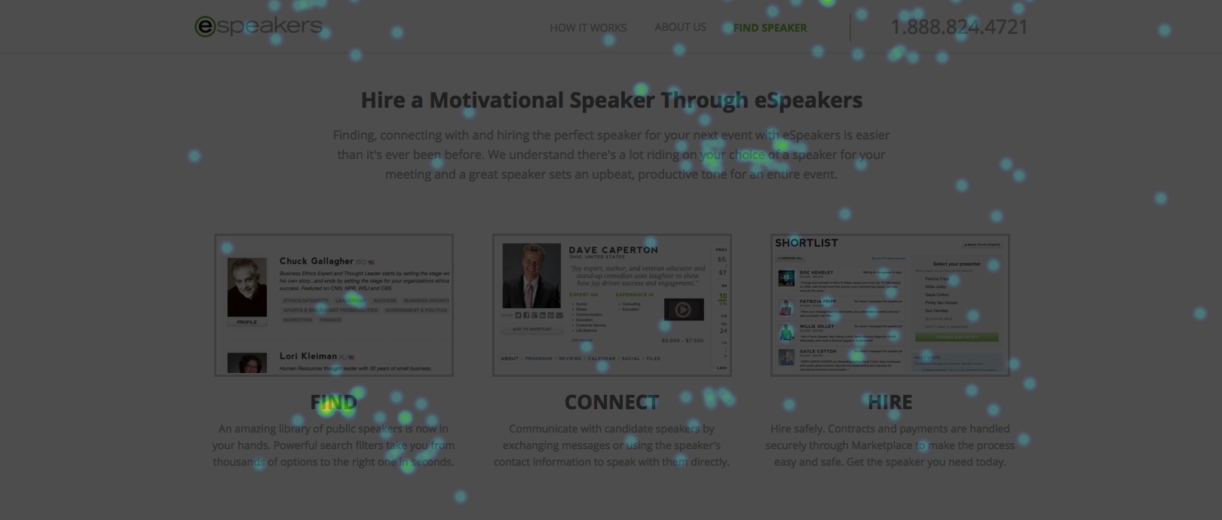
Unfortunately, their industry was pretty niche, so their page wasn’t getting a lot of traffic. And, the traffic it was getting, wasn’t converting. In an effort to try and fix things, we tried some heat mapping:

Initially, the results left us with more questions than answers. Clearly, people were clicking our “Find Your Next Speaker” CTA. But why weren’t they filling out the form?
At first, we were mystified. Then, we looked a little further down the page and discovered something odd.

To our surprise, we were getting many clicks on a big “FIND” subheading. That was great…except for the fact that the text didn’t link to anything.
Although we didn’t have 10,000 visitors for a classic A/B test, the visitors we did have were telling us something important. They were looking for and responding to the word “find.” In other words, they didn’t want to fill out a lead gen form right off the bat.
They wanted to find a speaker.
Based on this data, we made a couple of tweaks to the page. We pointed the CTA to the client’s speaker directory and linked the “FIND” subhead to the directory as well. Almost overnight, the page started generating 11x more leads.
Easy enough, right?
The fact of the matter is, you don’t have to A/B test thousands of visitors to figure out what your audience is after. Simply by using heat mapping data, you can often divine what your potential customers want and make the change directly (incidentally, if you’d like to try this on your own page, here’s a list of heat mapping services).
As you run heat maps on your low traffic landing pages, though, keep in mind that heat maps only track mouse movement and clicks. They don’t track what your traffic is looking at or reading. They also can only really track clicks and page scrolling on mobile, so it’s important to keep these limitations in mind when you draw conclusions about your page.
But, some data is better than no data, so if you’re stuck in a low-traffic, low-conversion rate situation, heat mapping can be a great way to figure out what is wrong with your landing page.
2. Run A 5 Second Test
People form a first impression of your website in as little as 50 milliseconds. Yes, you read that right. Milliseconds.
However, if you make it past that first 0.05 second assessment, it takes a visitor about 2.6 seconds to focus in on the part of your landing page that most influences their first impression. And, the better the first impression, the longer they’ll spend on your page.
In other words, first impressions matter.
Unfortunately, if you don’t get a lot of traffic to your page, it can be hard to know if your page is making the right first impression. This is where five second tests can be incredibly helpful.
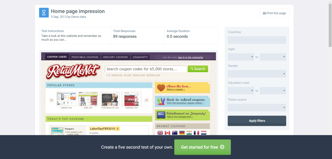
To run a five second test, all you have to do is show your page (or your variant) to someone for five seconds and ask them about the page. How your test subjects respond can give you a ton of insight into what is and isn’t working on your page.
In fact, five second tests are so useful, that UsabilityHub actually runs a website where you can submit pages for randomized five second testing.

Since your page(s) are being shown to a random audience, this can be a great way to figure out whether or not your landing page is communicating the right message. However, as you run your tests, keep in mind that the UsabilityHub audience may not be very representative of your target audience.
If you’re running a shoe retail site, that may not be a big deal, but if you’re marketing to a very niche market, the UsabilityHub test takers may not resonate with (or even understand) the pain points your page is targeting.
But, if you keep these limitations in mind, UsabilityHub can give you a lot of perspective on how other people are responding to your landing page design.
3. Just Ask People
One of the difficult things about conversion rate optimization is the fact that people don’t tell you why they didn’t convert. I mean, no one ever sends you an email after they bounce saying, “I just wanted to let you know that your headline really didn’t work for me.”
Even the best A/B test won’t give you that information, but there is a way to get at it. All you have to do is ask.
This tactic actually isn’t all that uncommon. If you’ve ever started to leave a site only to get a survey question as you exit, that’s a business asking you about your site experience. If you’ve ever been asked a question after completing a form, that’s a business trying to figure out what worked for you on their landing page.
Obviously, on-page surveys aren’t a perfect way to get at information, but even a few responses can teach you a lot about exactly what is and isn’t working on your site. At Disruptive, we’ve used Qualtrics, VWO and Qualaroo to run on-page surveys and learned some surprising things.
As you review your survey results, however, keep in mind that they aren’t always representative of how your average visitor feels. Odds are, you’re dealing with a pretty small sample, so one or two angry people can really give you a skewed view of how your audience views your page.
The key is to look for trends in your responses. If you notice that many or most of your responses mention something similar, there’s a good chance that you’ve uncovered something important.
Conclusion
While A/B testing is probably the best, most reliable way to improve landing page performance, sometimes you just don’t have enough traffic to pull off a formal A/B test in a reasonable time frame.
However, just because you don’t “got time for that” doesn’t mean that you can’t use data to optimize your low-traffic landing pages. Heat mapping, five second tests, and on-page surveys are all great ways to get at the information you need—even if you don’t have the traffic to run an A/B test.
How do you handle low traffic landing pages? Are there any tactics you’d add to this list? Tweet to me.


