Your PPC dreams have finally come true – data visualization is now available in the AdWords Report Editor! You now have the ability create your very own data masterpiece by dragging and dropping data to create pivot tables, graphs and charts directly in the AdWords interface.
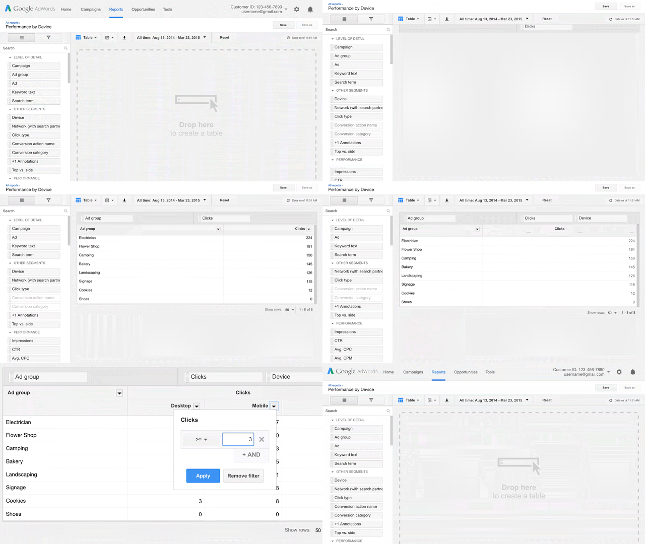
Last week AdWords announced the release of the AdWords Report Editor that will be rolled out across all accounts over the next few months. We’ve already seen this available in many of our accounts already so the roll-out does appear to be happening pretty fast. Below is a GIF AdWords put together to provide an overview of the tool.
AdWords Report Editor allows you to:
- Explore your data with simple drag and drop actions
- Sort, filter, and pivot your data to focus on the slices of information you need
- Visualize your data in pie, bar, or line charts to reveal powerful insights
- Apply multiple segments to analyze your data with finer granularity
This new addition is a great way to help PPC advertisers tell a story with their data that can help create some actionable optimizations directly in the AdWords UI. Below we discuss 7 must have reports to help you visually analyze your account, how to set up a report in the new Report Editor and what to do with the data you find.
What Types Of Reports To Run?
The Report Editor quickly audits your account segments by slicing and dicing the data to see if there are any anomalies. Below are 7 must have reports to run on a regular basis to help you see what’s going on in your account.
- Time (day, week, hour of day, day of week, etc.)
- Conversions (name or category)
- Network
- Device
- Top vs. Other
- Impression Share
- Brand vs. Non-Brand
How To Create A Report
For this article, I’m going to walk you through how to create a Day of the Week Analysis.
Step 1
Go to the report section in your account and select your appropriate date range for the report. For this example, I used the last 30 days.
Step 2
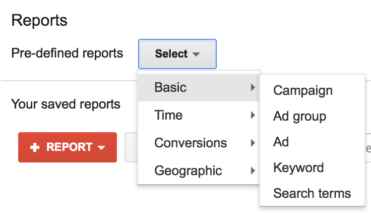
Next, you can either select a predefined report or create one from scratch. For the Day of Week Analysis, I’m going to use the predefined “Time” report and then drag over the Day of the Week from the Performance column on the right-hand side.
If you are using a predefined report, it should look something like this:
Step 3
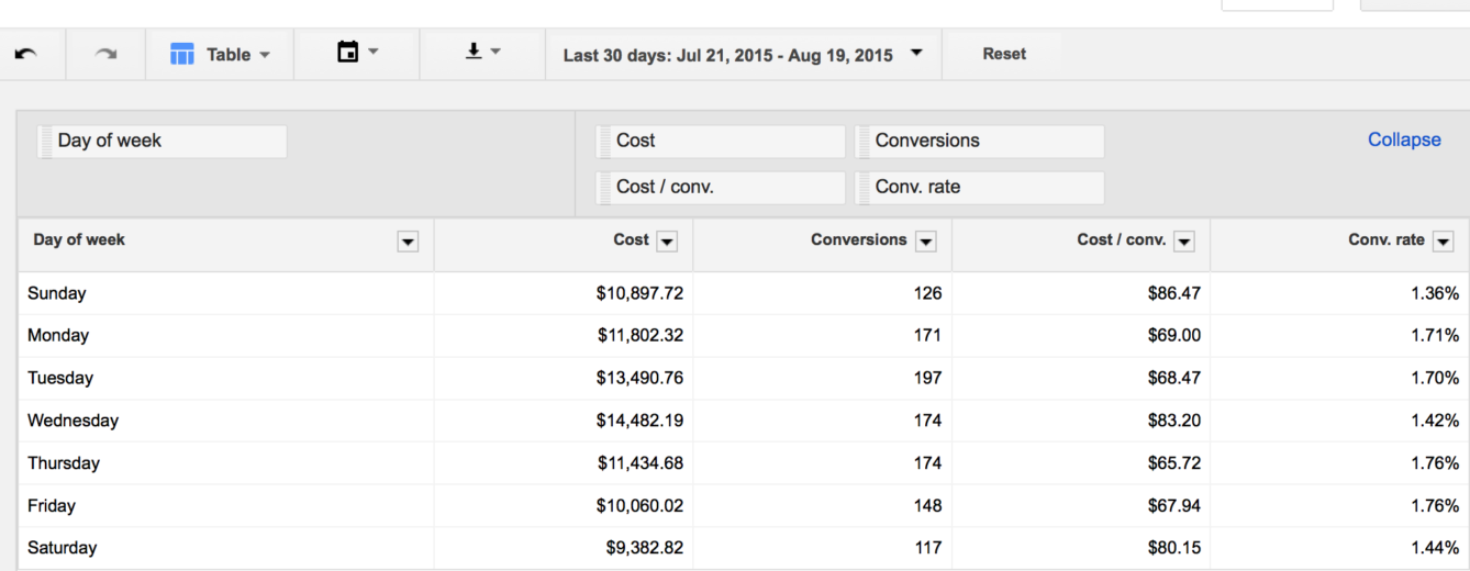
Organize the metrics that are most important to you for this analysis. Using the predefined report threw in a couple extra metrics I really didn’t care to see so here you can customize by dragging and dropping metrics into the table from the Performance Column on the right-hand side. You can include all types of metrics including Google Analytics data.
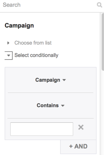
If you want to segment further, you can select all campaigns, keywords, ect. or you can select to run the report for specific campaigns or specific metrics. All of this is available on the right-hand panel and can be dropped into your table. You also have the ability to filter data based in your performance metrics.
Step 4
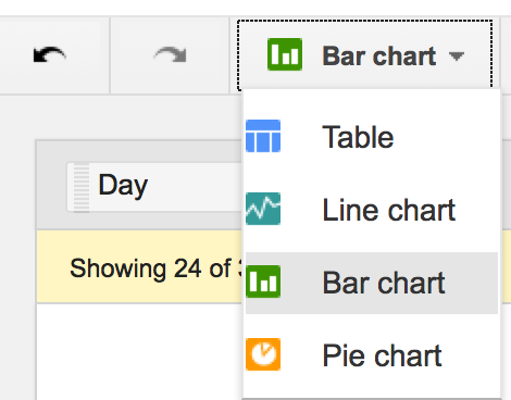
Once you’ve whittled down the report metrics to the most important KPIs, select which type of graph you would like to visually see the data.
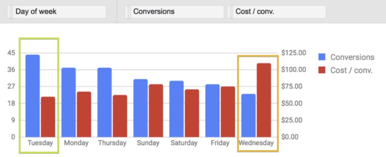
*Note – the fewer the KPIs the easier the graphs are to read. For the day of the week report, I selected conversions and CPA (cost/conv) to see what days are yielding the most conversions at the lowest CPA.
Step 5
The data will automatically populate into the chart you’ve selected and start helping you visually analyze your data.
* I did notice that the more KPIs you used, the Report Editor would cut off some of the information especially for the hour of the day report.
Step 6
Save and schedule to run this report every 30 days. You can also opt to have this report emailed to you or export the charts.
What To Do With This Data?
Now that you’ve created the report template for Day of the Week Analysis, you can start to pull out key takeaways from the findings and create a plan to optimize.
For example, in the report above I can see that Tuesdays are driving the most conversions at the lowest CPA. However, Wednesdays have the least amount of conversions at the highest CPA. From here, I can see that I should go in and adjust ad scheduling to increase bid modifiers on Tuesdays and decrease on Wednesdays to increase efficiency and maximize conversions.
Conclusion
If you do not have this feature available in your accounts already, stay tuned! They should be rolling out soon. If you do already have report editor available, I encourage you to get in there and give it a shot to start creating reports, tables and charts to help you save time and analyze your accounts.
If you are already a Report Editor expert what types of reports and charts do you think are worth creating?


