Testing is an important part of running a successful marketing campaign. Strike that – testing is an integral part of a successful campaign. Assuming anything can lead you to miss entire insights and opportunities for optimization. That’s why you read article after article, watch webinars and speakers, and study up on how to best test your content and targeting.
As a lover of all things ecommerce, I felt it my duty to share with you fellow PPC Heroes the findings of my latest test. So sit back, relax and enjoy reading the Tale of 2 Landing Pages: an Ecomm Fable.
The Setup
In running the PPC account for a retail footwear company, we’ve seen trends come and go. There are some products that perform well across all time and others that burst out of nowhere, leaving a trail of amazing ROAS in its wake. In this story, we had seen sudden and impressive performance come from a few specific products. The product brands included Nike, Asics, K-Swiss, Miranda Lambert, and Rocket Dog. We had always opted to send this brand traffic to a landing page 1 level higher than the product page, as often shoppers do a bit of browsing before making a purchase.
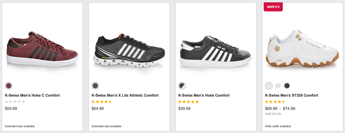
The original landing page, herein referred to as “Brand page” usually had somewhere between 12-99 products, such as the one below.

Sending traffic to this page allows shoppers to view a variety of products, just in case something entices them (even better – an additional purchase!) as well as seeing the color options, spectrum of prices, and various product ratings.
As mentioned above, over a series of just a few month we had specific styles of shoes that really took off. The shoppers came through product-specific search queries and bought these styles like hotcakes.
Upon seeing this, our wheels began to turn as to what might happen if we sent these shoppers directly to the product page itself? Our Shopping campaigns do it, right? What about Search? Do shoppers want to be sent directly to the product as though they’d chosen it directly out of a PLA?
The Test
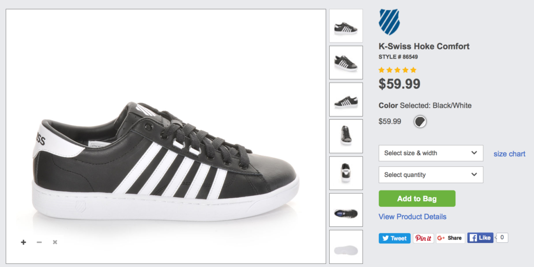
To satiate our curiosity and seek out potential gains in conversion efficiency, we decided to run a test on these specific products. The test would concern potential landing pages where we split traffic between two options: The Brand page (as shown above) or the Product page shown here.

The Outcome
The test was pretty simple and truthfully, our hypothesis was that sending users to the exact product they wanted to shorten the sales funnel would allow them to purchase immediately. No ifs, no buts, no coconuts.
Much to our surprise and chagrin, we were wrong. Really wrong, in fact. When it came down to it, shoppers wanted a broader landing page. They wanted to browse. Not only was engagement higher, but most metrics pointed to the Brand page as being a better landing page choice!
Metrics Ain’t Lyin’
Conversion Rate
Across each brand, we saw differing ranges of success.

In this table, we have 5 brands of products (and a total of 11 styles), all of which had best conversion rates when directed to the product’s Brand page. The Brand page conversion rate typically beat the Product page by at least 95%, showing that was a serious victory for Brand in this round.
CPA
Although many factors weigh into the final CPA of a target, ultimately a high or low CPA can determine exactly how far your budget will stretch. In our landing page test, we saw that frequently the Product page saw a better CPA than the Brand page. By how much, you ask? I asked the same question.

Although the Product page won 4 of the 11 battle-of-the-CPAs, the success ranged across the boards. One K-Swiss style saw a 50% lead of Product page over Brand page, while the other beat Brand by 85%. Nike, on the other hand, had a wildly different CPA depending on the style, as the Product page had a CPA 11x more efficient than the Brand page for one style (spoiler – the style with the lower Product page CPA had about 1.2x the click volume as the second style). The Brand page consistently outperformed the Product page for our final brand Rocket Dog, a result consistent with the conversion rate comparison.
Although for our optimizations, when we look at the specific style-by-style performance, we also see some pretty amazing high-level insights about Product versus Brand pages.
Bounce Rate
When comparing visits to our Brand pages versus Product pages, we saw something fairly shocking. Bounce rate improved across 10 out of 11 styles. The bounce rate for the Brand page had an average improvement of 44%. Below are the style-specific changes when shifting from Brand to Product page (hint: lower number means bounce rate dropped, which means less people immediately exited from the page).

Now, we could stop there, but I suspect you readers would find fault in a blanket “Oh, bounce rate went down, it must be a better landing page” statement. So let’s dig into another metric.
Pages Per Session
We also reviewed the impact this test had on pages per session, a metric that reveals how much content the visitor was exposed to. As you can see from this table (similar to the above view of all styles’ respective performance), the average change in pages per session was a positive 34%. The details, however, reveal that it wasn’t as simple as the bounce rate average. Some styles saw huge gains while a solid set only showed minor improvement. A few actually lost traction in this metric when shifting from Product to Brand pages.

One of the lingering questions with this table is that of intent. Did pages viewed increase because they were highly engaged and ready to purchase? Or did they arrive at the Brand page and simply spend more time surfing the site, looking for the product to purchase. [While I’d love to high five myself for improved pages per session, I turn to additional metrics like “Pages viewed/transaction” to give the real winner. But I digress.]
Let’s return to the immediate metrics at hand, such as the next one.
Average Session Duration
Similar to the pages per session average, the session duration performance could indicate invested shoppers, but it could also reveal that site visitors aren’t finding what they came for. To begin, let’s review how low these guinea pigs lasted on the site when switching from the Product page landing page to the Brand page.

Again, we have some serious growth in the length of time per session. Some styles saw a light boost, some saw major investment shifts, and others saw a slight degree of loss. Overall, the Product page led to more investment in the site, further browsing of pages or products and improved conversion efficiency as well.
Conversion Rate
As noted time and time again, this data has many layers. This onion of a landing page test also has many consistent trends running through it, and conversion rate improvement is one of them. Across the boards, conversion rate improved by an average of 47% from Product to Brand page. In addition to the other metrics, this makes for a compelling case to make the switch.
A Happy Ending?
From this test, we learned a few things about what [some of our] visitors are telling us. We can see how their behavior changes when we take them to exactly where we think they want to go, versus a slightly broader page. In concluding these tests, the next step is to see about that CPA – remember, the one that was frequently better when the Product page was running? As the test becomes the new landing page, we’ll then revisit the outcome of our existing targets (our bids, our keywords and overall setting).
As I said in the beginning, testing is everything. With each concluded test begins the next trial. And so our story is to be continued….


