I’m sure everyone has gotten out their smartphone to look something up within the last 24 hours. Most of us have our phones on us all day, every day. They’re easy to carry around, they’re convenient, they give us access to so much information, they’re convenient, they keep us in contact with our friends and family, they’re convenient. Okay, you get my point. We’ve heard it said time and time again that mobile devices have to be at the forefront of our minds as digital marketers.
Today, I’m going to show you the importance of segmenting your data by device when carrying out landing page optimizations. You should know that mobile and desktop users behave differently. Their intents are different. Their mindset is different. The way they use the device is different. All of these aspects have to be considered when you’re making optimizations. Your desktop users may react positively to a change on your landing page while the same change could result in a loss of mobile conversions.
Let’s start by going through a couple of examples.
1) Click-to-Call
For one of our education clients, we tested eliminating the click-to-call CTA within the lead form. This test was recently referenced in a recent blog post on best practices. Needless to say, it failed as a best practice. Anyway, the phone number is present a number of times throughout the landing page, the first of which is directly below the hero image. Therefore, we were comfortable eliminating the conflicting call-to-actions within the same form. These test results were interesting.
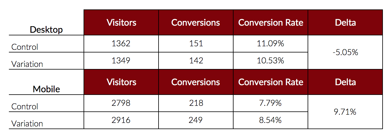
After seeing these results, we were initially dumbfounded. Seeing that this test lost on one device and won on the other, our expectations were to see the opposite results. Why would removing the phone number from the form have better results on mobile devices but worse results on desktop?
After diving deeper, we realized it’s due to the nature of the users and what they see on their devices. The following screenshots portray what users see on both desktop and mobile, respectively.

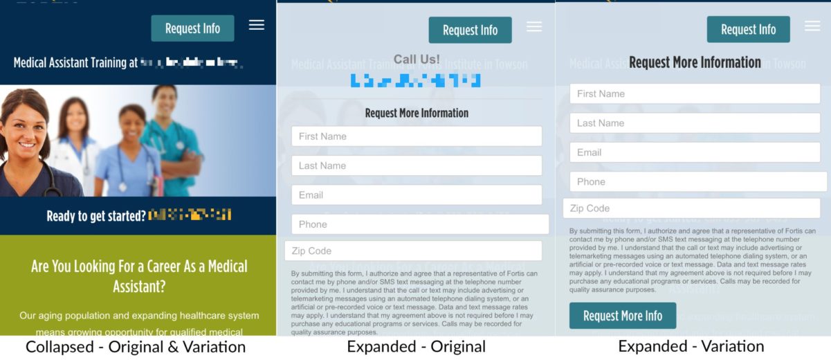
Desktop users see the form immediately upon entering the site. It’s suspected that the phone number acts as a credibility measure and that extra nudge to encourage users to fill out the form. Our mobile users only see “Request Info” immediately upon entering as well as the first click-to-call CTA below the hero image. The mindset of the users who click on “Request Info” is to get more information. The expectation is to be taken to a lead form, not to be presented with the phone number, yet again. Therefore, by removing the click-to-call CTA from the form on mobile devices, we aligned expectations, brought the CTA into sight and increased our mobile conversions.
Overall, this shows us the importance of segregating your data to see the performance by device. We started the test with aggregated data. Had we continued down that path, we wouldn’t have seen the entire picture, just the negative results. We would have missed this opportunity to increase our mobile conversions.
2) Promo Banner
An ecommerce client tested adding a promotional banner to the category pages. This same promotional banner was present on the product pages as well so we wanted to test introducing it on the category pages above the specific products. Once again, the results were surprising.
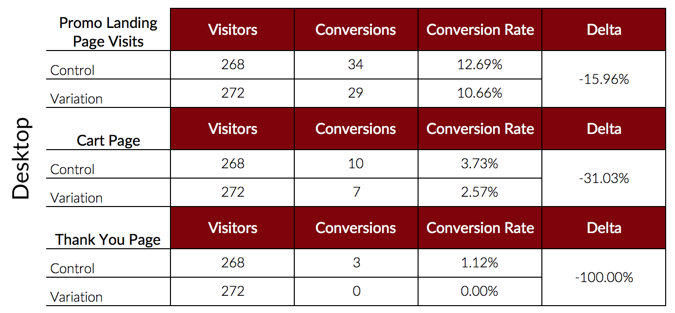
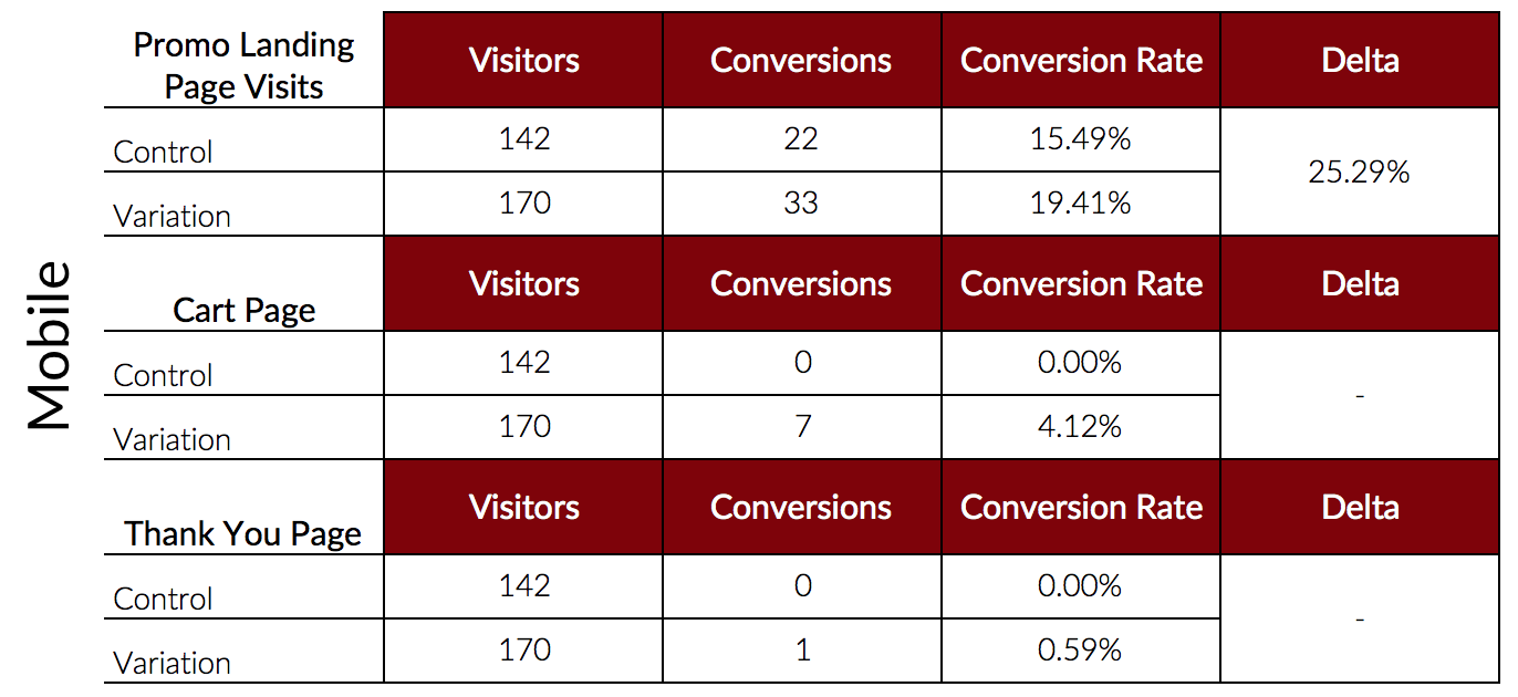
As you can see, placing the promo banner above each of the specific products performed better on mobile. We know our actual conversions are low due to the checkout functionality itself on mobile devices. However, we still see so many more users making it to the cart page on their mobile device when we add the promo banner to the category page.
Below are both the desktop and mobile versions of the test.
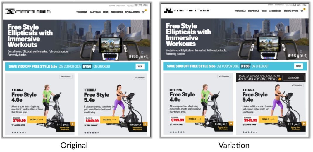
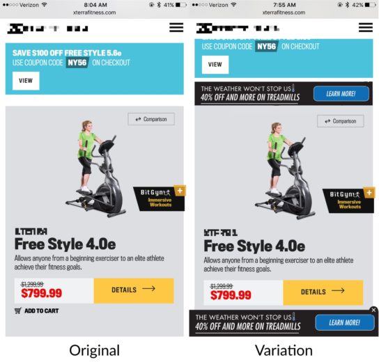
These results again, had us stumped. Not because we expected desktop to do better but because we expected to see the same results for both devices. I will also mention, the sticky promo to the bottom of the screen that you see pictured in the mobile variation screenshot was also present on desktop. Along with that, if you’re paying attention, you’ll notice the promo for the desktop and mobile screenshots are different – this is only for sake of example and not what was actually tested. This is what happens when you’re filling your desktop full of screenshots everyday and wind up losing the ones you need. Bear with me!

So why do we think the test won on mobile devices but not on desktop? Notice the competing blue banner on desktop. This bright blue banner also contains a promotion. On desktop, there’s no way to avoid these conflicting promotions. On mobile, while they still reside next to each other, the first thing users are going to do is scroll. Mobile users are more likely to see the promotion that we’re testing without seeing the conflicting blue promotion at the same time.
How will we know that the conflicting promotions caused our negative desktop results? We’ll need to test it, of course!
Final Thoughts
Mobile and desktop users see things differently, behave differently, and have different mindsets when they arrive on a site. You have to keep this in mind when you’re making optimizations, whether you segregate your data or test each device completely differently. Before you even begin your testing and optimizations, there are a number of different things to look at to compare your desktop and mobile users. But, we’ll expand on this at a later date. Until next time…


