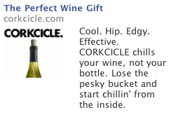
So I thought it would be fun to actually re-write an ad, rather than just comment or critique existing ads — show you how I might do it different, or at least what variations I’d consider worth testing. So let’s start with this not-so-interesting ad I found for a rather interesting product:
 So here are a couple of quick and dirty reasons I believe this ad falls short of its potential:
1) The headline is lame. I bet they could easily test your way to a far more intriguing headline
2) The picture makes good use of the Billboard strategy, but makes crappy use of space for the image
3) The first line of copy is nothing but a collection of less-than-credible, self-applied labels.
And here’s how I’d suggest you change those elements to create a worthwhile split test:
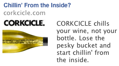
1) I’d steel the “Start Chillin’ from the inside” line from the end of the ad and use it for a headline. Only problem is it’s 5 characters too long. so let’s drop the “Start” and add a question mark: “Chillin’ From the Inside?”
2) Let’s flip the bottle so we can take advantage of the wide-screen picture format to show more of the icicle inside the bottle. This not only shows the product more clearly, but the horizontal bottle points to the ad text, directing the eyes of the viewer where we want them to go.
3) Cut the first line of copy and go with shorter copy length. Or add in a final “See what the critics are saying” CTA.
So here’s what you end up with
 Notice how this has a lot more visual impact, and a fair-bit more intrigue in terms of the headline. Well worth testing at any rate…
So what about you, what might you recommend for a test? Let me know your ideas in the comments section.


