I once saw a video clip of British-Irish comedian, Jimmy Carr, doing a bit on “enlargement” e-mails, asking if everyone else was getting spammed by them too, or if they were somehow targeting him based on some sort of presumed need. He ended it by saying that the worst part was how half the e-mails were forwards from his girlfriend ; )
Well, I can’t speak to those kinds of e-mails, but the number of “Gaming” ads showing up on my facebook page has me feeling similarly; I’m not a freakin’ gamer — why are all these ads targeting me? Do they know something about me based on online behavior or something? Maybe they’ve realized I’m prone to procrastination…
But then I realized that this was actually a great opportunity to talk about Targeting, Targeted Appeals, and core emotional appeals. So let’s start with Targeting:
 Because I’ve written copy for the golfing industry, and have also been known to play once in a blue moon, I’ve likely triggered enough indicators of golf interest to make targeting me for this game a smart move.
And as you can see from the second ad for the same game, these guys are also smart enough to split test different ads for different images and headlines. So let’s talk about the headlines, imagery, body copy, etc.
I would guess that the #1 Golf Game on Facebook headline would outperform the “New Golf Fame on Facebook” headline because it takes advantage of social proof. But the image of the woman is more appealing than the other image, at least when combined with the same body copy.
Why?
Well, there’s the obvious hardwired appeal of the female figure when it comes to grabbing eyeballs (especially male eyeballs), but more importantly, the femal figure looks like a digitized video game avatar set on a photo-realistic background. This gives credence to the “Most realistif Golf Game” bit in the body copy. The other copy looks simply like a photo taken of some exotic golf greens, which might or might not be a screenshot from the game. And since realism is what they’re obviously plugging in the ad, a picture which implies or substantiates that claim is going to do better than one that doesn’t.
In fact, I’d even go so far as to say that “Most Realistic Golf Game” would probably make an even better headline than “#1 Golf Game” because of the credibility factor built into the image. I mean, my inner cynic can’t help asking if that’s not kind of like being valedictorian of summer school? just how many golf games are there on Facebook?
OK, so let’s go with this internal consistency thing a bit more. Just how realistic is it? Enough to help me improve my club selection, game strategy, and so on? Will playing this make me a smarter golfer? In my opinion, that’s the angle to work if you can find any support for it. So how about something like this:
That would be a definite improvement for me. Why? Because it gives me enough of a fig leaf to justify playing it — I can learn more about the game, which might help me to write better copy. And much the same can be said for a true fan of golf who might play just to see if the game doesn’t help make him a smarter golfer.
So, now lets look at a relatively untargeted ad with a psychologically astute headline:
 “Banned Game” — you gotta love that. It’s using the idea of the forbidden / vice as a trigger to curiosity.
Unfortunately, the ad goes downhill from there. Banned by who? or Banned from where? There’s no supporting evidence or internal consistency, and so the ad gets dismissed as mere hype.
Plus the social proof at the bottom actually further erodes the mystery and credibility rather than adding to it. A game called “Super Hero City” got banned? In a world of Grand Theft Auto? Give me a break…
A simlar apprach — using a vice-cue to trigger curiosity, but failing to back it up in the body copy — was taken by this ad for a “New Addicting Game”:
Where’s the appeal? What kind of game? What’s so addicting about it? It’s not worth my click to find out.
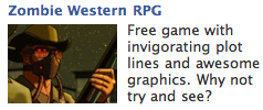
 And finally, there’s this Zombie Western Game. It tells you that it’s a Free RPG and makes some claims, but the whole appeal is located in the basic premise: Zombies + Cowboys = Cool. I’d imagine that if this was targeted to an actual gamer, the ad might do OK. But since I’m not a gamer, it gets patently ignored.
So what are the take-aways from all this?
First, understand that Facebook Ads really represent a 3-Step Process:
- Grabbing eyeballs
- Inspiring curiosity/interest
- Persauding readers to click
And while a great image can do #1 and a clever headline can do #2, it takes credibility inspiring copy — copy that reinforces the image and the headline — to make #3 happen consistently.
Second, understand that great ads can’t make up for crappy targeting.
You’ll almost always do better advertising games to gamers. Even though I clicked through on the golf ad, I won’t be playing anytime soon; I’m just not a gamer. Unless they know something about me that I don’t…


