We all know this, but the purpose of the landing page is to create a conversion. Some of the more common conversions are: leads, sales, and calls. The truth cannot be dulled and stands the test of time. I pose an interesting question for you today:
“Why does your landing page convert at the rate it does?”
Better yet, do you know what percent your landing page converts at? Every marketer, whether new or seasoned can improve their landing pages. In this post I want to cover some of the main reasons why your landing page doesn’t convert very well.
1. Design elements fitting with the desired conversion
If you came to me and said, “John, I want people to call me.”, then I would help you create a landing page that was fit for that conversion. You’d be surprised how many people screw that up!
One of my clients was trying to generate leads, but his landing page had phone numbers on the page. Does that fit the conversion? No. I rest my case.
Other things to eliminate would include: social sharing buttons and links back to the site (this is applicable if the landing page is a domain extension).
2. What is your USP?
I always tell my clients this, “You must dangle out some bait”. USP stands for unique selling proposition, by the way. Do you have a good USP? Are you dangling out some bait? It needs to be so good that they ‘have’ to opt in to receive it.
3. Have you flagged your ‘ideal prospect’?
Flagging is such a great concept. It’s the process of directly speaking to your ideal prospect. Here are some examples:
- Niche: MLM; Flagging would look like this: Struggling in Avon?
- Niche: Dating; Flagging would look like this: Dating got you down?; Sick of being single?
- Niche: Exercise; Flagging would look like this: Attention Gym Enthusiasts

4. Aesthetics
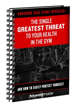
Landing page aesthetics are important. Many marketers foul this up as well. Do you have a picture of the free offer? If you’re offering a free ebook, then include a picture of the book. Here’s an example:
Some other aesthetics include:
- Bullet points that have benefit statements (What will they stand to gain by reading your free ebook?)
- An attractive headline (This is what people generally read first)
- Simple optin form (Keep it simple – you only need to ask for a name and their email)
- Respect their privacy and acknowledge it. (Simply tell them you will keep their information confidential)
- Call to action button that sticks out
Conclusion
Using this information will help you have more success online, specifically with your landing pages. You should be able to improve your existing landing pages or create an entirely better one using these tips. I covered landing page aesthetics, flagging your ‘ideal prospect’, creating a USP, and making sure your page fits the desired conversion.
Did I leave anything out? Questions, comments, or concerns?


