Facebook ads rely on the image to grab attention. When Facebook members are reading status updates, they’re focused on that small, narrow “active window” of the Facebook newsfeed that they are reading, and are therefore blind to your ad.
So the only time they “see” your ad at all is when they scan the page. And this means that your best bet for “grabbing” your prospect’s eye is an image. Pictures we can pick up in a scan. Headlines and body copy not so much.
So visually prominent colors work best. Emotionally galvanizing imagery works best. And images that are easily comprehended when shrunk to a 120 pixel by 80 pixel size work best.
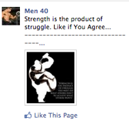
Want an example? Check this out:
No, this image is not ideal, but it definitely catches the eye.
It’s not ideal because it misses out on using visually prominent colors. Why go with a black background when you could use a deep red?
And the small writing on the image is wasted as it is absolutely indecipherable.
Finally, the white border on the image is represents wasted space that could have been used to enlarge the core image.
But despite these shortcomings, the imagery remains brilliant because it:
a) Is immediately identifiable and understandable even when miniaturized, and
b) Remains emotionally galvanizing at that small size
As for B, I’ll just say that the emotional power of the imagery comes from the symbolism and leave it at that.
But the first part is worth exploring a bit more, because the clarity of the image comes from something that storyboard artists call “Silhouette Value”.
Silhouette value means that one can still understand what a “character” is doing, even if you filled his figure in with black. If you turned your picture into black and white silhouettes, would you still be able to understand it? Would the important stuff still be clearly communicated?
Obviously the fat guy in the image IS a silhouette, so that’s preety easy to answer, right? But if you give a moments thought to it, the artist took some care to pose the fat guy figure so as to convey maximum information frrom that silhouette, right? He’s not just overweight, he’s obese, as his bulging belly suggests. And he’s not doing much about it, either, as the “guzzling” pose implies.
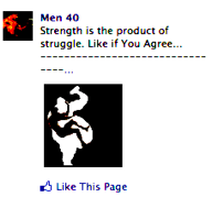
But what about the thin man insde the silhouette? Does he follow the same rules? Sure! Here’s what he looks like, when turned into a Silhouette:
You can still tell that he’s thin and ahtletic and you can also intuitively grasp that he’s struggling to get out, by the way his legs and arms are pushing against the fat guy’s boundaries.
And even though you can’t see it in this edited version of the picture, it’s an especially nice touch that the thin man’s left hand is blocking the drink that the fat man is trying to pour into his mouth.
So anyway, that’s a nice handy test for your images that can tell you how well they’ll grab the attention of a prospect even when shrunk down to a small format — take a look at their Silhouette value.


