Earlier this week Google unveiled a new resource, the Dashboard for Research Insights. This dashboard offers a few really cool features, most notably putting Google’s research in one easy to use destination.
This won’t directly help you manage your account but can be very helpful overall. While managing an account is its own game there is also the need to keep abreast of developments in the industry. Think of it as being aware of the larger patterns in the industry that could affect your account positively or negatively. While your account may be pristine, you need to make sure you are planning for the changing ecosystem it exists in. No account is an island.
The Dashboard for Research Insights aids marketers by offering an easy way to digest Google’s cutting edge research. First off, the tool breaks the research topics down by topic. As seen below the research is broken down into broad swathes such as mobile search, mobile’s impact on in-store activity, as well as the multi device ecosystem (one of the inspirations for the soon to be fully enhanced campaign world).
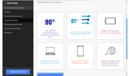
By clicking on one of these topics you will see another menu that further breaks down into more defined segments. For example when I select the multi-screen world, a new menu appears where I can delve into simultaneous device usage, multi screen shopping, and sequential screening. In the example below I selected sequential screening.
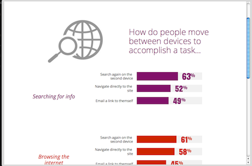
Now we are into the actual findings. I see a few key statistics and takeaways from the research. This is great on its own but I’m really interested in how people move between devices so I select that button. This opens another screen with more specific metrics relevant to the topic. From here I get the meat of the study, how many people use the devices to perform multiple searches, send links to themselves, etc. and I found all of this extremely quickly by browsing through the dashboard.
After I am done here, the navigation bar on the side allows me to jump to related topics for the multi-screen world. I can keep following the breadcrumb trail or once I have found everything I wanted, I can move on to something else.
If I want even more data, I can click on the “download this study” button in the bottom left hand corner. This pulls up a PDF file containing all the research findings and you can get everything from the study rather than piecing it out.
One feature that I have not mentioned yet, but you probably noticed, is the “build your infographic” button. Whenever you open up one of those data points or graphs you will see the “add to infographic” above it. By selecting this, the dashboard will compile all the selected pieces into an attractive infographic that you can then share with coworkers or clients.
As of now there are four studies in the dashboard, The New Multi-screen World, Mobile In-store shopper research, Mobile search moments, and Our Mobile Planet. Google plans to continue to add new studies to the tool, which will take this promising platform to the next level.
I encourage everyone to dig in to the dashboard and rummage through the data. You might be surprised at what you find. The interface makes it easy to both find the information you are directly looking for as well as browse for things you didn’t know you wanted.
While these findings don’t always translate into immediate PPC takeaways, any marketer who wants to stay ahead of the game should be watching the industry develop and preparing for new challenges to unfold. Google has even made it easy to share this information and explain the state of the industry to others through attractive and easily digestible infographics. I’m looking forward to see how the dashboard develops and I hope you are as well.


