When it comes to analyzing and optimizing search advertising campaigns, Microsoft Excel is one of the most powerful tools available, and can be found pinned to just about every search marketer’s taskbar or even home screen. When it comes to visualizing certain complex datasets, however, traditional Excel displays such as graphs, conditional formatting tricks and even pivot tables can only go so far in describing the datasets they’re drawn from.
While these traditional methods are great for discovering trends in simpler dimensions like campaigns, device type or hour of day, they lack the dynamism to visualize trends in complex datasets. Geography, for example, can easily surpass hundreds of thousands of rows when broken out by time or city. Also, before geographies can be analyzed in a manner that makes sense, they must first be manually rather than alphabetically categorized. Here are some examples:
- Country (e.g. countries in southeast Asia)
- State/province (e.g. states in the Midwestern region)
- County (e.g. counties in the Greater New York area)
- City (e.g. cities along the gulf coast)
- Zip code (e.g. zip codes within southern California)
- Specific address (e.g. store locations in the east coast time standard)
- Latitude/longitude (e.g. airports in mountainous areas)
Fortunately for us search marketers, the Excel team has seen the demand for advanced data visualization and built a little gem called PowerMap. With this Excel plugin you can see your search data mapped to any of the geographic levels above, with data visualized in any of 4 different methods: bubbles, heat spots, shaded regions and columns. You can also customize the way these visuals appear; make columns appear wider and stretch higher or turn up the degree to which trends are made apparent in bubbles and heat spots. Additionally, PowerMap provides some unique perks:
- Time/Date + Geography: use the timeline feature to see how your data shifts over time
- Collaboration: leave comments directly on top of the map view for yourself, peers or even a General Manager
- Traditional Analysis: call up a 2D column graph on the map interface
- Map functionality: search for any location worldwide and instantly zoom-to it on the map
- Variable World View: view data in either a 3D or “flat” map model
Being able to see data arranged naturally in a map-format allows for true analysis of geographic dimensions. Now that we know what it’s capable of, let me show you some search marketing cases for PowerMap, all generated from data available in Bing ads reports:
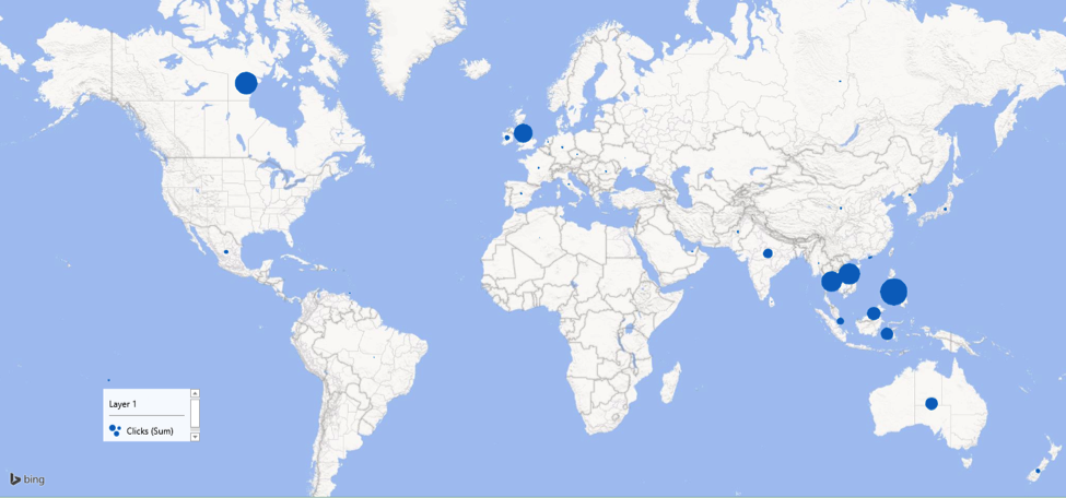
- First is a basic, international report that displays the sum of impressions as a bubble, with size varying according to total impressions attributed to each country. What does the data tell us?
- Depending on our advertising strategy, one conclusion may be a need to address the lack of traffic from Latin America and Europe.
- Alternatively, we could improve ROI by creating specialized landing pages for countries in southeastern Asia, since that’s where most of the traffic is coming from.
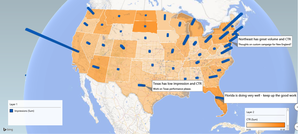
- Here we have state-level data, with the sum of impressions displayed as columns and calculated CTR as a regional shading. I also made use of annotations to demonstrate how you can communicate with other people within PowerMap. What does this data tell us?
- California has the highest number of impressions, however Californian CTR is middle of the road – that is, we have a lot of ad impressions that can produce clicks, but our ads are not doing a great job of driving CTR from those impressions. We can thus infer that improving our CTR for searchers from the Golden State will give us a high return on our efforts. We could boost CTR by improving average position with bid multipliers, or by developing California-specific ad copy.
- We can also see that the northeastern region has both a high CTR and high number of impressions, indicating that boosting impression share in this region will also produce a high reward for our efforts. Here, we could consider expanding our bidded keyword set for the northeast to extract the maximum ROI from this positive trend.
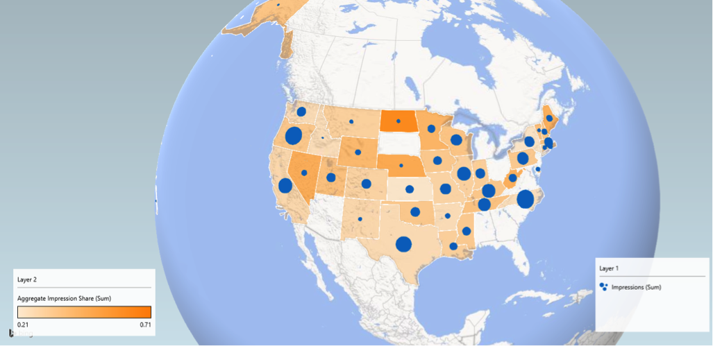
- The third example displays sum of impressions as a bubble and impression share as regional shading, both at state-level. While share of voice reports don’t drill-down to geography, you can extract this data in the share of voice report, if your campaigns or ad groups target specific areas, like states. This combination of sum of impressions and impression share enables us to see which areas have a high opportunity to capture more impressions (i.e. lighter shading, larger circles), which in turn enables us to zero in on the big opportunities. What do we see in the data here?
- One interesting finding is that a big area for improvement is North Carolina, whose opportunity outranks even California, Florida and Texas. We can tell this because the impression share shading is light, but the sum of impressions is a larger bubble, meaning that we have plenty of room to grow our impression share, and each additional percentage point we gain from North Carolina will result in more impressions on average than other states.
Search Marketers: if you’ve been dreaming of a way to make quarterly business reviews more engaging, then look no further than PowerMap. This article only covers the basics, but combine PowerMap with an external data pull and dashboard setup, and you just may find yourself promoted to director of SEM before you can say PowerMove.
How can you get this incredible tool?
- Download and install it from this Microsoft link
- Click into options under the file tab
- Navigate to add-ins, change the drop down menu to com add-ins and click go
- Make sure Power Map is checked
- Save your document, click into the dataset you want to chart and click insert > map
- PowerMap works on Office 365 and 2013 Pro Plus versions
Here’s a quick video demonstration:
Check out these other articles on Excel PowerMap here and here, find more features from the PowerBI team that brought you PowerMap, and bookmark my previous article on optimizing Bing Ads dimensions (including geography) in Excel. Thanks for reading and happy analyzing! Stay tuned for my next article and in the meantime, I encourage you to connect with me on LinkedIn and reach out with questions and comments!


