Spreadsheets are hard. For the uninitiated, diving in to an AdWords or Bing-generated Excel file can be an incredibly daunting task. With the number of potential rows and columns in play, you might have to dig through hundreds, thousands, or even millions of cells to find actionable insights in these reports.
I mean, you can… but why would you want to?
There’s an easier way to analyze that kind of data. Best of all is that it’s fast, it’s simple to use, and it’s informative– it’s an Excel feature called conditional formatting. And today, I’m going to use it to make a PPC heat map with just a few clicks.
What is Conditional Formatting?
Conditional formatting allows you to format things. Conditionally.
Specifically, it’s a function that allows you to automatically change the format of a cell based on its values and the parameters that you define. It can modify text color and format, cell colors, as well as adding data bars and other graphics. For our purposes today, we’re interested in the “cell color” function, but I guarantee that you can find PPC-specific uses for all of them.

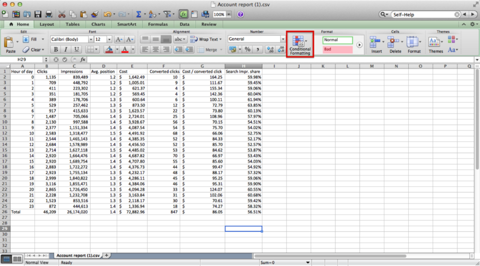
Clicking on the highlighted button above, we’re presented with the following options:
- Highlight Cells Rules: highlight cells based on their values using Greater Than, Less Than, Equal To, and other parameters. It can also highlight cells with duplicates, dates, and cells that contain specific strings of text.
- Top/Bottom Rules: highlight cells that fall in your top and bottom 10 values or percentiles, as well as your above and below average cells.
- Data Bars: fill your cells with data bars. The higher the value, the longer the bar. Comes in both gradient and solid bar flavors.
- Color Scales: change the color of each cell in a gradient scale. You can select which colors you’d like to use, as well as the way in which the color scale progresses (e.g. higher is better, or lower is better).
- Icon Sets: much like Color Scales, you can insert colored icons inside your highlighted cells.
These are all of your pre-built options. In each case, you can create custom rules for each formatting variation, or create entirely customized rules that don’t conform to any of the ones mentioned above. The process of customizing the existing rules and/or creating entirely new ones is a post all unto itself, but I wanted to point it out. Give it a try!
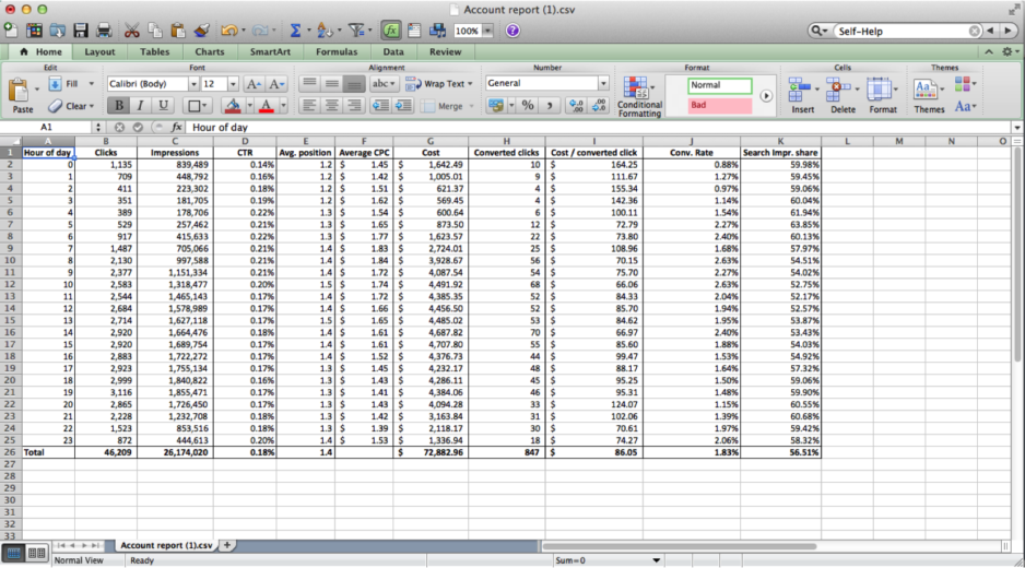
Now, to create a heat map. We’ll use the following Hour of Day report from the AdWords Dimensions tab as a base:

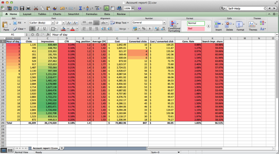
From here, we can use the Color Scales option found in the conditional formatting interface to apply different colors based on our success metrics for each column. A word of warning, though: don’t highlight and format everything all at once! If you do, it’ll look like this:

For one thing, your metrics are on entirely separate scales in comparison to one another– your impressions will dwarf every other number on that sheet, and it won’t tell you anything. For another, some of your success metrics are actually better when they’re lower. Like your Cost Per Conversion or Average CPC, for instance. Instead, you’ll want to highlight each column individually and choose the color scale based on what you’re looking for– whether a higher or lower number is better.
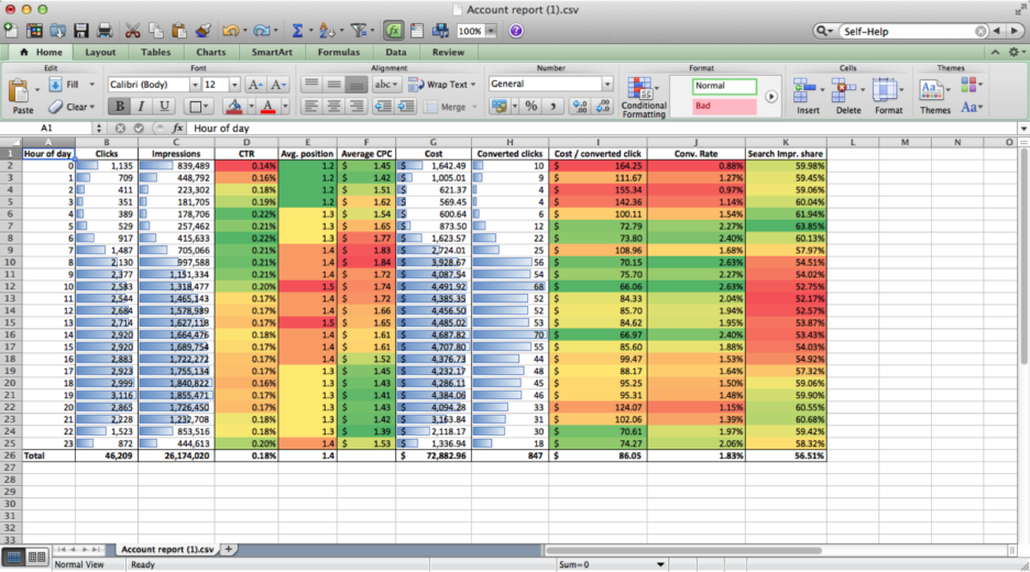
When done correctly, it should look like this:

Right away, I can identify an immediate opportunity to implement some positive bid modifiers in the hours of 8:00 AM – 11:00 AM. Our Search impression share takes a hit in those hours, and we see our average CPC rise… and then quickly fall as our average position increases. The competition appears to be heating up then, but our conversion metrics are at their best in these hours, so we can afford to press our advantage.
Conversely, we should *probably* stop advertising from midnight to 4:00 AM. Those hours are not good for us.
I could have found those same insights with a little bit of digging, but I tend to go spreadsheet blind when looking at too many stark white spreadsheets in a row. With this function, I can create an actionable (and presentable) report in a matter of minutes. This can be applied to just about any report– hour of day, day of week, device reports, pivot tables, anything. Start experimenting and see what you can find!
What about you PPC Heroes and Heroines? Find any Excel heat map applications you’d like to share? Custom formatting rules that can blow your mind? Let us know in the comments and, as always, thanks for reading!


