In late October I wrote an article about a template I created in Excel for account build outs and creating an organized paid search account. I emphasized that building out accounts in an organized manner helps with reporting and ease of optimizations.
How does this organization help with reporting? Let’s dig back into Excel to show how reporting can be done easily with a clean structure in place.
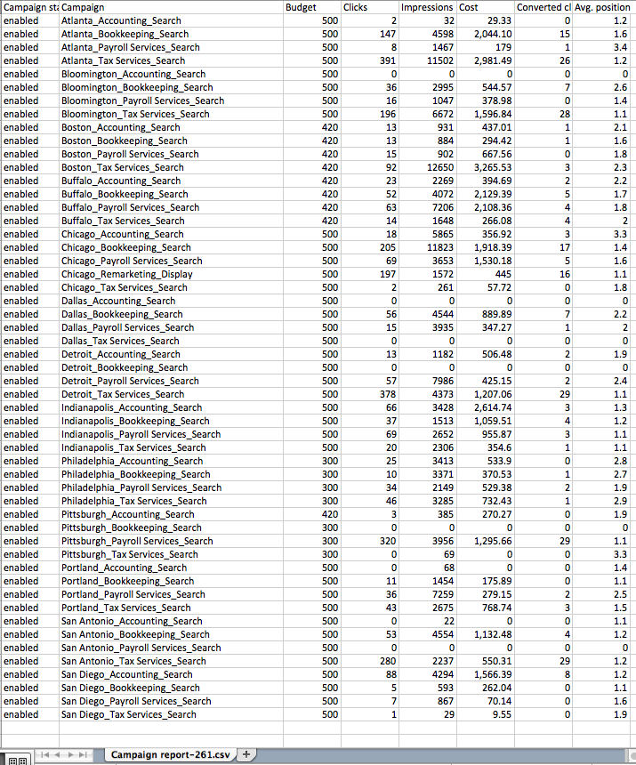
Below is a mock campaign data report downloaded from AdWords (sticking with the Accounting firm theme from the past article).
As you can see, the campaign structure is consistent and set with a “Location_Category_Network” naming convention.
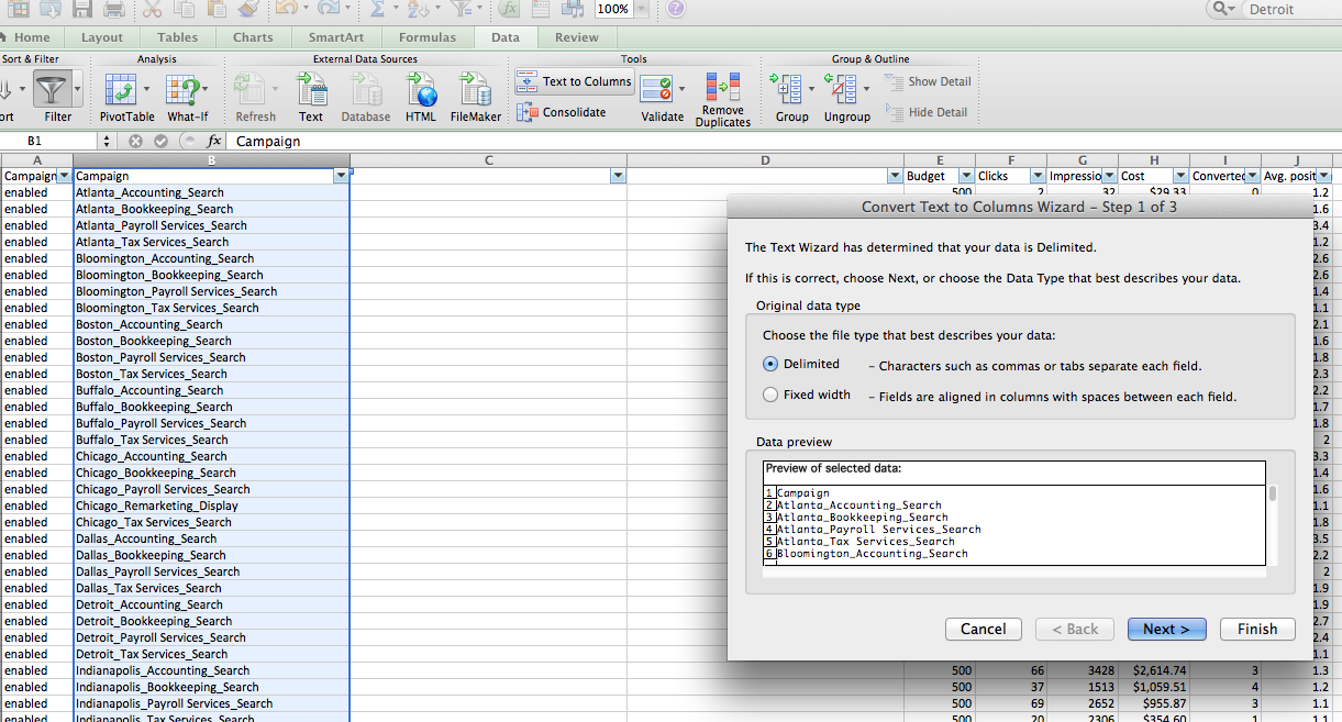
Now, on to the ease of reporting. In this particular naming convention the name of each campaign is separated out into three sections, so first you will need to implement two new columns after the campaign column, and go to Data > Text to Columns within Excel as seen below:
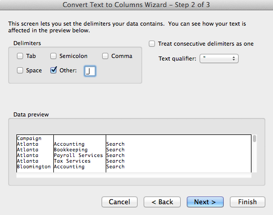
From here select “Delimited” in Step 1 of the text to column process, and then select “other” with whatever your account uses for separation of categories within your naming convention. For example, within this current account that would be: “_”, as seen below:
Once complete, your Excel raw data sheet should now look like this:
After this you can implement a few extra columns to contribute to pivot table formulas. The columns that usually get added to my reports include:
- Average Position Multiplier – Impressions x Avg Pos. This is included in order to get a true Avg Pos within a pivot table, as you take the Average Position Multiplier/Impressions in a calculated field in order to get a true Average Position.
- Potential Impressions – Impressions/Impression Share. This is another column created for the same reasons as the AP Multiplier for if you are looking to report on Impression Shares. In order to get a true Impression Share for your client within a pivot table you would then divide impressions by potential impressions.
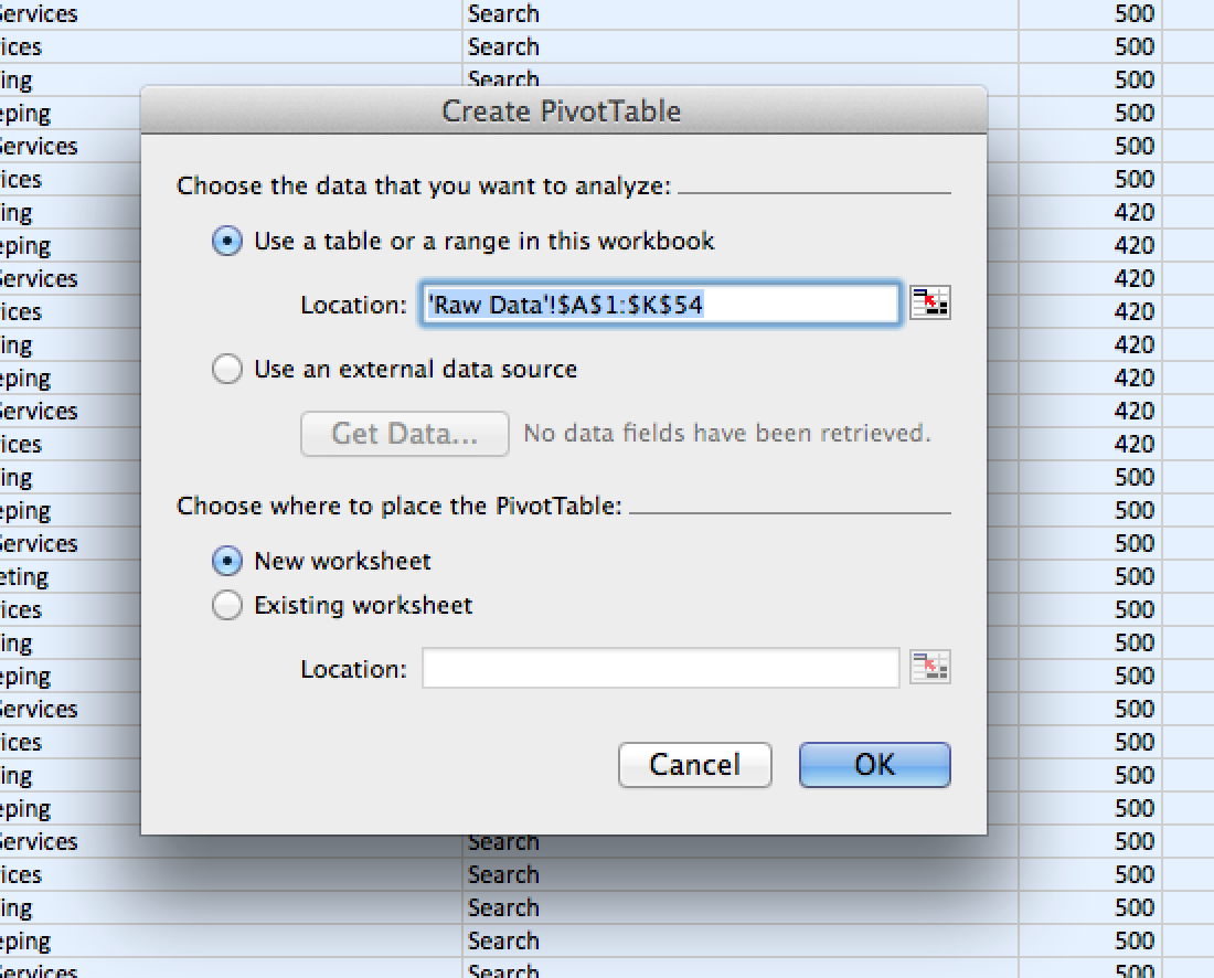
In this example we will only be reporting on Average Position and not Impression Share. From here it is simply creating pivot tables off of your raw data sheet. Just highlight all the data and create a pivot table in a new worksheet to work with.
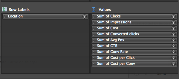
Select the data you want to include and create your calculated fields according to what data you want to show as well. See example below:
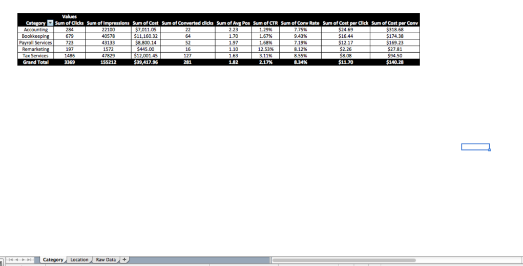
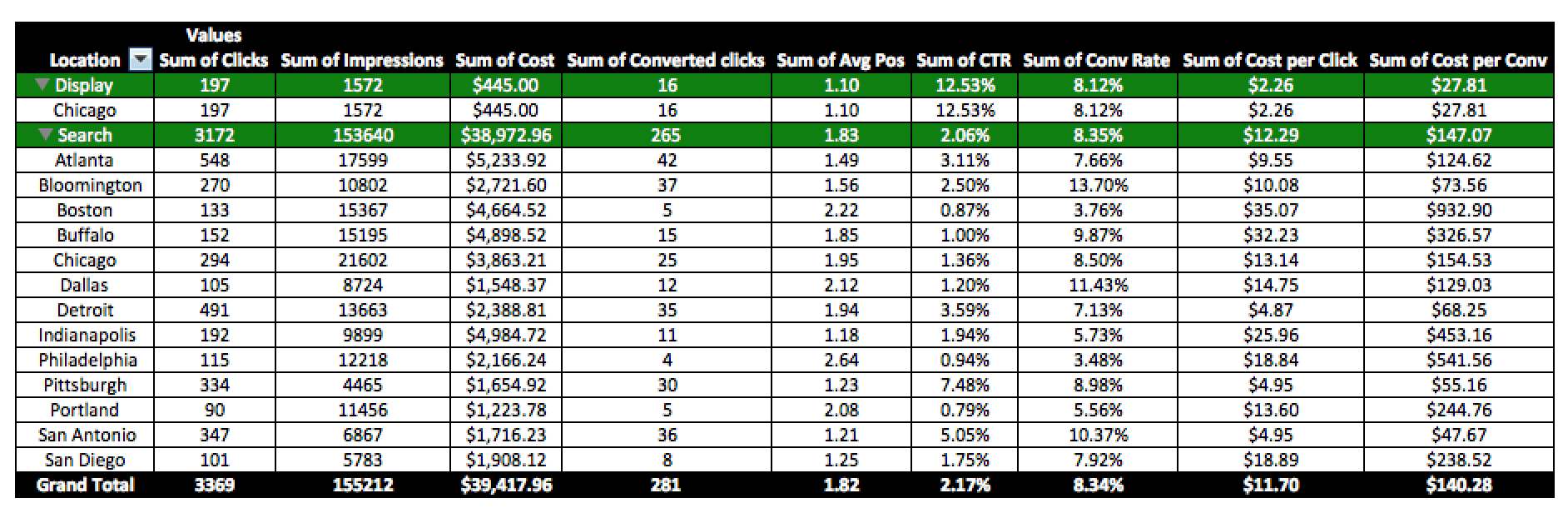
Once your fields are selected you will have a finished product for reporting (in this example on locations):
The structure of the account makes it easy to report on different parts of the business through simple pivot tables. You can create tabs for new pivot tables that show data in different ways, just be sure to include anything you might want to report on or optimize in the naming convention of your campaigns.
Also, putting different categories in your naming convention together in pivot tables could be helpful in order to get a feel for which strategies are working for different categories (the example below shows network data by location):
As you can see, the process is fairly simple. The reason it is so simple is because of the way the account is structured. Organization within an account helps with every aspect, and quicker and more in-depth reporting for clients is one of the ways organization helps.
All sorts of easy reports are now available due to a simple, consistent campaign naming convention. For the example above the client can get a ‘program by location report’, ‘network by location report’, or any other report as long as it is added to the campaign name.
Match types are another quality that can be added into the naming convention. This helps with budgeting as you can then segment budgets by match type to assure exact match keywords are getting a fair share of the budget when campaigns are “limited by budget”.
Do you already have an account set up? You can see if your campaigns are laid out in this way but with an unorganized naming convention. Sometimes all it takes is renaming of campaigns in order to make reporting easier. Renaming of campaigns will not impact current Quality Scores, so there is no true risk there. The great thing about this campaign structure is it also allows you to easily follow best practices at ad group level. Keywords and ads can be connected to more relevant ad groups as you break down the account structure even farther from campaign level down to ad group level.
Just like in life, in Paid Search, it is the simple things that matter, such as account and campaign organization.
Want To Learn More About Utilizing Excel for Paid Search?
Looking for mobile tactics to use? Read how to win the mobile battle with three easy Excel reports!
What optimizations caused what changes to your account? Use Excel to find out more about correlation, causation, and optimizations.
One of the best ways to utilize Excel for Paid Search is through heat mapping. Find out what heat maps you can create on Excel.


