It’s Tuesday, and that means time for another installment of our “Ads in the Wild Series” from one of our PPC Hero Allies, Jeff Sexton of BoostCTR, where he dissects and analyzes ads he sees various places online. This series gives an in-depth look at the philosophy and strategy behind these ads and provides actionable advice for anyone looking to improve their ad copy.
With a few savvy exceptions, most Facebook advertising clients run ads with a strictly direct response mindset.
But while expecting measurable response from your Facebook ads is smart, it helps to keep in mind that ads aimed, written, and designed specifically for a target audience consistently outperform generically messaged and designed ads — especially when you’re measuring performance on a conversion rather than click-through basis.
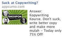
And that’s where a bit of branding can come into your ads through intelligent use of micro copy and branded imagery. Case in point, this ad for Appsumo:
Notice the irreverent and challenging headline? See how they call it a Kopywriting Kourse?
Doesn’t that say volumes about the approach these guys are likely to take regarding copy (think copy with a hyper-conversational and personality-driven style)?
Yes, this is still a direct response ad, but the guys at appsumo are smart enough to know that the person most likely to respond to this micro-branded messaging are also the most likely to sign up for their course, given the copy/description on their landing page. So this targeted and branded ad is very likely killing it on CPI.
And you’re not sure what I mean about the kind of copy on their landing page, here’s a sample:
“Soooo you’ve read articles online about improving conversion rates by changing headlines and copy.
It’s true…it does work. I’ll show you:
Appsumo is a web-based company that constantly improves its users lives through strategic discounts on needed products for startups and business users.
-or-
This fat-ass Sumo sends you one MASSIVE money-saving deal on tech stuff for startups (like apps and software)….Everyday.
Which one was easier to understand (and possibly more offensive)?”
See what I mean? As I said: hyper-conversational and personality-driven copy. What better way to describe a couse on this than: Kopywriting Kourse?
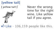
Then there’s this ad from Yellow Tail Wine:
First the logo and the use of brackets around Yellow Tail is taken right from their bottles, making it easy for customers to recognize the brand.
This is perhaps more important than you’d suspect, as there’s at least one study showing that consumers remember and respond to wine labels far more reliably than brand names alone.
Second, “Never the wrong time for the right wine” is a perfectly worded sentiment that Yellow Tail’s core market will find hard not to “Like.” And while the “like” response is still a measurable click and this is still a direct response ad, there’s no shortage of branding going on, either.
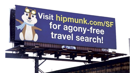
Finally, there’s Hipmunk. Unfortunately, I wasn’t able to screen capture their Facebook ad before it disappeared, but the Facebook ad is largely similar to this billboard:
With the same instantly recognizable flying chipmunk logo, and even better copy, as the Facebook ad copy read: “Sort flights by ‘Agony.’” This reads better than the billboard because agony-free is too nondescript an adjective — any flight search engine could claim (erroneously) agony-free searching. But only one search engine lets you sort flights by agony, and the syntax of that copy makes the common reader sit-up and take note.
Again, the very idea of sorting flights by agony is a bit of micro-copy branding brilliance. Just the sort of branding needed to make like-minded souls click through to the Website.
So here’s the deal, while you’re crafting your Facebook ads, make sure to step outside of your Direct Response mindset long enough to see if a bit of micro-copy and image-based branding might not inspire click from just the kind of people you most want to attract.


