Facebook ads don’t give you much room to play with when it comes to the image, think 80×120 pixels. And yet, the image remains pretty much THE make or break element of your ad. Without a great image, you just won’t grab the users’ eyeballs.
And if no one even sees your ad, it’s got no chance to convert, or even persuade.
So how do you get a hard-hitting image that’s also small?
You focus in on close-ups. Don’t picture the whole group, picture just one person. And don’t even show the whole person, just show their bust, or even just their face.
Same thing with products. Zoom in and crop. Make the image as visually striking as possible. And try to get some drama and story appeal into the photo too.
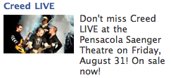
Here’s an example of what happens you get that wrong:
You’ve got the whole band there, and at this size image, they all get lost in the background. Plus the image is entirely black and white, with no visual pop.
And here’s what it looks like when you zoom and crop and add some color:
Now, this will probably piss off the band members, because they’ve been miniaturized, but that’s the sacrifice you have to make. Zoom in on the frontman, because, by the very nature of his job, he’s the most recognizable face of the band. Add in the band’s name in Red.
That leaves a little extra space on the side, so I used that with the “Live @Pcola, just to help people take in all the info at a quick glance.
Notice, too, that I made the headline more explanatory, to further egg on the Creed fans to look up the dates.
Quite a bit more visual impact, all in all though, don’t you think?
It’s easy, and you can do it too; just remember to zoom and crop for small images with big impact.


