This column frequently discusses Facebook Ad imagery simply because an attention grabbing image is crucial to ad performance — if the image doesn’t get the audience to stop and skim the headline, there’s no chance for the copy to do any good, no matter how brilliantly it was written.
So the image and headline have to create enough interest on the part of the perspective buyer/fan/reader before an ad’s copy can even start to persuade. But what happens when your image and headline works, but the copy falls short?
Your ad fails. Here’s an example:
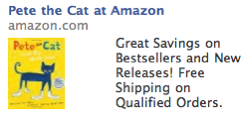
This ad was on my wife’s Facebook Page and it definitely grabbed both her attention and mine, when she asked me about it.
The bright yellow children’s book cover stood out on Facebook, and was instantly appealing to my wife, who’s always on the lookout for books that my youngest two daughters might like.
So Amazon had already done a brilliant job of both targeting and tailoring the image to the target audience. The headline might have been better, but it worked well; it made my wife think that Pete the Cat was a popular or award-winning book. So she read the body copy for more info on Pete the Cat.
And that’s when the ad failed.
No info on the book. So she asked me if I’d heard of the book. And, nope, I hadn’t. So we just sort of made a note about the title and ignored the ad.
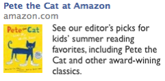
But what if the copy had read:
Now it’s solely about Pete the Cat, though the copy does tell the reader that this particular book is an editor’s pick, but is broadened to offer an editor’s vetted list of good reads for kids. Perfect.
What mom, when intrigued about a possible new, soon-to-be-beloved book for her kids, wouldn’t want to see what the “experts” picked for great summer reads for her kids?
So, yes, image is important — copy has to be read before it can persuade — but if you’re copy fails, then so does your ad. Don’t let your copy snatch defeat from the jaws of victory, make sure it’s as targeted & tailored, relevant & persuasive as your image and your headline.


