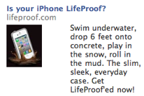
It’s Tuesday, and that means time for another installment of our “Ads in the Wild Series” from one of our PPC Hero Allies, Jeff Sexton of BoostCTR, where he dissects and analyzes ads he sees various places online. This series gives an in-depth look at the philosophy and strategy behind these ads and provides actionable advice for anyone looking to improve their ad copy.
So what’s the problem with this Facebook Ad?

Frankly, if you have an iPhone 4, it’s kind of a compelling message: get mega protection without settling for a mega-bulky case.
But the picture is something of a fail.
It looks like just one more “win an iPhone” pics. You have to look at it pretty hard to see the “threat” to the phone symbolized by the coffee-looking liquid splashing up, as if the phone had been dropped into a mud puddle or something.
Now look at this picture (and ignore the “play” button on the image):
Granted, at Facebook Ad Image size, it’s hard to get an immediate read on it, but clearly, someone is holding an iPhone with winter gloves on, and it looks like snow is covering the phone.
It also looks true to life, with a cinéma vérité sort of authenticity to it. And the incongruence of a snow covered iphone with the red riding hood figure in the background give it definite story appeal.
The point? This photo was taken from the LifeProof’s Website. They had access to this and could easily test it. And they should test it because more people are likely interested in this product than are currently, actively looking at the ad, and a better picture could best fix the biggest hole in their ad performance funnel.
If you look for pictures with an eye towards “Story Appeal” you might just be surprised at what you can find on your (or your client’s) own Website.


