I’ve said it before and I’ll say it again: PPC enthusiasts are often Excel nerds . But if you’re just starting off down the road of mass data analysis, Microsoft Excel can be a little daunting. The secret is that once you know a handful of tricks, it become pretty easy to figure out how to make Excel work for you, instead of becoming a source of insecurity and stress.
The following 10 tips will have you zipping through data, pulling insights and optimizations like a pro.
*Disclaimer: These screenshots are from Microsoft Excel for Mac 2011, Version 14.5.0. If you’re not using the same version or device, expect slight variations. *
Your Data.
Here she is. Whether you have 1,000 lines of data or 100k, you need to be able to manage it in meaningful ways.
1) Filters
Filters are the easiest step to working that data. Select the row you’d like to apply the filter to (such as the Heading column shown below), and go!
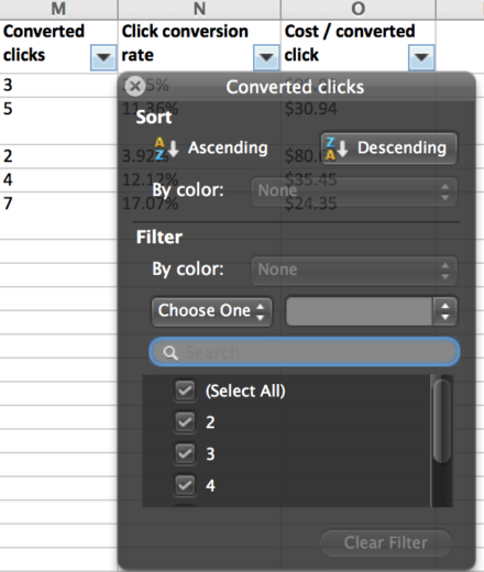
Once you’ve turned on your filter, you should see the following:
From here you can easily sort you data by numerical value or alphabetical order
2) Filter pt 2: Contains, Begins with, etc
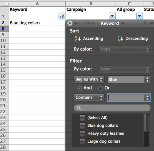
Although sorting is helpful, sometimes you only want to see certain pieces of data. Using the “contains” (default) filter allows you to zoom in on just the products you want to see, such as those containing “blue.”
Take it up another notch to a filter for “begins with” which allows you to zoom in a particular subset of these bits of data. This can be particularly useful with Campaign and Ad Group names, product lists, and exact match keywords.
3) Sum
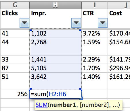
As you realize you’ve filtered out the relevant data, you might want to actually do something with it. Here is where all the little Excel formulas come in to play. Below is the example for summing your data within a particular column, such as H as shown here:
It’s a pretty straightforward formula, but you can also use “median,” “average,” and a few other simple mathematical calculations in the same way.
4) Freeze panes
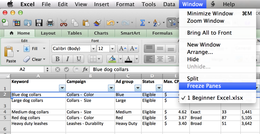
When you’ve got thousands of rows of data, you often may find yourself scrolling through them and finding yourself lost in which column is what. The solution for this is to use the “freeze panes” function.
First, you want to highlight the row below where you want the rows to freeze. That is to say, in this example I’m selecting row 2, because I want row 1 to stay put. Then from the Windows tab, I simply choose Freeze Panes. If I want to remove this setting, just return to the Windows tab and choose the “Unfreeze Panes” option what will pop up.
5) IfError
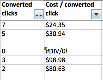
One of my least favorite occurrences in data tables is the presence of the dreaded “#DIV/0! ” This occurs when Excel can’t calculate the formula, often because of the presence of a zero or ill-formatted data.
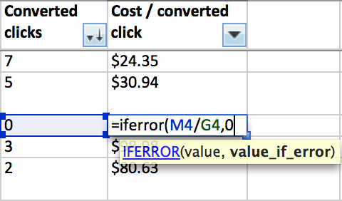
If you suspect you’re going to see many of these error messages, a quick solution (that’s also much more aethetically pleasing) is to use the IFERROR function. To do this, you simply apply the formula “=IFERROR(insert calculation here, insert character to be shown instead of error message) as shown below:
6 ) Len
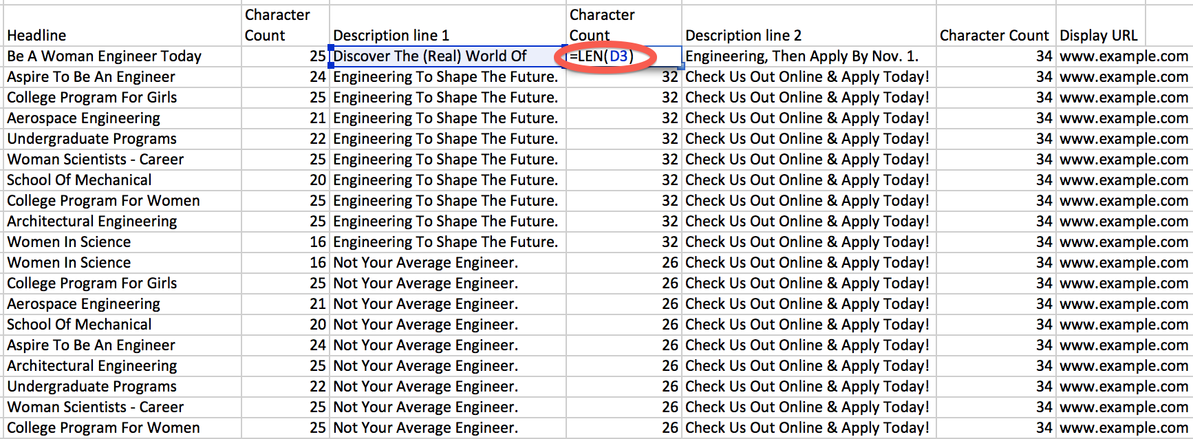
Another little trick that will rock your world if you’re on the new end of the Excel spectrum is the use of the =LEN function. This provides a character count for any cell of your choosing.
The most common application of this in PPC is when creating ads and sitelinks, where character limits are of the utmost importance. Here you’re able to generate the character count easily, and even use your handy filter function to pull out any that exceed the limit!
7) Concat
The concatenate function is an extremely easy one that simply aggregates the contents of any number of cells. One application of this is in transcribing Google ads into Bing ads (where the two description lines are fundamentally squished together).
You’ll notice that there is a ” ” between the cells listed in the concatenate formula. This provides a space between the contents of the cells. Similarly, you may want to add punctuation or additional language in those quotation marks.
Another shortcut to this function is to skip the “Concatenate” formula altogether and just add the two cells, like so:
As my favorite elementary school teacher always said, “Easy peasy, lemon squeezy.”
8) VLookup
The VLOOKUP function is a little further down the learning trail, but it continues to be one of my favorite formulas. The benefit here is that you can have 2 entirely different sets of data and create a formula that generates a particular value when the two sets of data overlap.
In the example below, I want to identify any search term that are present in both Google and Bing search query reports. If terms (in column B of the ‘Bing search queries tab’) from the Google list are present in the tab of Bing search queries (pulling columns B thru K), then I’m requesting that the formula produces the associated cost (the 10th column of data, K). Sounds complicated, but it’s just transferring data, only when it meets my criteria.
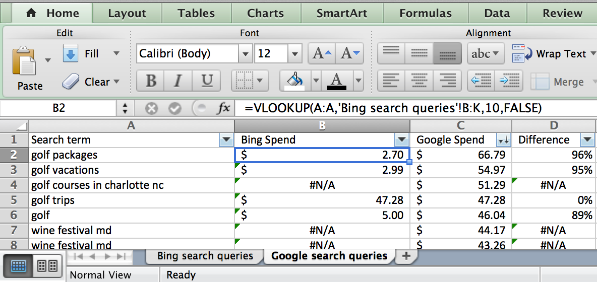 In this example, the ‘golf packages’ and ‘golf vacation’ really aren’t generating very many clicks in Bing. This could help me understand if I need to expand my Bing coverage more or pull back on irrelevant Google queries. Similarly, I can see that ‘golf trips’ appears to be equally representing in spend across both platforms. There are approximately a zillion ways to use VLOOKUP, so challenge yourself to explore it’s various applications.
9) Pivot Tables
If you haven’t yet realized the power of the pivot table – let me be the first to tell you:
Pivot tables will change your life.
There are hundreds of blog posts and tutorials that reference and explain pivot tables, such as another piece by yours truly and a few of my fellow PPC Heroes:
Pivot Tables Made Easy: The Last Demo You’ll Ever Need
10 Reports That Made Me Fall In Love with Pivot Tables
How To Use Pivot Tables for PPC Data
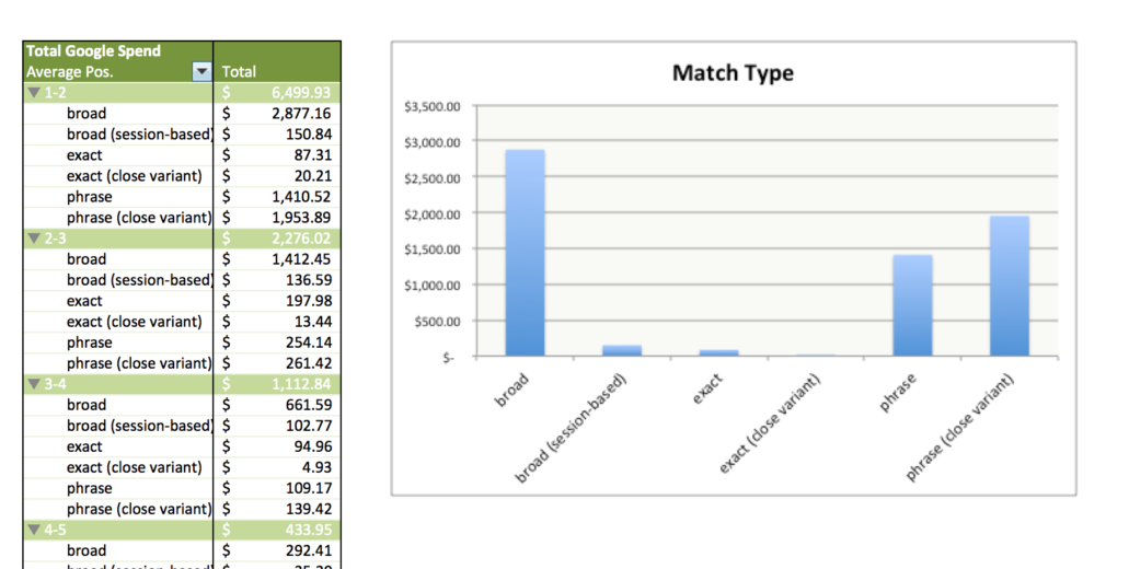
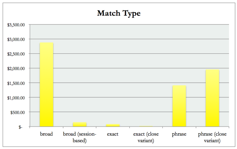
Below is just one example of a pivot table, which demonstrates the kind of matrix you can build with your data.
10) Default Settings
This is my grand send off for you, dear readers. My gentle nudge that will take you from someone who’s “getting the hang of Excel” to the person “with those nice-looking spreadsheets.” Eventually, you’ll create charts and data sets that look truly professional and impressive
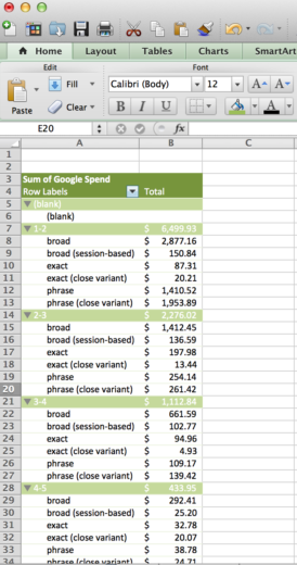
Your default Excel settings give you some very recognizable colors and fonts. Below is an example pivot table, which uses the default “pea soup” green and the “cornflower blue” tones. You’ll also see Calibri as the font of choice for the default Excel plan.
Although I don’t want you worrying yourself about this too much in your early days of Excel, I can assure you that the moment I see the default settings present in someones presentation – I immediately assume they chose to not spend the extra 30 seconds choosing a new format.
Do yourself a favor, customize how you present your data.
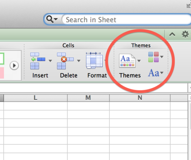
To do this, simply chose a new detail for your theme. You can just opt into a whole “color & font” package, or you can choose what works for you.
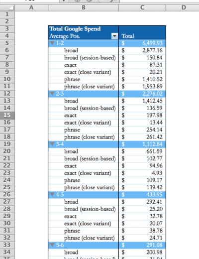
I strongly suggest choosing a color scheme that appeals to your company or your client’s aesthetic. And here you have your results:
Gone are the days of pea soup and cornflower blue! Embrace your identity!
After reading these 10 tips, you should have a solid understanding on how to make your Excel analysis that much more efficient, and even a little pleasing to the eye. At PPC Hero, we talk a lot about Excel and it can often be overwhelming. So this post is for you, young PPC nerds! Live long, pivot your tables, and prosper!


