The nature of Facebook Advertising dictates that advertisers don’t get the luxury of commissioning a custom photo, making vast majority of ad images either stock or client-supplied photos.
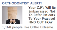
But that hardly means you have to settle for boring or lame photos. For example, let’s look at this ad:
The headline is OK, since it calls out the prospect by name, or at least by profession, but the image is rather meh.
The guy with the paper bag over his head is somewhat interesting, but… also kind of lame and cliched and well, too stereo-typically stock.
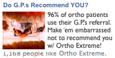
And, yet, this image is also from a stock photo site:
Just go to a site like Getty Images and type in “Dentist + Inside the Mouth” or something similar and you’ll get an image just like this.
And it’s a much better image — with greater story appeal, less “stock” stigma, and added visual prominence/color.
All I had to do was request an unusual angle from the stock photo site — a technique that works with almost any subject.
So why settle for plain-jane stock images, even when you’re forced to use stock photos?
And the same thing carries over into headlines as well. Orthodontist Alert takes the wrong angle of approach: that of the advertiser. Why not take the perspective of the prospect?
Notice how my headline asks the prospect a question from HIS (or her) perspective: are you getting enough leads from the general practitioners in your area?
So when selecting Facebook Ad Images and writing the accompanying headlines, why not select an unusual angle — your results will improve because of it!


