We’ve all been there at one point. You are out shopping and just wandering the many aisles of your favorite store or at the outlets with no buying intent in your mind. However, you end up with a whole new wardrobe and accessories a few hours later. You can’t really explain what happened but somehow the stores just made you believe that you needed to have all of these things.
Stores try to speak to an impulse to buy, which is called an impulse purchase or impulse buy. Impulse purchases are provoked by either seeing the product or by being exposed to a well-crafted promotional message. While it is easier for a brick and mortar store to entice impulse buys by prominently display their goods along the aisles and checkout lanes, it is more difficult for online retailers to speak to shoppers in the same way. Although the possibilities are more limited, there are things that can be done.
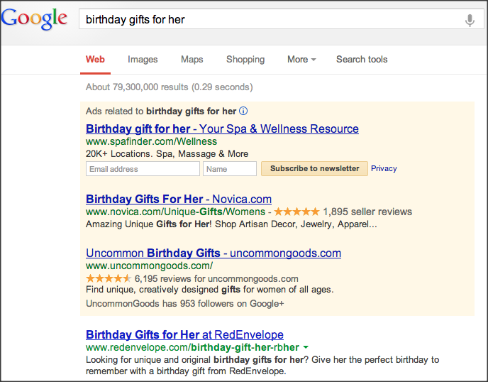
Paid search gives you a few options of how to turn a searcher into a customer. One of the most important things is the first contact that a user has with your company. In paid search this is most likely the ad that is showing up on search results or on social media. You want the ad copy to be very enticing. Turn users in the research stage into someone that follows through with a purchase. This can be achieved by following best practices as the following:
- Use the actual keyword of your ad groups in your ad copy to make the ad jump out at the user as keywords will be bold in the ad.
- Include site link extensions with cross-/up-selling offers or coupon codes
- Showcase benefits of products combined with a seducing call to action
- Make use of coupon codes, percentages off and any specific sale
- Test prices in the copy of your ad and make it sound like it is a once in a lifetime deal
These are some tips of how to help a user take the first step of leading to an impulse buy. Also read tips on successful ad copy here. Once a customer finds the way to your webpage, impulse buying is a whole other story. Let’s take a look at how Amazon tries to open up your wallets once you are on their page:
I am looking for “birthday gifts for her” on amazon. So before I can even begin looking at my search results, I see a promotion to look for “gifts for Dad” which reminds me that father’s day is coming up soon and I don’t have a clue yet on what to get my dad:
Promotions and reminders of specific holidays and deals displayed on your page ensure that people remember what else they need to buy and might shop for additional products as well since they are already on your site.
Next I actually start to scroll down to look through the search results that came up. Nothing is really jumping out so far for me. But wait! Once I scrolled through the first page of search results, I see this on my screen: Sponsored Products on Amazon:
Promoting related products or special offers from within your site is a pretty easy way to call your visitor’s attention. It is also very smart as your visitor is already on your site so he might as well look around some more. However, people need to be invited to look around more so show them that you appreciate their visit and try to make them stay on your site as long as possible.
Back to Amazon. Scrolling down further on this page (yes we are still on the same page!), Amazon presents me with the following overview:
It not only reminds me of what I have previously looked for but also suggests what other people bought based on my recent history. They not only point out the products that I have previously searched for (in the hope of me coming back to it and actually buying it), they also show me similar products that other people bought. This is a good move as my search might not have been as satisfactory as I had hoped and I might have given up on finding the perfect item I was looking for. Now that I have additional items presented to me, I can just browse these with one easy click.
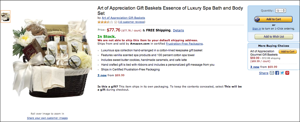
Now let’s look at what Amazon does right once I decided on a product.
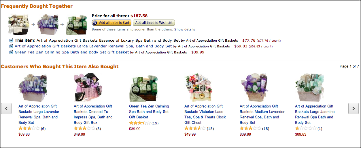
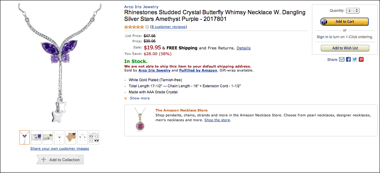
This is the first screen I see after clicking on the item. It’s an easy and quick up sell. And even if you do not want to buy all three items, one line below Amazon showcases what other customers bought when choosing this item. This particular tactic might be a little bit more obvious in the below example:
Here it not only shows you additional necklaces or charms but it also points out to add earrings to make your gift complete. In the above screenshot you can also detect an additional eye-catcher, “The Amazon Necklace Store.” It is sneaky of Amazon to present this link to you right here. I am sure even if you don’t immediately click on it, it spurs your curiosity and you might end up clicking on it after all. One more thing on this page that I want to point out:
Special offers and product promotions are proposed right below the image of the product and stand out via font size and text color.
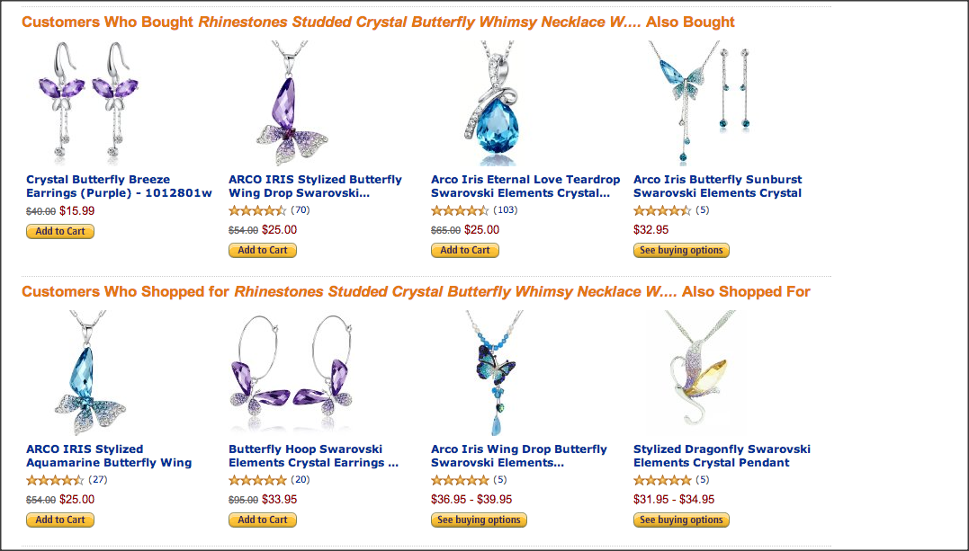
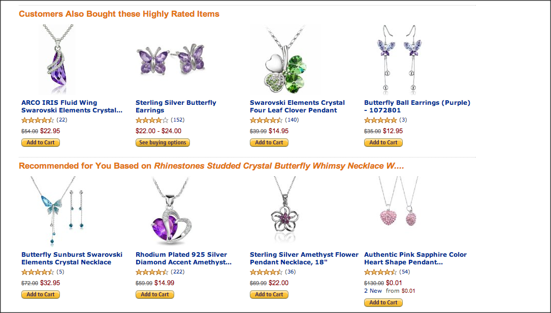
Once you decided to buy the item without any additional purchase and you hit the ad to cart button, Amazon again tries to recommend a few more things to you:
Four different category sections speak to your emotional side of the brain rather than your rational. While this might be a little bit too much for your own business, you could still at least try to recommend a few additional products that add on to the already selected item(s) in your cart. Throwing in an offer, special or sale also doesn’t hurt.
These are just a few examples of what Amazon does to help speak to your emotions and make you buy something that you weren’t probably looking for. What could other strategies be to further impulse buys on websites? Are you using any? I would be very interested in your tactics and how they are working!


