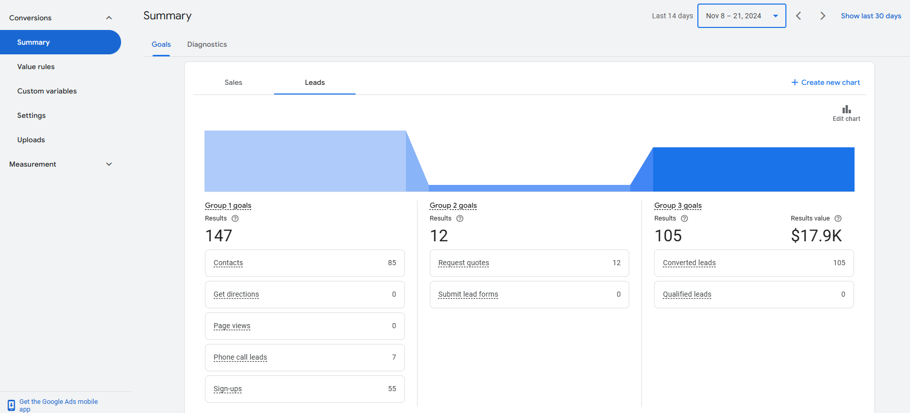
Google Ads has introduced a new feature under the Conversions tab called “Create new chart”, enabling advertisers to visualize their conversion data more effectively. This enhancement mirrors some of the charting capabilities found in Google Analytics 4 (GA4), offering a user-friendly way to track and analyze performance metrics for Sales and Leads. By breaking down conversions into customizable visual charts, this tool allows advertisers to monitor key data points, making insights easier to interpret and actionable trends more apparent.
The addition of this feature represents Google’s ongoing efforts to integrate analytical features directly into the Google Ads platform, reducing the need to switch between tools like GA4 or spreadsheets. This streamlines workflows for advertisers, helping them focus on optimizing campaigns based on visually presented, real-time performance data.

Practical Use Case for “Create New Chart”
The “Create new chart” feature offers immense practical value across different business models and campaign types. Here’s how advertisers can use it to their advantage:
1. Tracking Conversion Types
Advertisers can break down conversion goals into distinct categories such as:
- Contacts (e.g., form submissions, email inquiries)
- Phone Call Leads (calls tracked through call extensions)
- Sign-ups (newsletter subscriptions or account registrations)
By visualizing these metrics over specific time periods (e.g., last 14 days), businesses can identify which conversion actions are performing well and which require optimization. For instance, a drop in Contacts compared to previous weeks might indicate technical issues with forms or a less engaging landing page.
2. Assessing Performance of Grouped Goals
Advertisers can create groups like:
- Sales Goals (tracking actual purchases or revenue-related KPIs)
- Leads Goals (monitoring potential client inquiries or requests for quotes)
In scenarios where multiple goals are tracked (e.g., sales vs. leads), visualizing them in a comparative chart makes it easier to allocate budgets effectively. If sales conversions outperform lead conversions, advertisers might choose to reallocate spending toward campaigns driving sales.
3. Optimizing Campaign Strategies
Visual insights into conversion trends empower advertisers to:
- Quickly identify spikes or dips in performance and correlate these with campaign changes.
- Test strategies like adjusting bidding or updating ad creatives in response to trend data.
For example, if a chart reveals a steady increase in Request Quotes, it might indicate that the messaging in the ads resonates well with the target audience. Advertisers can then replicate this success across other campaigns.
4. Custom Reporting
This feature allows advertisers to create tailored visual reports for stakeholders. Instead of exporting data into external tools, they can now generate and share clear, concise visualizations directly from Google Ads. This is particularly helpful for presenting data to non-technical stakeholders, as charts are often more digestible than rows of raw data.
Conclusion
The “Create new chart” functionality under Google Ads Conversions menu is a game-changer for advertisers looking to enhance their data analysis workflows. By enabling quick and intuitive visualization of conversion data, this tool saves time, reduces dependency on external platforms like GA4 or Excel, and provides actionable insights directly within the Google Ads interface.
For businesses of all sizes, this feature streamlines decision-making processes, from identifying performance trends to optimizing campaign strategies. As digital marketing continues to evolve, tools like this highlight the growing importance of visual data analysis in achieving advertising success.
Embracing features like “Create new chart” ensures that advertisers not only stay informed but also remain ahead in a competitive landscape, armed with the insights needed to drive better results.


