One of the most effective ways to relay information to your client is via Excel. The plus side is that it’s easy to pull data from most PPC platforms into Excel. The negative side is that it’s not so easy to make this data easy to digest.
By taking the time to create a template that you can plug data into, you can save precious time that you can spend on analysis and strategy. As a bonus, you’ll get some nice looking graphics that you can send along to your client or boss.
Competitive Analysis
Auction Insights data from AdWords is a great resource for determining who your competitors are. Unfortunately, it doesn’t download into Excel is an easy-to-graph format.
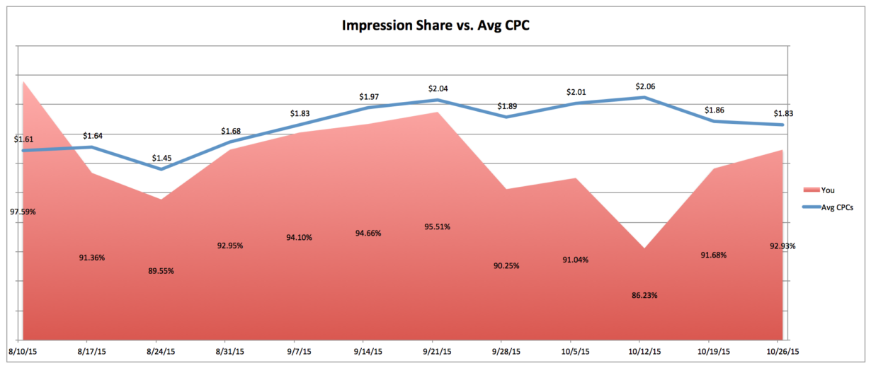
Create a template that uses VLOOKUP and OFFSET functions to map out impression share for yourself and your top competitors. Combine this data with an average CPC data from the dimensions tab to map out how the competition is impacting your costs.
Once you’ve got the data to auto-populate into the correct format for graphing, you can create your graphs (which will also auto-populate when new data is pasted into the workbook).
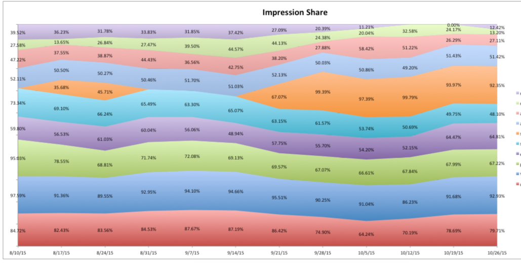
Consider using line graphs or area charts (shown below) to illustrate impression share amongst yourself and your competitors.
Or combine both graph types!
In this particular example, we see a competitor (pictured in orange on the impression share graph) enter the space and take up a large chunk of the impression share. At the same time, as our own impression share decreases, average cost-per-click rises.
The graphs provide a nice visual for the client to look a, while allowing you to formulate a strategy to become more competitive.
Ad Testing
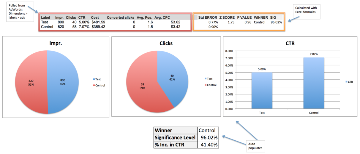
When running an ad test, it’s important to reach statistical significance before concluding the test. This simple template allows you to copy and paste data from the dimensions > labels > ads tab, and calculates statistical significance for you. It also automatically updates a set of graphs to show impressions, clicks, and CTR for both variations.
Now you’ve got a nicely laid out snapshot of the ad test, and you can easily include the actual ad copy if you’d like. In this example, you can clearly see that the control is the winner with 96% significance, resulting in a 41% increase in CTR.
Ad Writing
An ad writing template that includes length counters and potentially conditional formatting is pretty common, but it isn’t quite so easy on the eyes.
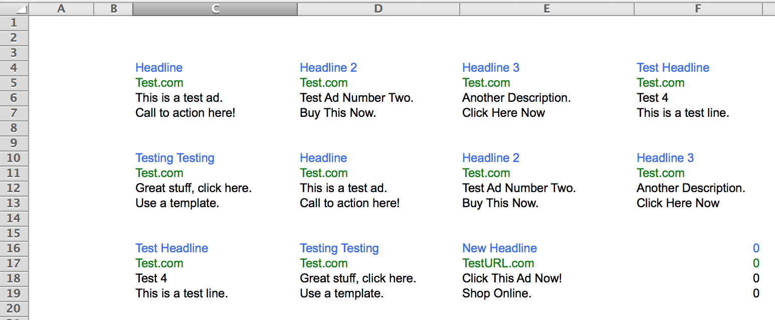
If your client likes to review ad copy, some simple OFFSET functions on the next sheet will format your ad copy to mirror what it’ll potentially look like on the SERP.
Here’s some detail behind what’s going on in those cells:
Time Of Day Analysis
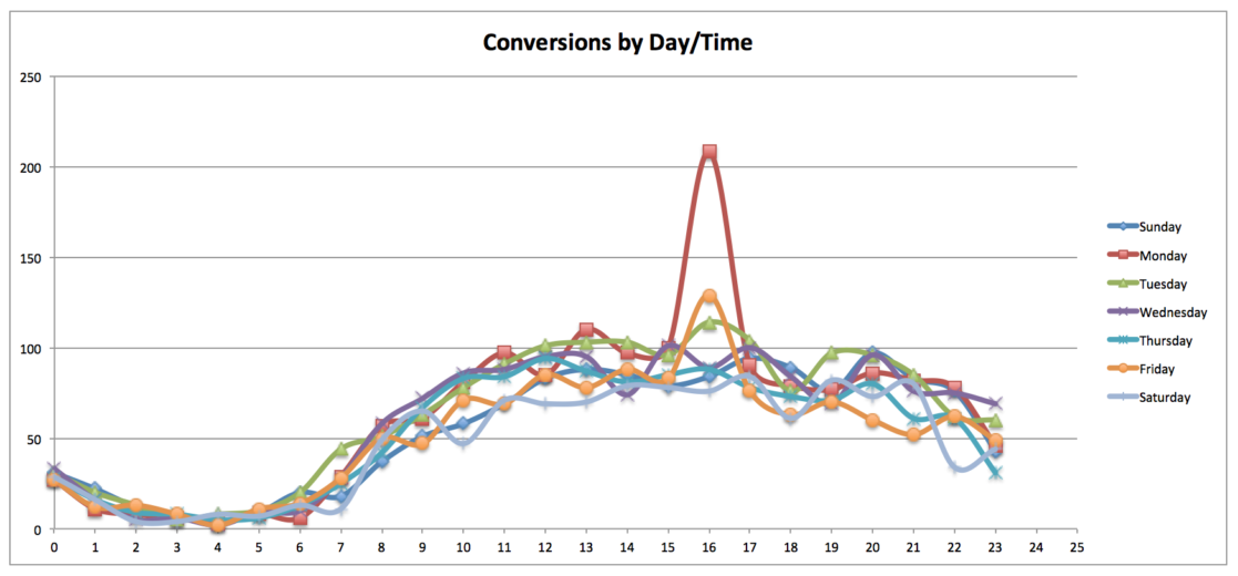
Time of day analysis can be great for bid adjustments, and can also provide great information for your client. While a heatmap is a great way to visualize performance across days and times, a scatterplot works nicely.
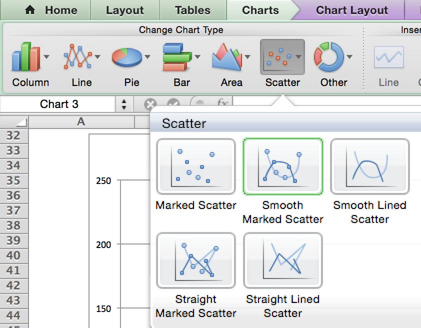
Create a pivot of conversions by day and time of day, then highlight the data and created a smooth marked scatter plot:
Once you have the chart formatting to your liking, simply copy and paste a different pivot for your respective accounts/campaigns/etc.
Closing Thoughts
Using Excel templates is not only a big time saver in your analysis, but also can provide great visuals for your clients and colleagues. It’s worth it to take the time to create a good template, rather than to do the same charts/graphs over and over again for all of your different accounts.


