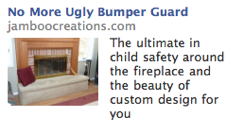
Images that work great at larger sizes can fail miserably when you shrink them down to 120 by 80 pixels.
And oddly enough, it’s almost the same dynamic that billboard designers have to take into account: some images look great on your computer screen but look awful when they’re slapped up on a billboard and viewed from 200 feet away while zipping down the road.
In fact, one billboard designer I know actually advises people to shrink the design down to index card size and then look at it from across the room.
Apparently, it’s a size-to-discance dynamic, and regardless of whether it’s a billboard or a Facebook ad image, the problem remains the same:
You have to work with limited visual detail, either because the picture is so small, or because you’re looking at it from a great distance. In other words, you can’t rely on the viewer picking up subtler details. You have to make your point boldly.
And that’s exactly what’s wrong with the image in this ad:
Without reading the copy, you have no idea what you’re looking at, other than at a fireplace. The fireplace is the focus that gets communicated even in low-res.
What requires higher resolution to “see” is the pillow-top that covers up and surrounds the fireplace hearth.
Bet you didn’t pick up on that, did you?
Well, here’s a higher-resolution close-up of that same fireplace:
See? It’s interesting when you see it in detail. But that doesn’t do you any good for a Facebook image.
Now, here’s an image that would have worked much better:
See how we took the requirement to see “texture,” which is a fairly high-resolution feature, and replaced it with color?
Now the royal blue color tips you off that the hearth isn’t stone, but is instead some kind of fabric. And if that’s not enough, the tan piping on the top pillow puts it over the top.
And if even that’s not enough, the little kid and teddy bear add context clues that the hearth probably isn’t a typical, uncovered, cold, stone baby-hazard.
In other words, you can look at this picture and tell right away that they’re selling some kind of fireplace pillow. Which is just odd enough to make you want to see whether they might not be just the slightest bit worried about fire. And that makes you want to read the copy to find out.
Which is really the point: your picture has to grab attention and generate a desire to read the headline, at least, if not the body copy — and your picture can’t do that if it’s primary appeal is lost once you shrink it down to a 120 by 80 pixel format.


