I came across two Facebook ads recently with images that snapped me out of my newsfeed trance and compelled me to take a closer look and read their headlines. Naturally, I took screen shots:
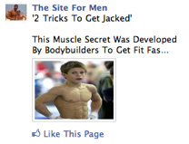
I mean, how can you not stare at that first ad for at least a few seconds? It’s not every day that you see a picture of a 9-year old who looks as if he could bend iron bars.
Unfortunately, the ad failed because it didn’t present me with “2 Tricks to Get Jacked” when I clicked through to their Facebook page. But that certainly doesn’t take anything away from the power for the image.
And the thing I most like about the image is that it’s relevant to the sales message — a muscle picture for a muscle-building offer.
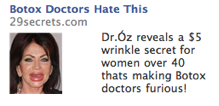
This second ad has all the same things going for it, except that it’s a disturbingly negative image, rather than a mostly positive one.
This lady’s freakishly over-inflated lips and generally disfigurred face looks like a horror show with lipstick. You can’t help but take a second look and then to wonder, who would use this freaky face to advertise anything?
After reading the copy, it then makes sense that people who want to look young without risking Botox injections or plastic surgery might just see the embodiment of their fears in this lady’s face.
So what’s the point? The outrageously unusual grabs our attention, even when — or especially when — embodies in the form of a “Freak.” So it’s something to consider when using an ad format that requires attention-grabbing images.


