Within AdWords there are multiple sections that allow you to see which areas of the account are contributing to sales, and not just directly, but somewhere along the line as users go through the buying process. To me, the best tool we have available in AdWords to view buying cycles is the Top Paths report. This report can be found under “Tools > Attribution > Top Paths.” At first glance, this tool seems like an unhelpful mess, but with a little organization, it can become one of your top resources you use to review performance.
How do you go about getting organized? Through Excel, of course.
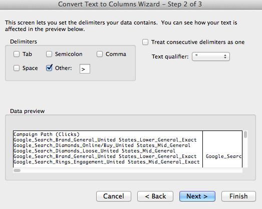
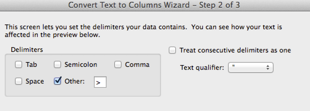
First, let’s download the data. When downloading the data I typically first assure that the path length is set to “Any.” The default is “2+” but I also like to develop information on users who only click one ad and purchase. Once the sheet is downloaded, it’ll have three columns. The paths, the conversions, and conversion value. Adding columns is necessary between the paths and the conversions in order to perform a text-to-columns function. In this case, our longest path length is 17 steps long so we have to add 16 columns. From there you can perform the text-to-columns function using “>” as seen below.
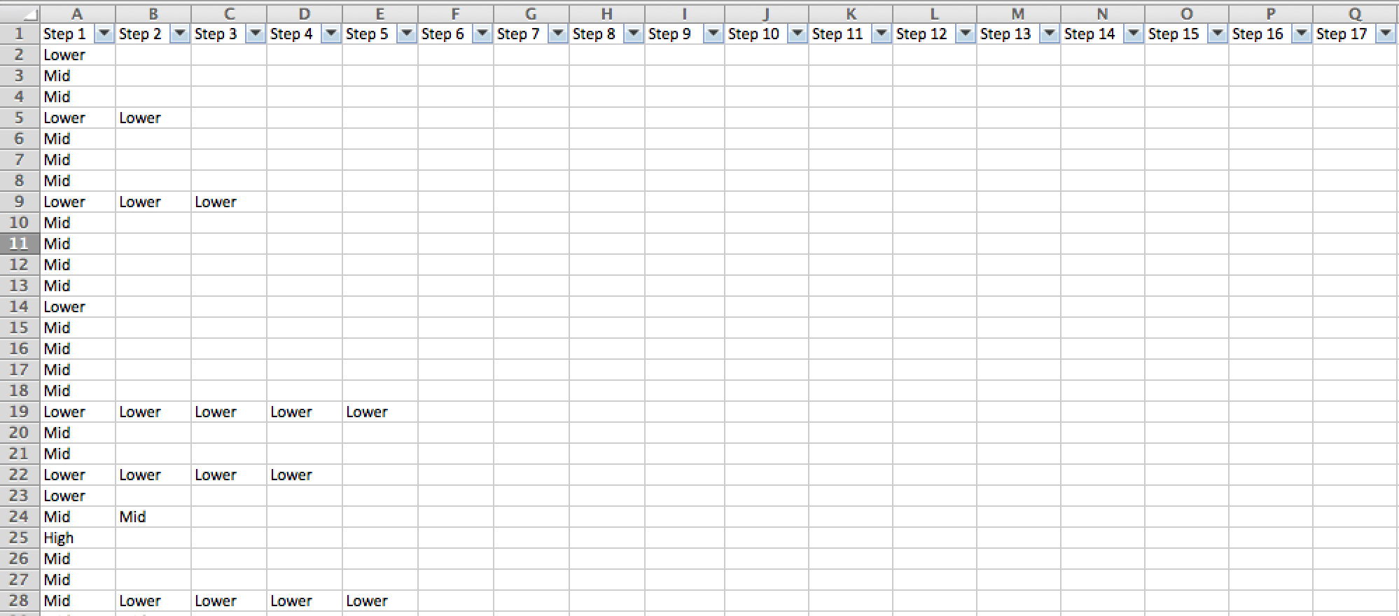
From here, you can name each column Step 1, Step 2, Step 3, and so on in row 1. After this process is complete you need to make a decision if you want data on a campaign-by-campaign basis, or if you want to just track something such as funnels. For this particular example, we have “Funnels” in the campaign naming convention. We can filter by “lower,” “mid,” or “higher” in each column and then rename all the campaign data to say one of those three funnels rather than the campaign name. Again, this step is optional, but in a very large account highly recommended.
Once this step is completed your Excel doc should look like something below.
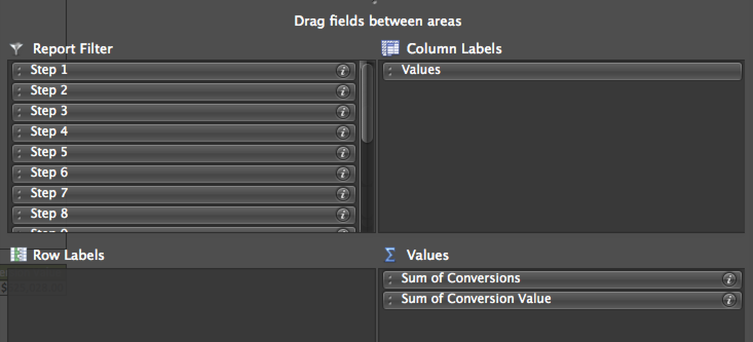
So, what do you do with this information? You pivot. The image below shows how the pivot table should be setup within the builder.
I also like to pull in AOVs (Conversion Value/Conversions) to see if different paths lead to our higher sales. So let’s go ahead and dig into what this report can help to show you
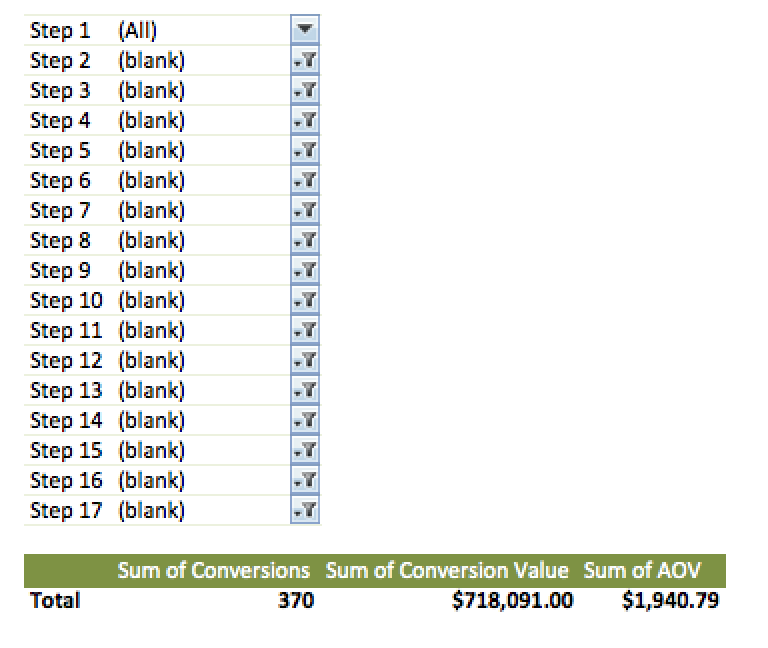
The first thing I like to review is the difference in sale amounts and AOVs when a user bought during Step 1 compared to when they did not purchase in the first step. The image below shows how to make this comparison with the report filters. Here you can see who bought on the first step by making Step 2s filter as “blank,” meaning there was no second step in the purchasing process.
On this next chart, you can see who did not purchase on Step 1 by making Step 2 one of the funnels and filtering out the “blank.”
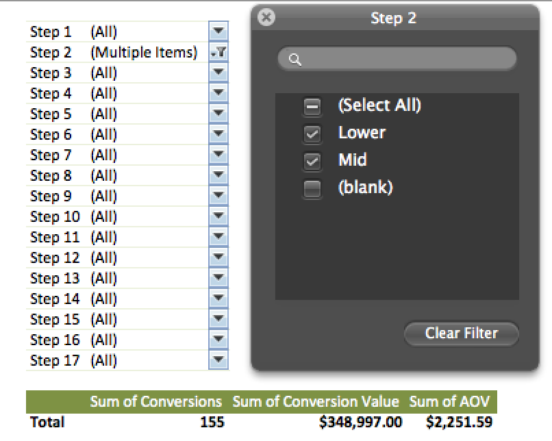
Through this analysis, you can see that the majority of our sales have come from users who only hit us through AdWords one time. However, the AOV is much higher for users who reach us via AdWords earlier in the buying process. Therefore, we can validate trying to hit users earlier in the process due to the fact that the assists are typically leading to higher AOVs.
The next analysis shows the difference between performance when users start at the bottom of the funnel compared to when users start by searching middle funnel terms.
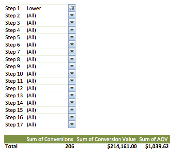
In order to see all users who started with lower-funnel terms (long tail or brand) set Step 1 as lower-funnel and the rest as “All.”
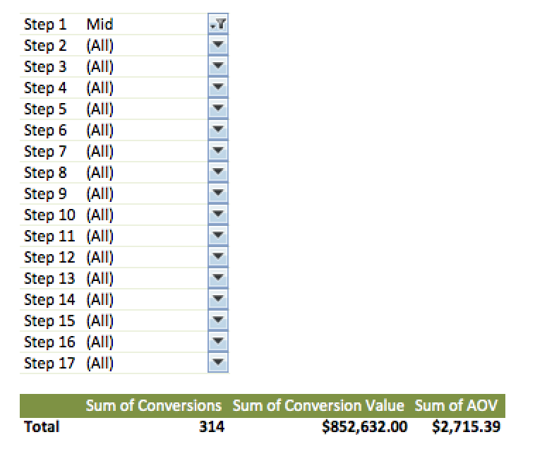
For the middle funnel terms do the same thing, except put Step 1 as “Mid” here.
Another example as to why middle funnel terms are important. Those users who start at the lower funnel are more likely to convert typically, but as can be seen here the middle funnel users are more likely to lead to a large sale down the line.
How about when there are multiple mid-funnel searches before the purchase?
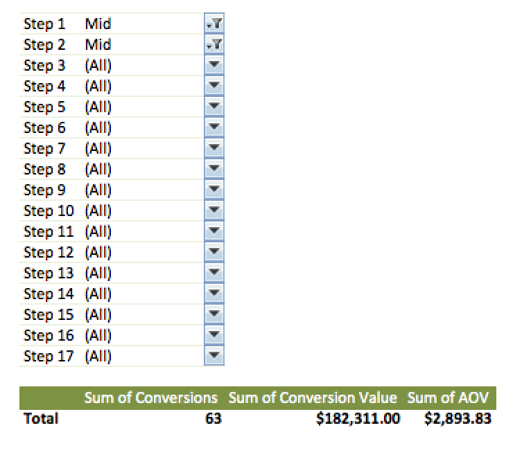
The image above shows the stats of this scenario by filtering Step 1 and Step 2 by “Mid.” The AOV takes another jump higher when a user looks into middle funnel keywords a second time.
The value of assisted conversions can be proven via these reports. You can play with the filters in an attempt to get more answers from a funnel perspective as well. Other ways you can use these types of reports include:
- Seeing how Shopping, Display and Search campaigns work together throughout the process. For example, do users that start on Display often lead to larger Shopping campaign sales?
- How do different categories of your business work together? For example, If you have campaigns around workout equipment and campaigns around workout clothes, do they assist each other and lead to larger sales?
- You can focus in on match types if you broke them out at campaign level. Do people start with searches that connect with your broad terms that then lead to larger sales later on exact terms?
Final Thoughts
The options are endless. If you have different ideas around how to segment campaign data using this attribution model then feel free to tweet @PPCHero with other ideas. Also, think through your campaign naming convention. It is always helpful to think what breakouts would help from a reporting standpoint We love any feedback and are always open to new ideas!


