If AdWords aged at the same pace as a human it would currently be utilizing a learner’s permit and preparing for an upcoming driver’s exam. Furthermore, this “teenager” would have been sporting the same semi-outdated style since the second grade. Fortunately at just over 15 years old, the primary paid search platform is slated to undergo its first complete design overhaul since 2008.
Per Monday’s announcement via Google, the AdWords interface will receive a full-scale redesign in order to accommodate changes in consumer search behavior and the ever-increasing importance of mobile traffic. According to the announcement, a rise in complexity within the paid search world has inspired a need to reimagine AdWords while ensuring that it is as “relevant for the next 15 years as the first 15.”
While the necessity for such an overhaul remains clear to Google, updated features are aimed at providing remedies identified by the advertisers themselves. Following these customer insights, user studies, and refinement tests, Google’s product team specified three key focus areas for the platform redesign:
- AdWords will have an increased emphasis on your business and less on Google’s product. While this assertion is certainly broad in scope, the announcement indicates a desire to help advertisers efficiently and effectively optimize their campaigns based on unique marketing objectives. The redesign will seek to streamline the user experience for any task ranging from how business goals are expressed in the way an advertiser measures and manages their ads.
- The interface will aim to provide valuable data with maximal convenience. While most experienced paid search advertisers have little trouble organizing and accruing actionable data for their clients, many would agree that the process can often time be less than user-friendly. The upcoming changes will refine this process through easily accessible reports that accurately reflect performance within a given segment.
- Aid advertisers with simple yet powerful tools. Through these additional resources, AdWords suggests that an individual will be able to do more in less time. Completion of important tasks such as ad extension audits or report building will be benefitted from less clutter and more intuitive workflows.
How Will These Changes Appear?
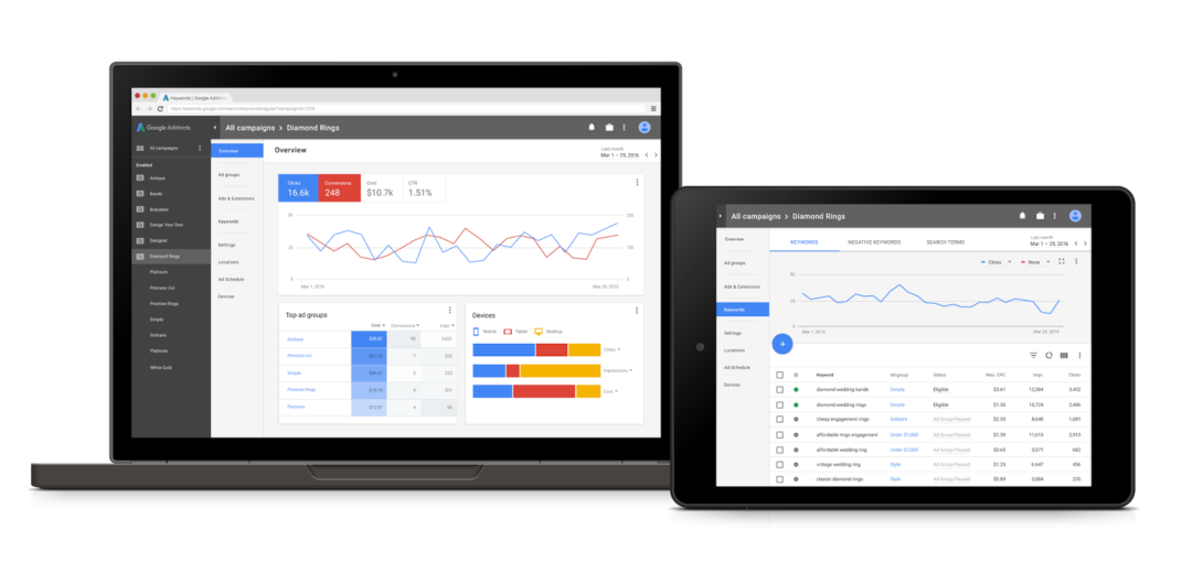
Ultimately, specifics within the announcement are limited, however, the provided screenshot from below does help to fill in some of the gaps. For one, campaigns and ad groups are shown in the left-hand navigation bar much like they are now. However clicking on a given campaigns brings up a dashboard view referred to as the “Overview Screen”. These will be available at campaign, ad group, and ad levels in order to supply a more thorough visualization of performance.

Additional changes visible within the screenshot include a relocation of secondary navigations tabs. Navigation for ads, extensions, and keywords are to the left-hand side of the screen parallel with the primary navigation. The aesthetic inspiration for the redesign is based on Material Design, which is the primary design language at the heart of other Google Apps such as Map, Search, and Gmail.
Despite the ambitious design changes, campaigns will run the same as before with no required upgrades or necessary migrations. The build will continue through the remainder of 2016 and into 2017 with continual updates based upon feedback. Google will reach out to advertisers directly to begin the testing process based on a number of factors.


