With the holiday season well under way, it becomes increasingly important for online advertisers to ensure that all of their ducks are in a row. Additionally, when you add in the ever-changing behavior of online consumers year after year, proper preparation becomes even more difficult. Now, assuming you’ve already planned out your holiday bid, budget, keyword and ad copy changes, it’s time to make sure your landing pages are ready to go as well. More importantly, your mobile landing pages and adapting to the rise of the multi-screen shopping experience.
For the purpose of this post, I’d like to discuss the importance of having a mobile-optimized website during the 2012 holiday season and walk through a couple examples that help demonstrate best practices for consideration on your own pages. So don’t be a website Grinch this holiday season. The last thing you want is to lose customers based off a poor experience with your website. Here’s some context to get us started:
The Multi-Screen Shopping Effect
As PPC analysts, we feed off of data, but that isn’t anything new. Rather, if you’re like me, you would probably want to see some statistics to support this call-to-building a better mobile landing page before investing the time and effort. Read on, my data-driven friends:
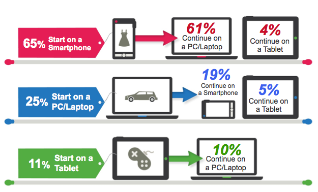
According to a recent shopping survey, Google suggests that roughly 65% of consumers begin their search on a smartphone. Yes, you read that correctly, 65%! When you also consider the fact that only 25% and 11% begin their searches on PCs/Laptops and Tablets, respectively, 65% becomes an extremely significant figure to overlook as we move further into the 2012 holiday shopping season. It then becomes up to us to offer a mobile-optimized website to sufficiently cater to that 65%. Here’s something else to consider:
Last holiday season, 1 in 3 shoppers used their phones for product reviews or pricing information while inside a store. –Pew Research Center, Jan 2012
I’ll be the first one to admit to checking prices on my iPhone while shopping in-store. This is because the product information is readily accessible and acts as a free price checking mechanism (aside from data charges…) to help save myself money and receive the best offers. I can think of several times where I’ve saved more than 50% on my purchase simply by checking the price online. Who wouldn’t want to take advantage of this?
Hopefully you’re starting to catch the drift by now, but the numbers are making it more and more clear each year that smartphones are becoming an integral component of users’ search experiences. Let’s take a look at a few good examples of mobile-optimized sites and see what we can learn from them.
EXHIBIT A
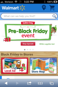
- Notice the search bar in the 1st screen shot. On-Site search features are becoming more of a standard today because they allow users to find what they are looking for quickly and easily. I also like how they took the time to customize it by asking, “What can we help you find.” Subtle touches like this can help make the customer feel appreciated.
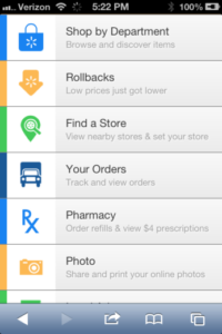
- Notice the size of the buttons in the 2nd screen shot. Mobile users tend to browse and click with their thumbs so designing your mobile website with this in mind becomes crucial. As a rule of thumb (no pun intended), mobile buttons should be easily clickable with your thumb and clearly marked. I really like how they added in the custom symbols/icons for each button as well that make them easy to identify.
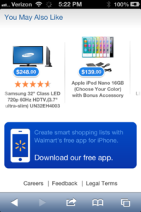
- Although there are many other good elements about this page, take a look at the 3rd screen shot. Specifically, the large blue button that offers up a shopping applet as an alternative to their mobile site. This is also a good idea to include on your mobile site if available.
EXHIBIT B
- One of the coolest things about this mobile site, in my opinion, is how they treat the shopping cart. I think it’s neat how customers are able to quickly and easily see the quantity and total costs of the items in their cart or bag without having to click over to other pages. This gives the site an ecommerce feel with minimal complications to the aesthetics and functionality.
- Take a look at the promoted items that they’re highlighting in the front-and-center. This is a great idea for those business owners who want to push particular products or collections. This tactic becomes even more helpful around the holidays, so you can more easily promote seasonal items. It also allows for versatility so you can add slight changes to the color scheme to better accommodate specific holidays.
- Notice the thumb-sized button on the second screen shot that says Gift Selector. These are popular around the holidays on both PCs/Laptops and Mobile devices because they help your customers collect gift ideas for friends and family. Oftentimes, these will include product filters by gender and age, for example. Ultimately, Gift Finders encourage more sales in the long run, but can also enhance a user’s experience on your mobile site as well since you’re taking extra measures to show that there is a gift for anyone.
EXHIBIT C
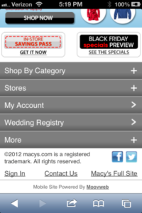
- First and foremost, I must point out that this doesn’t come off as being the cleanest and sleekest mobile site, but there are a few things working here that I can appreciate. I really enjoy the banner ads in particular that make mention of free shipping and holiday-specific sales. This is a good idea for any mobile site, so your customers aren’t questioning whether or not you’re having a sale on Cyber Monday, Black Friday or any of the other renowned shopping days. Additionally, customers are beginning to expect free shipping and other offers with their orders around the holidays, so you’re best off trying to find a way to make this happen. According to the Comscore Q1 Review (2012), 59% of customers said they would cancel their purchase if free shipping wasn’t offered during checkout. I’ll just let that figure sink in and you decide the rest.
- For those of you without a mobile applet, it’s a good idea to place a link to your full-site at the bottom of your mobile page. Sometimes the full-sites offer more functionality that may not be available on the mobile version, so adding a small link allows customers to switch over if they want.
- Lastly, I like how they encourage visitors to connect with their social media accounts. Smartphones are becoming more and more integrated with our personal Facebook, Twitter and various other social accounts each day, so adding a few social buttons can be incredibly beneficial. I’ve seen several sales and discounts promoted through social avenues like these which ultimately build hype around the promotion as well as your brand.
EXHIBIT D
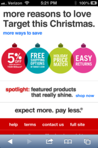
- Although this is just a small portion of this particular mobile site, I really enjoy the fun and colorful decorative elements. I think this example does a good job of demonstrating how easy it can be to add holiday décor to your mobile website, without breaking the bank. Rather than changing up their entire color scheme and adding a bunch of holiday graphics that could affect load times, they simply added in some clip art that combines holiday décor and their special offers. I can’t say it enough, but sometimes the small and subtle details like these can help your mobile site stand out from the rest of your competitors and enhance user experience.
I couldn’t find an example with this, but I also wanted to recommend adding a quick and easy gift card feature. This would be along the same lines as including a Gift Finder, but sometimes it’s hard to make gift decisions. Incorporating an eGift Card feature would then be able to serve as a last resort for those that can’t decide so you still have a shot at winning their business.
Closing Thoughts
Mobile landing page optimization is becoming more and more crucial each year, simply because the smartphone population continues to grow exponentially. While we’re currently in the heat of the holiday season, it’s not too late to make a few last minute changes. Just remember that you could potentially be missing out on 65% of seasonal shoppers who are starting their search on smartphones if you decide to neglect your mobile landing page optimization efforts. Now, this certainly is not a definitive list of optimizations and recommendations, so I would love to hear from you. Have you made any changes to your own mobile sites to better accommodate the holidays?
Feel free to leave some feedback below, and as always, thanks for reading.


