The last few weeks we have been tackling basic PPC principles, looking at “how can I make it better?” with some general best practices and tips. We have looked at account structure tips and steps to improve your quality score as these are two fundamentals to any PPC campaign. I have also previously covered landing page best practices to make sure that the traffic you are driving does the right thing once the click. Now that you know the basic principles of landing pages, let’s take it one step further to look at some rights and wrongs and figure out how to really make your landing page better.
A quick recap of the landing page best practices:
1. Make your headline visible and relevant to the user
2. Don’t bog the page down with lots of text, people scan pages
3. Keep it clean and simple but still make it look nice
4. Conversion forms should be strategically positioned on the right
5. Simplify the form – less is more
6. Put the important stuff above the fold
7. Make the offer clear and easy to spot
8. Quality score and user experience should always be considered
9. If people don’t convert, allow them to still visit another part of your site
Now, let’s go a step further and look at a few pages to identify what is right or wrong.
Every page can be improved upon, even the one YOU created. Ever looked at the before and after pictures of a home renovation or even a person in a weight loss commercial? The reason people like these is that one is so drastically different from the other. We often say, “how did they live with the kitchen like that?” The answer is, because it was comfortable and what we knew. Once you try out something new, you realize how much better it is. While your landing page may not be the 1970’s home with the shag carpeting, there are likely things that can be improved upon that you don’t realize. The first step is to admit this, and then try for outside, unbiased opinions. Grab someone from accounting, your neighbor or your dog walker. Give them your landing page and ask them honestly what they think. Don’t get defensive or you will be looking for a new dog walker on top of an updated landing page.
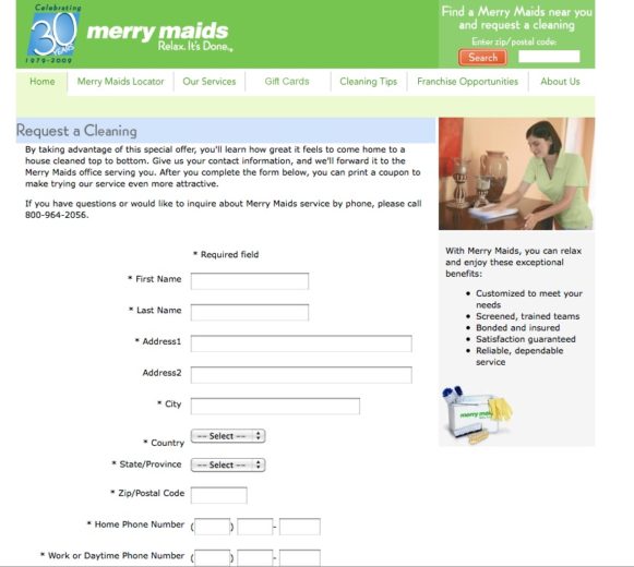
Take a look at the page below. What do you think they are doing well? What needs to be improved upon?
What are they doing well?
- I know exactly what they want me to do, fill out the form. There is absolutely no confusion in this.
- Look and feel is clean and simple. Not too many photos, colors, etc. to make it feel overwhelming.
- Trust symbol is up at the top – can’t miss that they have been in the business for 30 years
Areas to improve on:
- Whoa, that is quite a form and all fields are required! This is a lot of information if I am just at the researching phase where I am not quite ready to commit.
- I am not quite sure what is in it for me. If I read the page very closely (where most people don’t) I see that by giving my information I will get a coupon. I don’t know what type of a coupon, and I question if it worth this type of contact information commitment.
- Benefits are in small type at the right – the bulleted list is great, but put them somewhere where I might be more likely to see them.
Be a consumer, and learn from your experiences. We all use the web and see tons of landing pages. Be a consumer, but keep your marketing brain turned on a little to pick up some general cues. Look at pages and make a list of what you like and don’t like. Do your pages do the same things – good or bad?
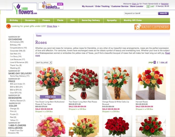
I searched for “Red Roses” and 1-800 Flowers came up. My search was very specific, yet below is the page I was directed to. What are your thoughts? Does it need to be changed in any way? Is there a clear call to action would you be convinced to buy right away?
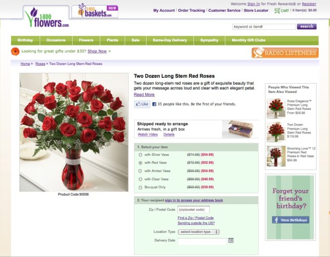
My initial reaction was that I searched for red roses and the landing page gave me ALL of their roses. Here is an example of WAY too many choices, which made me feel overwhelmed. The first flower vase shown is “Long Stem Multicolored Roses” – even if it has a free vase, they sure aren’t red. What I expected to see is something more like this:
If your visitors are searching for a specific item, take them to the product page – don’t force them to click again. If my initial search had resulted in the page with just red roses, I would have been much more likely to buy – research done. Now if I had searched for just “Roses” then I would have expected to see a page with several options, as I wasn’t very specific with my search.
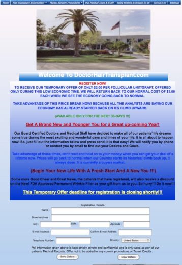
Show your visitors you care. While this isn’t necessarily going to be the end all reason a person converts, stays on your site or buys from you, make sure your page is something you are proud of. An ugly landing page can still work, some of the highest converting ones are not beauties, but don’t put your guests through that. You cared enough to PAY for their click, show them something that is clean, interesting and gives them the information they need and want.
This page not only breaks pretty much all of the basic principles of PPC landing page design but it also does it in a way that makes me embarrassed they are paying to drive people to the page. Use images that are high enough resolution and mean something to the visitor. Rainbow colored text is for nursery school sites, not a doctor’s office. I will let you come up with the full list of rules broken, but I think you get the point.


