I’ve always been behind the philosophy that telling customers what to do on your landing pages or website is much better than letting them figure it out on their own. After all, that’s what marketing is, right? We lead them in the direction we want them to take; to see our new product, new offers, new promotions, new content, etc.
However, if you’re working with graphic designers to design a website, I must say, they typically don’t like using buttons. Buttons are also known as a ‘call to action’. We’re calling the customer to take an action. Buttons can certainly ugly up a page if too large, too colorful, or too in your face. The up side to these kinds of buttons is: they work. Adding buttons or calls to action on not only your landing page but throughout your website can help increase conversions and conversion rates exponentially.
For a large client of mine, we had a landing page dedicated for user submissions requesting more information. This page was accessible via top hand navigation on all pages of their site.
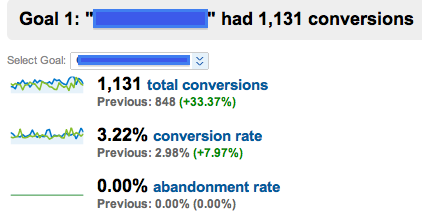
What I did was add an additional ‘request more information’ button to the body of all the pages of the site that also takes users to the same ‘request more information’ landing page. Just by adding these buttons consistently throughout the website we increased our conversion rates 8% and conversions by 33% in one month.
Sometimes customers can actually ignore (although not on purpose) top, left or right hand navigation on websites, especially if they’re looking for content. So by adding your call to action clear within the body of your content they may be more likely to take that action.
Here are a few tips I’ve tested using buttons that have worked wonders for me:
- Add multiple buttons throughout your website (be sure not to be too annoying though)
- Make your buttons above the fold – very important
- Set your buttons to a different color from the background of your page to make it more visible and stand-out more to the user.
- Be precise in the verbiage you’re using on your buttons, don’t just say, submit, but rather, ‘Get your free Info Kit Now’.
- Wherever there is a button, there is a form to be filled out. Be sure to send customer’s confirmation pages/emails confirming you have received their information and how to contact you with questions.
- Be sure to make your call to action a button, or button like. Some people prefer to use text link calls to action that don’t necessarily have the same effect as regular buttons.
Adding buttons to your site are not difficult, you’re graphic designers should be able to create a unique button in about 2 minutes or less, and programmers can program them to a site in about the same amount of time. They’re a great way to increase conversions and conversion rates for your PPC account. If you haven’t convinced your marketing team that adding buttons to the site will help, use Google’s website optimizer, which allows you to test a version of your landing page with the button and one without the button. Website optimizer will then show you conversion rates on both conversions. Not too many people can say ‘no’ when numbers are there backing you up!


