The best RFP question I’ve read said something to the extent of, “how do you explain performance swings without always blaming external factors when things are bad but taking all the credit when things are good?”
As with most answers PPC Managers give, the answer is “it depends.” But indexing PPC data to external sources can shed light on relative performance. Thus, helping explain when you’ve done something that’s really worked versus riding a wave of high search volume.
For the index, I like to show the data relative to the highest point in the data set because it is how Google Trends indexes it and thus makes it a clean comparison to those charts.
Doing this is simple! All you have to do is find the Max (=max()) in your data set and then divide that number by each data point. So if the most conversions you had in a month is 100 and in July you had 50, July’s relative number would be .5.
I also played around with looking at data relative to the top quartile, which I liked because it showed me when I did better than normal, versus indexing against the highest point makes it hard to tell great months from terrible months. Especially depending on how much higher the high mark is (if the best month in the data set is 1,000 conversions and the next closest month is 750, all the relative numbers look terrible. But the top quartile may be 500, so 750 in a month is still great).
I think it’s worth using this method if you’re indexing account metrics against themselves (CTR compared to conversion volume) so you can see if better than normal CTR means better than normal conversion volume. But it’s less useful when compared outside data.
Now for the fun part, let’s start by comparing performance by state to US Census data. Why? This shows if you are over/under index for a state and thus you should focus there, or if having abnormally high/low conversions is simply the result of that state’s population (I stole this idea from Brad Geddes, thanks Brad!)
For this, I downloaded the population estimates for 18+ from the US Census site. You could look at any date range you want, but I chose the last 90-days so I could see how we’re indexing recently. To get the data from AdWords you go to the dimensions tab, choose the “Geographic” view, and add the “Region” column. You can then do “sumif” statements, or other formulas, for taking the data from one of these spreadsheets and adding it to the other.
Once you have the data, you index it to the high point by finding the Max for each column, and then dividing the State’s data point by that Max.
Here’s what the spreadsheet looked like after doing all this and merging the data:

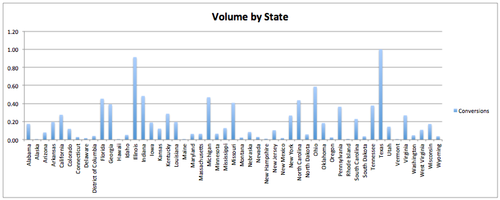
Now you can chart the data! Here is conversion volume by state:
Now this is what happens when we index against US:
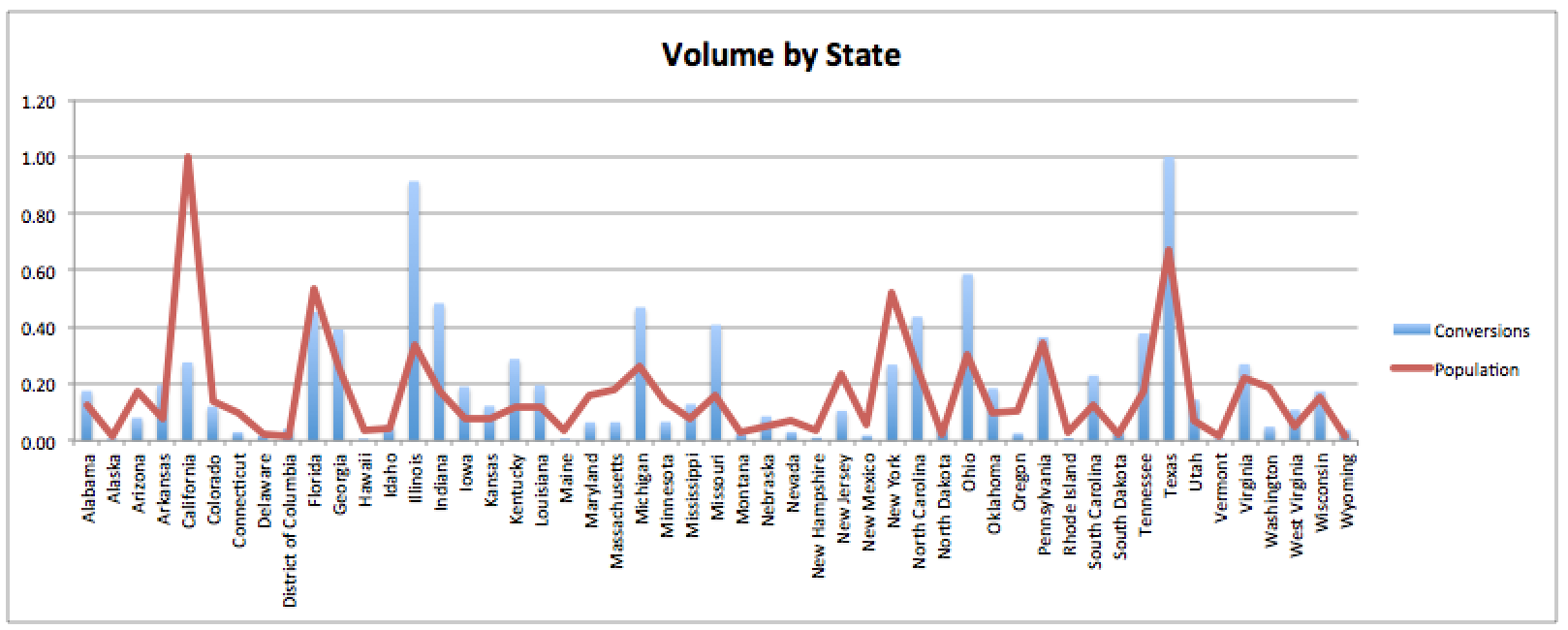
If you only looked at the first chart you probably would have pulled out some highlights, like how high Texas and Illinois are, but you likely would have missed that Missouri and Michigan are way over index while California and New York are drastically underrepresented.
Next, I want to see how we’re doing if we compare our results to overall search volume. This practice can answer questions such as, “are we doing better because of something we did or are more people just looking to buy our widgets right now?”
Comparing data to Google Trends is fairly easy because Trends allows you to download data as a .csv. One big limitation is that you can’t choose how to segment the date ranges for the data (it does it weekly, Sunday-Saturday, AdWords does Monday-Sunday). This means that you have to spend a minute to clean up the data and if you are looking at WoW performance, your data won’t be perfectly comparable. Because of this, I would use this data for directionality, not indisputable evidence.
Here’s the broad steps I took to pull the data together:
- Downloaded the .csv from Google Trends for 2015 keyword or topic I am looking at.
- Averaged the weekly Google Trend data over each month.
- Found Max of each month and re-indexed the months to that point (it won’t be 100 because you are average each week, of which only 1-2 will be 100).
- Downloaded 2015 data segmented by month for the keywords/campaigns I was interested in looking at (through dimensions tab).
- Found Max for each metric I was interested in.
- Divided the Max by the data for each month to give me that month’s relative score.
- Charted the two relative data sets against each other.
For example, let’s say I am selling sunglasses and I am wondering how I’m doing compared to the total search market for sunglasses. In the following example, I decided to only use one keyword and compare it to just one keyword in Trends. You could also do the sunglasses industry or you could compare a specific product line (like Aviator Glasses). Google Trends will aggregate data in all these ways.
Clicks compared to searches for Sunglasses:
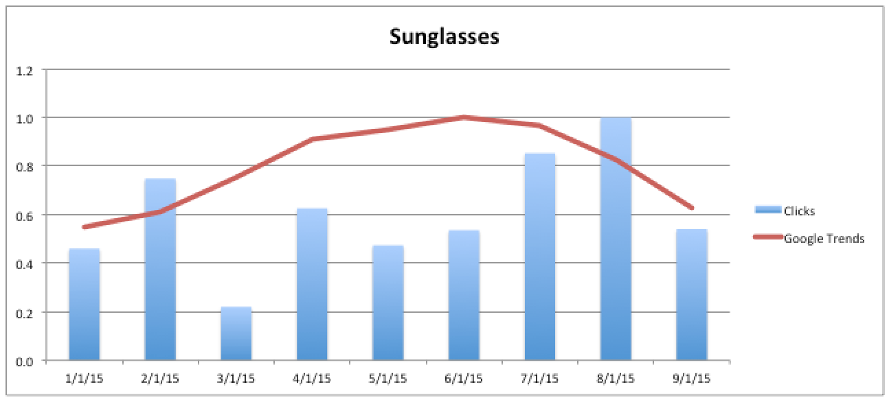
This graph highlights a few things. For one, you need to understand your accounts and their history. March has low clicks compared to the other months, but Trends show that searches increased from Feb to March. So we’re seeing the opposite of what we’d expect. If we don’t know what budget looked like, if there were any site issues, etc. we might conclude we did terrible in March. On the other side, August looks great. Search volume dropped from July to August, yet August was our greatest month for clicks.
I chose to look at clicks in the case above, but you could look at any of your PPC metrics. Below is the same Trends data compared to conversions.
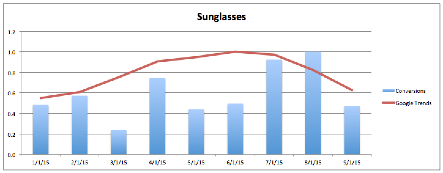
The two are very similar, although February did much better in terms of relative clicks than it did for relative conversions. That could be something to look into (why did we drive so many clicks that didn’t convert, especially since this is an exact match keyword we are reviewing).
Lastly, let’s look at account wide data instead of only at one keyword. The first thing I’d expect to happen is to see a flattening of relative search volume. That’s because there is way more data to look at than just one keyword. I’d also expect to see more variance from Trends data to my AdWords account data because I can do a lot of things to impact an entire account (add display campaigns, pause campaigns, etc.).
Here’s what it looks like for the shoe category:
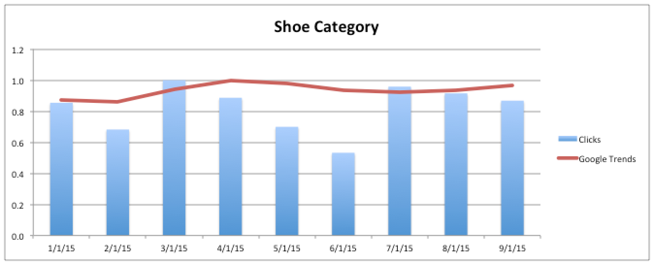
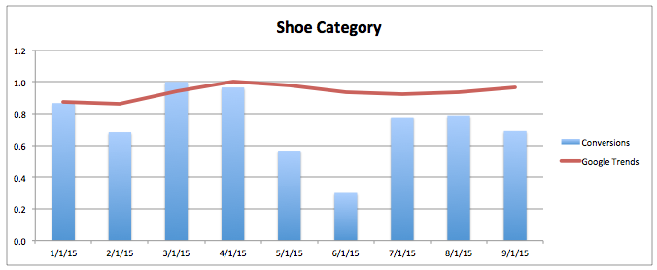
An interesting observation is that there is a drop off in search, click and conversion volume in May and June, but the drop for conversions is the greatest. July and August do what they should. All numbers go up, but September is interesting in that search volume continues to go up but clicks and conversions change. If budgets remained the same, this would be something to dig into.
Here are a few other ideas for how indexing data against Google Trends may be useful:
If you are doing a lot of ad testing, and CTR is a metric you are trying to impact, then looking at clicks compared to Trends data can show you if you’re getting more out of less or equal demand.
If you are working on conversion rates, comparing conversion volume to Trends can help show if you’re seeing more conversions relative to search volume.
If you’re focused on keyword expansion, looking at impressions may tell you if you’re increasing your reach or if there was just more search volume.
If you need to make a case for more budget, you could compare Impression Share lost due to budget to search volume.
Conclusion
As mentioned earlier, this data doesn’t answer a lot of questions with specifics, but it can help paint a picture if performance is good relative to population, Search Volume, or other third party data you have access to. Once you identify something surprising, you can then jump into the account to figure out what caused the good or bad performance.


