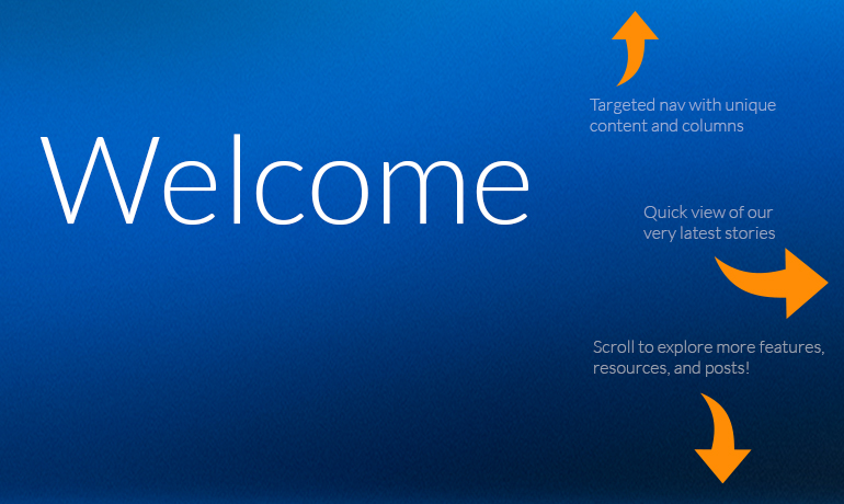
 It’s a big day. One that’s been a long time coming, and one that’s taken a lot of time, effort, and energy here at the Hanapin offices. But it’s finally here, and we’re proud to finally welcome you to the new PPC Hero.
It’s a lot to soak in, but here are the watchwords we followed while creating it:
Relevant. Dynamic. Shareable. Meaningful.
We hope you find at least a few of those things on every page.
Most importantly, we wanted to create a new look and feel that embodied the speed, progression, depth, and breadth of the content we create here at PPC Hero without changing the approachable voice, expert-level detail or engaging tone we’ve become known for.
Yes, that’s right, to answer what might be your first and most important question: We’re not changing what we write about or the way we write it here at PPC Hero. At all. You’ll get the same personable, in-depth analysis as always at the same relative frequency from the same authors you know and love. We just dressed it up and—hopefully—made it a little easier on you to explore and find content you love.
As for the new look, we hope you’ll find things that are different, yet comfortingly similar, on every single page. The new logo is sleek, trim and progressive, yet as big and bold as ever. The new images are beautiful and engaging, but full of personality. The new navigation is relevant, and everywhere.
I could go on and on. So I will, but in a more scannable format.
Here are our eight most favorite things about the new PPC Hero design:
The site cares about what you care about
Responsive design that reacts to the device you’re using is all the rage right now, but we identified one type of responsiveness that was even more important: Dynamic content.
Whatever type of article you’re reading on PPC Hero, the site will identify the topic and offer additional resources that are highly relevant to you at that moment. This goes far beyond the standard “related post” suggestions (although we have plenty of those), as the actual sidebar content changes from post to post. So if you’re reading an article about the Google Display Network, the sidebar and contextual features will offer webinar recordings, white papers, even job opportunities within that topic area. This opens up a whole new world of PPC Hero beyond the typical daily post you’re probably used to discovering.
We’ve always been interested in delivering exactly what you want to read. Now we’re proving it.
Social sharing is fun and meaningful
Ever have unspoken contests with your fellow digital marketing geeks to see who can get the most Twitter love? Well our writers now live in that world 24/7, since an aggregate share count for every article appears right there on the home page.
Sure, it makes for great bragging rights, but it’s also a valuable navigation tool. You’ll be able to see, at-a-glance, what our most popular (and shareable) articles are, which will allow you to devour them accordingly.
And sharing them yourself has never been easier: Hovering over the on-page share icon brings up one-click sharing options for our favorite social networks.
Visuals are important… and beautiful
What can we say beyond the obvious—the new homepage is beautiful… and very, very different.
We’ve moved past the typical single-column, backwards chronology of a standard blog, and more toward a magazine-style layout. The home page still displays the most recent stories first and then works backward, but we’ve built in some natural ebbs and flows for you to view the articles that are most important to you.
“Feature” articles will travel down the page in full-width placements, while all of our daily content starts with an at-a-glance “Latest” box at the top-right of the page and travels down the page in left-to-right waterfall style. This will allow our best content to rise to the top, while also allowing just-as-valuable posts to stick around near the top even longer.
Columns! Yes, finally. Columns.
PPC Hero has always been known for its authors more than anything. And now we’ve finally given them the respect they deserve.
Our “Columns” navigation in the upper right features once-monthly updates from popular PPC Hero writers within their forte. Sam Owen will be covering conversion rate optimization. Amanda West-Bookwalter will be updating all of us on display advertising. Jeff Allen will generally be Jeff.
And that’s not the only new content style we’re going with. We’ll be launching more regular screencasts, round table discussions, interviews, news roundups and much, much more.
Navigation is finally back in style
Remember the old PPC Hero navigation? As in, there wasn’t one? Yeah, I remember too.
It looked like this:

It was really, really hard to find things. In particular, it was hard to figure out where you would even go to read more about a topic you’re interested in. No more. Now we have dynamic, complex navigation for our most popular topics along the top, and deep, keyword-based navigation for almost everything else in the footer.
As with everything else, we’ll be changing this based on how people use the site.
It hasn’t changed THAT much
This is a lot of change. We know. But at the same time, it really isn’t. The same digital advertising rock stars from Hanapin Marketing (and the occasional standout guest poster) will still write our articles. They will still have the fun, personal, creative voice we’ve always had.
And we’ll still be posting only the best content, at a pace that makes the most sense for us—we’re not tripling our posting schedule or anything threatening like that. We just look a little fancier now, that’s all.
It’s clear where we’re headed
This redesign and rebrand is in the same vein as the Hero Conf and Hanapin Marketing website redesigns. The focus for all three has been to create world-class, dynamic, leadership-driven sites on which the visual and written content matches the phenomenal team at Hanapin Marketing and the work they produce.
For PPC Hero, that means a site on which you can find the latest topics and deep analysis specifically about PPC, but also tips and guides for how, specifically, you can do your job better. Ad network certification guides, weekly webinars, expansive ebooks—all should be as easy to find as the day’s top blog post. And now they are.
As Hanapin has grown in both size and industry stature, we accelerated even faster than our websites could keep up. This PPC Hero launch caps off a global rebranding effort that brings our digital presence up to speed with both our industry impact and our aspirations for the future. We hope you’ll continue to join us along the way.
We’re not even finished yet
This is only the beginning of where we’re going to go with PPC Hero. Even now, our phenomenal Senior Designer and Project Manager, Megan Stout, continues to work essentially around the clock with our web development team to push waves of updates live to the site, so if you get a chance, thank them for all of the hard work they’ve done to make this a reality. It was truly a huge undertaking.
Here are even more updates to look forward to in the (very) near future:
- A fully responsive design
- Even more powerful navigation
- Even easier one-click sharing
- Dynamic homepage labels for at-a-glance browsing
- Smart, contextual related article recommendations
- Scrolling navigation & toolbars
- Entirely new sections of PPC Hero
I’ll stop there, but I think it suffices to say that we’re just getting started. We’ve planned new content areas, evergreen guides and how-to navigation, dynamic news features, and more—all to make sure PPC Hero is the first place you go for all things digital advertising.
Of course, we’ll always want to know what you think! Leave your comments below or tweet at me with your thoughts, feelings and emotions. We listen every time.


