You’ve been asked out for coffee by a cute guy at the office and you’re a little nervous on this first date. What is he going to be like outside of work? Will this go anywhere?
When you get to the coffee shop, he wastes no time. He grins and introduces himself… then promptly proceeds to get on one knee as he slowly draws a ring out of his pocket!
By this time, the other patrons have noticed what is going on and begin snapping pictures with their phones as an excited buzz fills the shop. Everyone leans in and waits for your answer to his inquiry…
You face flushes with embarrassment as a solitary thought pounds in your head. I just wanted coffee.
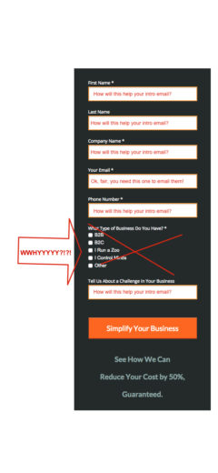
While you may roll your eyes at this socially inept individual, I challenge you to consider your PPC landing page forms.* Is it possible that we marketers are consistently proposing marriage to those coming to our landing pages “just wanting coffee”?
The “First Date” Landing Page Form
A large part of PPC is advertising to potential customers or clients unfamiliar with your brand. When they click on your ad and hit your landing page, you just got your first date with them. They’re curious and interested, but there is no hesitation to leave if you get creepy.
So knowing that, what do your First Date Forms look like? Are you asking for First Date level information, or are you getting down on your marketing knee and raising a ring?
The Case for the 1 Field First Date Form
Your First Date Form should contain the least amount of information required to get to the next step in the relationship.
Here are my thoughts on First Date forms.
(1) Eliminate All Non-Essential Fields.
(2) Take Your Remaining Fields and Cut Them In Half.
(3) Remove One Field From Your Remaining Form. You’re Almost There.
I’m going to say something that will have everyone up in arms that their industry is different: In my opinion, only 1 Field is absolutely necessary for the majority of First Date Lead Generation Forms: email.

In my opinion, only 1 Field is absolutely necessary for the majority of First Date Lead Generation Forms: email.
You may scoff, but hear me out.
Phone Number
People are holding their phones closer to their chest in this data-crazed era. Put a number by your CTA, if they don’t call it, they didn’t want to talk on the phone. Don’t believe me? See my client example below.
Business Name
How will this information really help you in that first contact other than padding your internal “contact” database for information?
“Tell us about yourself”
This is the information to gather in the second level of contact. Example email response to First Date lead:
“Hello, my name is Kirk. You recently contacted me about PPC help and I wanted to learn more about you and your business and how PPC can work for you. Please let me know your business name and website and we’ll set up a time for a consultation call. Yours truly, PPCKirk”
Your Name
According to my example email reply above… do you even really need to know their name? Or if you’re not there yet, do you really need 2 name fields? Simplify the form by removing First and Last Name fields, and replacing them with 1 “Name” field to further simplify your form. Let them figure out what to call themselves and eliminate a field!
The goal here is to get us to think. Ask yourself “what is truly needed in my form fields to begin a conversation?” You may be surprised.
Client Case Study**
Here’s an experience I recently had with a client’s First Date Landing Page.
We originally started with a 2 Field First Date and things were going well. We do a lot of Display campaigns so nothing to write home about in terms of account Conversion Rate, but we were pleased with the KPI’s.
Then the sales team struck. They wanted phone numbers and business names added into the field so they could more easily assign the correct lead to the correct department. I objected and we compromised by running a test for one week to see what would happen.
Company Name (required)
Email (required)
Phone #
At the end of the week I pulled the numbers. We had experienced a 50% Drop in Form Submissions. My chief concern was the form length, but especially the phone number field, even though it wasn’t required. People just don’t toss their numbers around on a first date anymore and I was concerned about the psychological effect it was having.
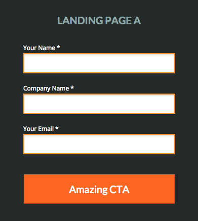
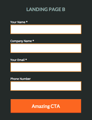
I sent in the numbers and we decided to run another test (they really wanted the company name field). Here is what the forms in our test looked like:
The results
8 days later, I pulled the numbers and we saw this: Landing Page A (the shorter one) had beaten Landing Page B (the longer one) in form submissions 6 to 1.
Apparently people REALLY hate putting phone numbers into a form on their first date. What are you doing to chase first dates away? Stop being creepy, stop collecting more data than you need. Minimalize your landing page forms and start increasing your First Date leads!
What about you? Any advice you would give on this? Reasons why I’m completely off-base in believing what I believe? Leave it in the comments below!
**If you are interested in an awesome landing page solution for your campaigns, I highly recommend Unbounce. They are the provider I use (and that I used for all these Form Screen Shots!) and their testing capabilities and usability are fabulous. I get nothing for saying that, I just think awesome companies should get talked about.


