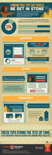
For this month’s infographic, we wanted to emphasize landing page tips that are key to conversion rate optimization (CRO) to go along with this month’s CRO Toolkit, which can still be found over at our CRO Toolkit page on the Hanapin Marketing site.
Below is a transcript of the copy included in the above infographic image. Enjoy!
Landing Page Tips That Should Be Set in Stone
Mastering the Timeless Art of Conversion Rate Optimization
There might be too much information about landing page optimization out there. How do you chisel away the bad to discover the useful tips? This guide features rules for your landing page that should be set in stone.
Layout
Everything Within Reach
- Calls to Action (CTAs) should be easily clickable and above the fold
- 70% of small B2B companies don’t have a CTA on their landing page
- The color and size of CTA button should be appropriate (not obnoxious, but not lost)
- Be sure to sprinkle conversion options throughout page
- 57% of B2B companies and 69% of B2C companies say conversion is the most useful metric to gauge landing page performance
- 37% of B2B companies and 56% of B2C companies say increasing lead-to-conversion rate is their most critical landing page goal
- Highlight deals or promos in your messaging
- Make sure your contact form is in an appropriate place (not forced down the page)
Copy
Crisp and Compelling
- Use compelling calls to action to provoke clicks
- 47% of B2B companies and 34% of B2C companies say clickthrough rate (CTR) is the most useful metric to gauge landing page performance
- Utilize concrete facts, stats, or testimonials to back up your messages
- Ensure the copy voice is appropriate for the intended user and speaks to the target audience
- 62% of B2B companies and 34% of B2C companies say increasing lead gen is their most critical landing page goal
- The copy should be balanced: avoid large block paragraphs as well as text chunks that are too choppy/broken up
Imagery
Relevant and Varied
- Use a variety of images with both wide and close-up focus: repeating the same image composition can be redundant and unappealing
- Vary image sizes, too — by increasing product photo size 28%, one auction site saw 63% more clicks and 329% more bids
- Use imagery that is relevant to the objective of the page
- Balance the use of imagery with the amount of text; there should not be too much of either
- 51% of B2B marketers and 65% of B2C marketers said redesigning/simplifying their landing page was the best optimization strategy
These tips stand the test of time: etch them into your rulebook for landing page success.
Sources:
- https://smallbiztrends.com/2013/08/b2b-small-business-websites-lack-call-to-action.html
- https://www.emarketer.com/Article/How-Do-Landing-Page-Objectives-Differ-B2Bs-vs-B2Cs/1010161
- https://econsultancy.com/blog/62391-do-bigger-images-mean-improved-conversion-rates-three-case-studies


