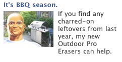
So, I couldn’t help but noticing this ad on my Facebook page:
So far so good, right? I mean, if you can’t help but notice an ad, it’s at least doing something right.
And what was so conspicuously noticeable about this?
Mr. Clean of course. And while this is a discussion for another post, I think it’s worth noting how much power this brand icon — an icon created by mass media advertising — has when it comes to creating Facebook Ads that grab eyeballs.
So the ad then creates a bit of curiosity because I normally associate Mr. Clean with floor cleaners and stuff — not with grills and BBQ.
Unfortunately, it’s all downhill from there. The background image of the grill is non-descript and the body copy fails to tell me why the Outdoor Pro Eraser is a better tool for my grill than my trusty wire brush.
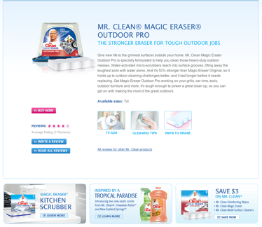
Still, given what passes for average when it comes to Facebook Ads, this one is hardly counts as a failure. Until, that is, I clicked through to the landing page and found this:
I’m expecting to see content around the Outdoor Pro Magic eraser, but the ads and videos and pictures all look like they came from the indoor version of this product, and there’s absolutely nothing about cleaning grills.
Dude — if you promise me info on grill cleaning in the ad, you gotta DELIVER the info after the click!
So while I took the time to mock-up an alternate Mr. Clean ad, the real improvement has to come with a change to the landing page. And, frankly, this isn’t an infrequent problem, which is one reason why people often complain that Facebook leads don’t “convert” very well. Baloney!
Facebook leads convert fine when they are linked to a landing page that provides what was promised in the ad. The problem is that Facebook ads provide a greater opportunity for advertisers to mislead prospective “leads” than most other PPC Ads, and therefore have a greater chance of creating a mismatch between ad and landing page.
So, yes, by all means, optimize you’re Facebook ads — but take a little time to optimize your landing pages, too!
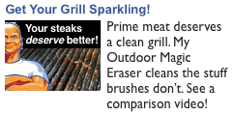
P.S. Here’s how I might have designed that Mr. Clean ad:
Showcase the problem. State your promised benefit. End with an appropriate CTA. Note that the landing page for this ad had better deliver on the comparison video!
Rob Lenderman is the Co-Founder of BoostCTR, a marketplace for copywriters. You can find him on Twitter @BoostCTR or at www.BoostCTR.com/blog


