PPC reports are not tasks. They are not something merely to be completed and sent along in the hopes that the client or boss is getting what he or she wants or even worse, sent hoping that he or she does not read the reports at all.
Reports should shed light on activity, give the reader insight into performance and engage the reader so he or she feels compelled to dive along side you and figure out how to continuously improve the PPC account. Too many reports are done in a fury, with little customization or anticipation of what questions may arise.
Below are my 5 tips for creating actually useful reports. Following these tips will allow you to never send a bad, misleading, boring PPC report again!
Properly segment the data
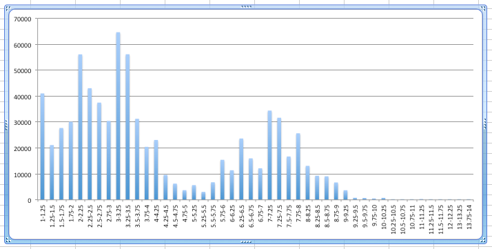
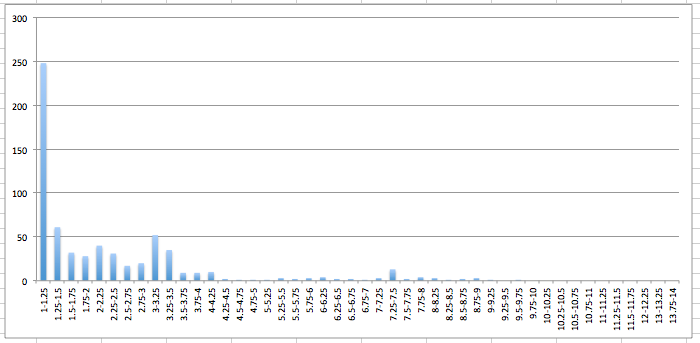
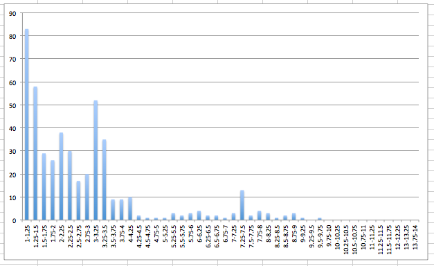
My favorite tip here is to make sure to treat brand traffic and non-brand traffic separately. Click through rate, conversion rate, cost per lead/acquisition, average position and pretty much every other key performance indicator will be different from brand and non-brand traffic so lumping them together will give you an inaccurate picture. Below is an example.
This is with brand impression included:
This is what it looks like with branded terms excluded:
You can see that while the top average position still generates a large portion of sales for this account it does not drive nearly the percentage of non brand traffic as it does brand traffic.
Beyond just brand traffic it is important to segment any data for product categories that may behave very differently. For example, for a product that have an average ticket price of $100 compared to one at $200 should not be looked at together since the goals for the two will likely be very different. You could also segment by device, time of day, location, etc.
Put things in historical perspective
Looking at only the past month or two may be very deceiving. Things may look great or poor based on what’s happening in the past few months but if an overall trend is down and you’ve had a couple good months you still may be very far off from where you want to be. I prefer to look at the past 3 months, if the data is available, and then also compare the time period I am looking at to the previous year as well.
Here’s an example of why it is important to keep the past few months in mind as well as what happened last year.
Last week of December 2012
All of December 2012
Quarter 4 2012
You can see that the first view makes it look like conversion rates are bad. When you look at all of December you see considerable improvement in conversion rate and when you look at the last 3 months you see that there is a very significant improvement in conversion rates. (note: this is a non-ecommerce client and the CR improvements were actually due to CRO and cutting out poor performing keywords and not seasonality. See below chart for data including January.)
Allow for readers of the report to investigate
Most reports are used as just a high level overview of an account’s performance. But there are times that the reader of the report may want to dig down a level deeper on a particular performance metric. While you may not know exactly what the reader may look for, you can certainly keep an eye out for anomalies on the report and preemptively add a second level of detail for that metric.
For example, let’s say you notice a particular product has a very high CPA for the past 7 days. You may want to show a keyword report for that product category that might direct the attention to what particular keyword(s) are having an issue.
Include highlights in the email in which the reports are sent
This isn’t text, this is a screen grab from the report itself, which should both be informative but also grab the reader’s attention so that he or she actually wants to download and open the attachment. This could be a line graph, a bar chart or a list of recently added keywords along with performance metrics.
Add data that can’t be accessed in the same place
If your report is primarily from Analytics, put some AdWords data in your report. If the report is primarily from AdWords, put Analytics metrics in. Doing this makes the report more useful since you are putting all the information in one report and it makes it more useful because the report doesn’t become just a rehash of information already easily accessible.


