The more PPC managers I’ve gotten to know, the more I realize that all nerds are not created equal. We talk of Analytics and Excel, and we use the term “pivot tables” a lot. And if you’ve ever tried and failed to create a pivot table, this post is for you. Yes, I’m using a Mac and yes, I’m working with Excel 2010. BUT there are valuable takeaways that apply universally, and we’re always happy to help troubleshoot any details with you! So buckle up and get ready to pivot!
The step-by-step will show you how to produce two types of pivot tables:
1) Mobile performance and 2) Display placements.
Spoiler alert: The heart of this article is about creating a pivot table. Feel free to apply this to all your favorite reports!
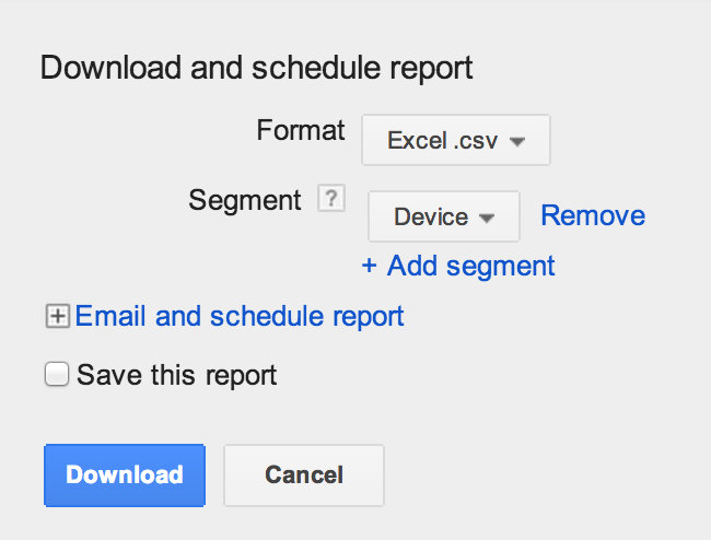
To evaluate how your campaigns are working by device, you’ll want to first pull a segmented report, which looks like this:
Step 2 is to do away with unnecessary rows of data. It’s likely that these are part of your problems in the past— pivot tables are finicky beasts that don’t want excess info. You should delete your report title and dates,
and the various Totals provided.
Step 3: Because your Desktop and Tablet performance cannot be optimized separately, you’ll want to re-label any column as a joint Desktop/Tablet.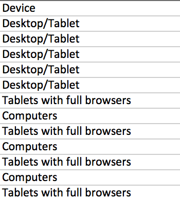
Step 4 is to grab that data. My favorite go-to method is to simply place my cursor in the top cell and select Data and then choose Pivot Table. This starts the ball rolling and as you can see below, you’re often given a few metrics to start with. These may not be what you’re looking for, so the next step is to choose what does go in your report.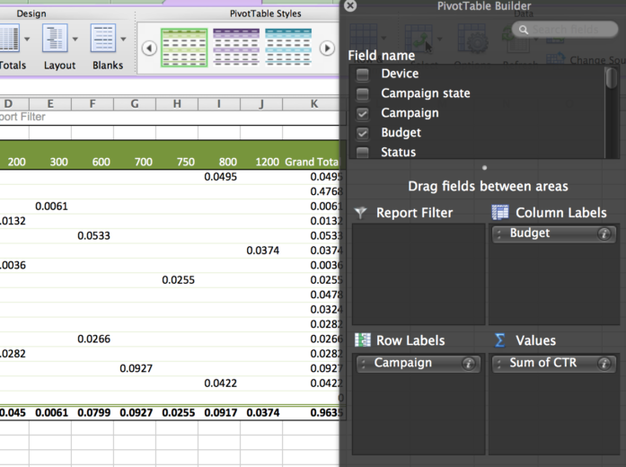
Step 5: For this report you’ll want your primary columns to reflect your (surprise!) Device segment. Easy. But what data are you interested in examining? The volume of impressions for each device? Perhaps the click-thru-rate for each campaign by device? Let’s walk through how you’d build this out…
Step 6: Pull impressions. You want to always identify the proper time for “Sum of” versus “Count of” your data. The default is typically “Count of” so this is an easy place for you to get flustered. You want all of your mobile impressions to be summed, which means you’ll choose “Sum of Impressions” like this: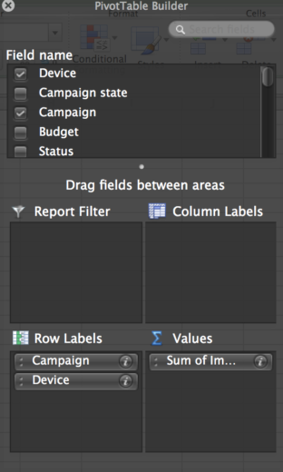
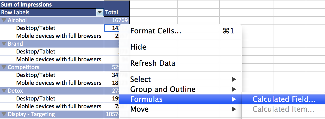
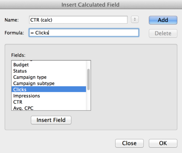
Step 7: If you want to pull the CTR for your mobile and non-mobile traffic, should you just pull this column into your table? Nope! Because your CTR is already calculated in your data, pulling the sum or count or even average of this data will inherently be a little wonky. Instead, use this opportunity to calculate your own CPL by device using the Formula option! And the beauty of pivot tables is that you don’t actually need the cost and conversion columns present in the pivot table to do this, you just need them somewhere in the data source. As a side note, if you are creating a new formula, it must have a unique title. I often opt for something like “CPL (calc)” which reminds me that I built the data myself.
Upon creating your calculated field, it will initially appear a little goofy (without formatting)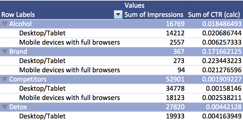
But simply selection the CTR column and adjusting to a % value, it cleans up nicely.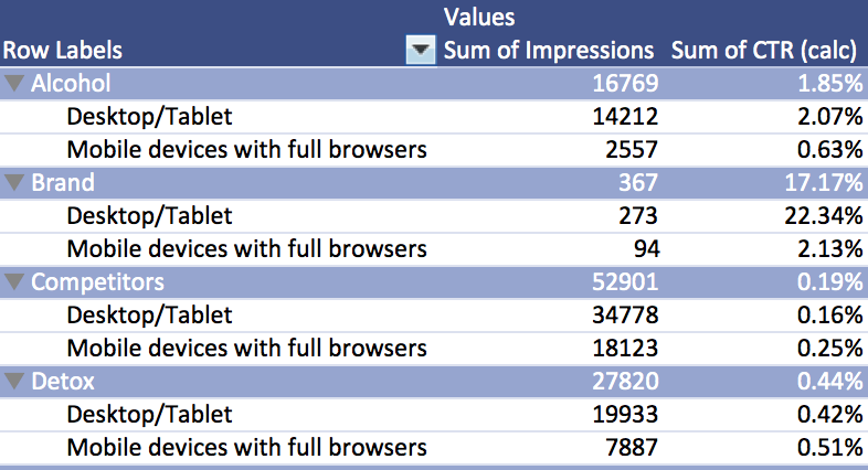
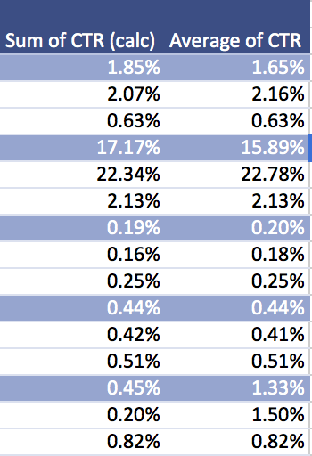
As I mentioned, it’s highly, highly recommended that you calculate your own values when able. Your provided CTR, when averaged, can have a stark difference to what it actually calculated manually. On the left side of the table below are the CTR’s that I calculated for each device, based on the clicks and impressions from the report. The right-hand column is an average of the provided CTR. Clearly, they aren’t always adding up.
Ta-dah! You made your first pivot table! Now you can see how your performance fares by device on campaign, ad group, keyword, and account level!
So now that you’ve walked through this process, let’s crank up the velocity and try again with a Placement Report for your Display campaigns!
Step A involves pulling a report for your performance topic of choice.  Here we’ll pull a placement report, which we hope will give us insight into profitable placements across various ad groups or campaigns.
Because I want to see what performs across multiple campaigns, I’ll pull every placement I can get my hands on. From this data, I want to see what ranks in the highest impression volume as well as a high CTR. I want to know what will get me results if I invest my time and money in this site.
Step B: Get rid of the junk. Pull the dates, pull the totals. And pull any unnecessary garbage that may have snuck into your report (such as inactive campaigns).
Step C is the big one: start a new Pivot Table! Let’s take a look at what placements are showing the most, receiving the most clicks per impression, generating the highest costs, and which are actually converting.
Hint: Your columns will be impressions, CTR, cost, and sum of conversions.
As you’ll note, I also included the count of ad groups where these placements were found. This gives me an idea of how frequently they appear repeatedly in various parts of my account. If they fall into an appropriate CPL for this account, I think I’ve found myself an opportunity for managing a placement!
There are literally hundreds of ways you can use pivot tables to benefit your account management. We PPC Heroes are constantly pushing the envelope, with exciting heat maps, pulling the curtain back on Average CPC, and a general “Best Of” list.
Whichever way you slice it, pivot tables are beautiful creatures with countless uses in the life of data nerds PPC Heroes. What are your favorite ways to use pivot tables to dazzle your friends and clients?


