#CRODay was just around the corner when I received an email from Oli Gardner stating that I’d been selected to compete in the 5-second landing page showdown that at the time was just 3 days away.
Setting The Stage
12 participants (including little ol’ me) and 12 conversion rate optimization professionals go head-to-head in the 5-second showdown. We’re given everything we need, including:
- A landing page
- An Unbounce account
- 3 questions that need to be answered
- Baseline scores
The task at hand? Edit anything and everything above the fold to improve the clarity of the page. Oli inputs our page as a 5-second test in Usability Hub and asks 3 questions. We’ll get a score based on these three questions. However, the score isn’t just the number of correct responses. The questions are weighted based on their importance. Oh, and you have two chances! Whoever gets the highest score wins the showdown. Sounds easy enough, right? I beg to differ.
The Showdown
The task appeared to be easy. The second day of working on this page rolls around – frustration sets in, my OCD takes over, and I’m working with the impossible.
At this point, I’m blaming the product – we can thank Oli for that one. I need to make my page look pretty while getting across all 3 answers to the questions – or that was the approach I was taking. Here’s what I had to work with.
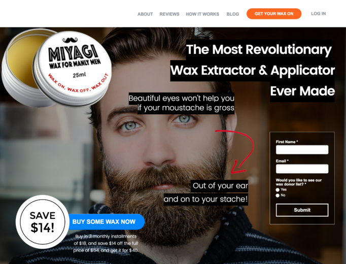
The questions: (Keep in mind, you would have had just 5 SECONDS to try and answer these questions. 5. That’s it.)
- What product do you think this company sells?
- What would you get if you filled out the form?
- How much does it cost?
I’ll let you ponder this page for a moment…


Now that you’ve seen the product and you’re familiar with the questions, here’s my first attempt.
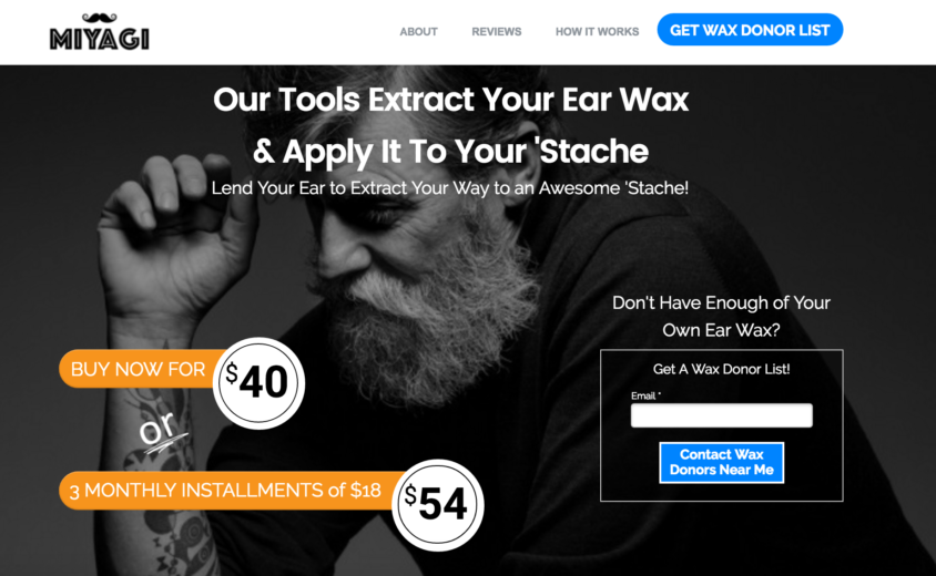
Let’s discuss the answers to the questions. In 5 seconds, the following answers needed to be portrayed:
1) What product do you think this company sells?
Something that extracts wax from your ear and lets you apply it to your mustache. Gross, I know. (½ point for extracts from ear and ½ point for applying it to your ‘stache)
2) What would you get if you filled out the form?
A list of wax donors if you don’t have enough of your own ear wax. So gross. (½ point for donor list, ½ point for “wax” donor list)
3) How much does it cost?
$40 is the price. With the 3-monthly installment discount, it’s $54. (½ point for each)
I thought I did a pretty decent job of portraying all of these answers…until I saw my results. The headline is right there when you land on the page explaining what this product does. The classy gentleman in the background is looking straight at the two pricing options. The headlines of the form and the call-to-action are repetitive, reinforcing what you get with the form, including the button in the top nav.
The results? Drumroll, please…

Question 1: Question 2: Question 3:

As you can see, the only question that was answered correctly, occasionally, was the first. This was a good start since that was the most important question. But I thought I needed to do better. My thought process? Okay, only some people got the product correct. I need to make it MORE obvious what the product is and shove the form and the price in the users’ face. At this stage in the competition, I’m placed 10 out of 21. I’m beating 4 pros. I can do this.
I now present you with the end result and my final submission to the showdown after hours of edits and iterations.
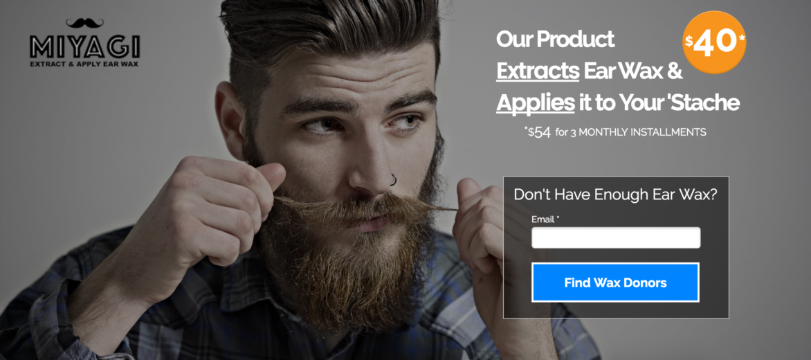
What a difference! I’ve highlighted what the product does by underlining the key words, I’ve put the price where you can’t miss it (at this point I’m not worried about $54), and I’ve simplified the form. I’m pretty happy with the end result and I’m feeling good. I mean, look at that handsome hipster. He’s staring right at the headline AND the price.
The results?
Because the questions were weighted and the first question was the most important, my first round ended up doing better than my second. Hindsight is 20/20, right? I should have kept my headline rather than try to make it even better and JUST focused on the form and the price. I ended up placing 18 out of 21 once the showdown was complete, but hey, I learned a lot.
The Learnings
As you can see from the showdown, the first 5 seconds users are on your site are crucial. This is when first impressions are formed and when you’re going to draw your users in and grab their attention. I believe my hipster did that. I think that’s one of the reasons the questions couldn’t get answered. Theresa Baiocco, the winner of the competition, used the same hipster on her page and got the feedback that he was “too good looking” and people got stuck on him even though he was looking towards the info we wanted users to see.
Another interesting learning from the competition surrounded the form fields. Using just the pages that were submitted in the showdown, there was a 4% success rate with the forms that had 1 form field or less and a 5.6% success rate with forms having 2 or more fields. That’s a 40% increase. When you have just 1 field, the form is harder to see and gets lost on the page. You end up with answers such as, “What form?”, “I don’t see a form”, and so on. While my gut instinct was to simplify as much as possible and remove all unnecessary fields, that’s not always the best solution.
Joel Harvey wrapped up the competition with a cool insight. Many of the pages in the showdown scored similarly but varied greatly. There’s not one right answer or one right direction to go for optimization. Next time you’re optimizing landing pages, I encourage you to set up a 5-second test to gain insights on how your page is currently being perceived and then begin testing.


