There are a lots of ways to make your image visually prominent or striking:
- Bright colors or borders that cut through the blue and white Facebook backgorund
- Close-ups of human faces or products
- Sex appeal,
- Dynamic Angles and/or Foreshortening
- Visual Effects
But while visually striking images will get your ad noticed, they won’t get your ad’s headline and body copy read.
And this goes double if the image itself is unrelated to your product. So nix the vampy headshots of vixen used to sell, oh car insurance or whatnot.
So what DOES get ad copy read?
Story appeal.
When people see an image and are comelled to understand the story behind it, then they read the copy. But what creates story appeal? And how can you bake it into your ad images?
The Two Elements of Story Appeal
For an image to tell a story, it has to seem as if it is capturing a single, dramatic moment within a larger context. That means the viewer has to supply the “immeditately before and immediately after this moment” context. And in order to do that you have to show an image from a “ritual” with which we are familiar.
The Importance of Ritual
If you show the image of a car driving away, there is no story there, because the viewer can’t fill in the temporal context — she can’t place the image within an identifiable scenario.
But if the image is of a car driving away that has lots of shoes tied to it and a “Just Married” sign in the back window, there’s an immediate story, because we’re able to understand what happened prior to the couple getting into that car and what’ll happen when they get out of the car.
We can do that because the image is a frozen moment within a ritual. So ritual (or identifiable scenario, if you prefer) is the first element of story appeal.
Incongruence
The second element of story appeal is some amount of incongruence, or what some people call trouble.
Going back to the “Just Married” image of the car, we can make the image a whole lot more compelling if we show the same car that has the arm of a dead guy sticking out of the trunk, sort of like how it’s done in this picture of a creative Sopranos ad:
NOW you really have a story going on right? Who gets married and then drives away in a car with a dead guy falling out of the trunk? Or maybe you have the shoes and “Just Married” sign on the back of an armored personnel carrier?
The point is that by incorporating an element of the unexpected and incongruent, you up the story factor. Why?
Because we don’t make-up stories to explain the expected. If your wife gets home at 5:30pm every day, and she gets home at 5:30pm this afternoon, you won’t feel any need to create a story about her arrival.
But if she’s still not home by 6:15pm and you can’t reach her by phone, you’ll start to spin a story or two to explain why. Maybe she got called into an emergency meeting and had to turn her phone off? Maybe she forgot her phone at work until she was halfway home and then turned around to get it?
It works the same way with pictures, too. Ritual allows us to tell a story. Incongruence pretty much forces us to do so. Put them together in a picture and you’ve got story appeal!
Some Examples
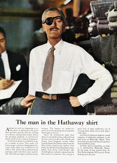
Of course, you can’t have an aritcle on story appeal in advertising without referencing the ads of David Ogilvy, the man who popularized the term. So here’s a famous ad from Ogilvy’s legendary “The Man With the Eyepatch” campaign:
Notice how we intuitively understand the temporal context of the image: the man is being fitted for high-end clothing. That’s the ritual part.
And then there’s the incongruence of the eye patch. Eye patches belong to pirates, not upper-crust gentlemen wearing flannel trousers. This incongrucne causes us to ask, what’s the story behind this “Man in the Hathaway shirt”?
A more modern-day example is this slim-fast ad:
 Once again we return to the “rituals” surrounding marriage, this time to the ritual image of a wedding cake with the prescribed minature couple on top.
But the story appeal comes from the “incongruence” of having the bride fall through the cake — presumably because she’s too heavy/fat.
Not very PC, but effective none-the-less.
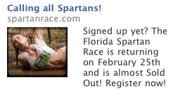
And finally, from he world of Facebook Ads, there is this ad for a obstacle course type of race:
 The race number on the woman and the image of the race struggling to get back up and finish the race provides us with the context cues of this particular “ritual.”
But the image of the very athletic looking and beautiful woman crawling through the mud provide enough incongruence for most people to wonder at the rest of the story.
And that’s the formula for story appeal. Now that you know what “story appeal” is made of, can you say whether your ads have any of it? More importantly, can you tell me how you might create ads with more of it?
Rob Lenderman is the Co-Founder of BoostCTR, a marketplace for copywriters. You can find him on Twitter @BoostCTR or at www.BoostCTR.com/blog


