When we’re running a PPC account, it’s a necessity to take data into consideration when making changes or updates to a process or standard procedure. When we move to CRO, we look to data to call a winning test over the variation or to tell if something is statistically significant. But what we often don’t think about is any type of data or themes before we decide what to test.
One way we’ve been able to come up with testing recommendations is by doing user testing (both external and internal). We use this type of testing as proof that what we think could be impacting performance is having an impact on another user. Below we’re going to discuss:
- What user testing is
- Why we value it
- What you should expect to find
- What you should do with the information
What Is It?
User testing is the practice of analyzing a website (the layout, checkout process, etc.) and providing feedback based on the experience, any friction created, or usability issues that may arrive. By running through the site as a regular visitor, we’re able to see any issues upfront as well as areas that could make it easier for the user to convert.
We use a few tools for our user testing process:
- UserTesting
- UsabilityHub
- An internal initial assessment
- An internal user testing process
The sites listed are just two of many sites where we’re able to get feedback from random visitors and have them describe what made them frustrated, what they liked, and what design they preferred.
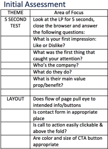
For our internal initial assessment, we’re able to preview the site and then answer just a few, of many, questions like the ones below. We then get together and present our findings, thoughts, and feelings on the site and ways we believe it could be improved.
Another way we perform our user testing is by asking a Hanapin team member (one who preferably doesn’t have any prior experience with the site or landing page) to actively navigate the site. For this process, we aren’t so much looking for areas of improvement, but rather looking for more emotional experiences and feelings on the site and the conversion process. We want them to address what’s preventing them from signing up or moving forward in the process. This is just another way we can gain actionable feedback or at least a starting point to create more testing ideas to further enhance the websites and landing pages.
Why Do We Value It?
Like we stated above, we value all of this user information because it helps us create that next test or at least get us thinking about aspects of the site we thought were fine. It provides us with multiple points of view and a new way of processing all the areas of a landing page or checkout process.
From doing user testing, I have found that even though something could be aesthetically pleasing to one eye, it could be a huge area of friction for two more eyes. It then becomes more about finding that middle ground and testing to fit the audience that you want to convert.
What Should You Expect To Find?
So far with our user testing, we have come away with certain themes on landing pages. A few of those themes are what’s causing friction for the visitor, what’s just not functional at all (404s, misaligned text, etc.), and what has to stay the same regardless. The friction theme is one we see quite often, as some of our testers tend to point out just what they don’t like on the site. We want this type of reaction so we’re able to address it and make the visitor’s experience an easy one. The functional piece is one we look for continuously. We want to make sure the site works and looks professional and trustworthy at the same time.
The last theme falls along the line of those things we cannot change. If a visitor doesn’t like the huge block of text at the bottom of the site but that has to legally be visible due to regulations, that’s something we have to address as a source of friction but one that can’t be altered or changed.
What you could find from all of this, too, is that some visitors may not have your best business decisions at heart. We try to filter those out as much as possible but sometimes, they might not have any idea what you’re trying to sell or provide so their experience could be altered that way. For the most part, the advice given during user testing is straightforward and is probably applicable to many sites, but there are instances where we take the advice lightly.
If you’re running multiple tests you should probably expect to receive a lot of information. While it might be overwhelming, there are ways to organize the information and highlight the most important takeaways. What you can take away from user testing are ways to improve your site (of course) and ideas on what to do next or what to test next.
What Should You Do With This Information?
It could be useful to let this information influence other areas of your site. If there is a lot of friction on just one of your landing pages, odds are, there could be very similar areas of friction on your other landing pages. This process is designed to provide us with actionable takeaways that will affect the way you view your visitors and users and could help you determine your audience.


