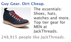
I saw this really pretty solid ad on my Facebook page and thought it was worthy of analysis:
This ad does one thing well and one thing extraordinarily well.
The picture is solid and interesting, because it’s a high quality image of an odd-looking, but still fashionable boot that manages to catch your eye because of the red laces and blue suede-like material.
In other words, the picturing is striking and interesting enough to not just get noticed, but to inspire a quick scan of the copy. Nice.
Then the headline blows it out of the water, as far as I’m concerned. “Guy Gear. Dirt Cheap.” Does three things brilliantly:
1) It intrigues the reader on exactly what kind of cool stuff they’re categorizing as “Guy Gear.” Could be cool high-fashion clothes, James Bond type gadgets, sport clothing, geek-cool type stuff… really anything, but almost surely something interesting (if you’re a guy).
2) It makes a strong offer of value with the “Dirt Cheap.” It’s not just cool guy gear, it’s guy gear at a discount. Awesome.
3) It works with the image and deliverson the promise of the image. You see an interesting, high-fashion boot, then scan the headline for context, and bingo, you know exactly what the ad is for.
So is it a good ad? Sure; it got me to click-through and check out JackThreads.
Could it be even better? Absolutely. It could be better because even though I clicked through to the landing page, I didn’t convert by becomming a (free) member of the site/service.
So I would recommend improving the ads CPI by keeping in mind the two most powerful words of discount advertising:
1) Yeah, and
2) Sure
As in, “Yeah, sure,” said with as much cynicism as you can muster. Offer me stuff dirt cheap or at deep discounts and I think, “Yeah, sure — what is it, like 15% off on clearance items?”
This is a technique I learned from legendary copywriter Gary Bencivenga, and it works wonders if you can just train yourself to say those two words to every piece of your copy and/or your Facebook ads.
And it does so because it forces you to close the loopholes and offer better substantiation.
Now with limited-space ads, like Facebook ads, you normally can’t fully substantiate anything in the space alloted, but you can indicate that further substantiation exists, ready to be found on the click-through page. And for Facebook ads, that’s really just as good.
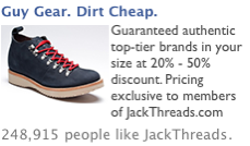
So let’s look at how we could change this ad to overcome the “Yeah, sure” cynicism of prospective readers:
Notice that I kept the high-quality photo and the headline, but tweaked the body copy to specifically address concerns and objections surrounding the authenticity and quality of the brands, the size of discounts, and the available of clothes in your size.
Of course, changing the ad like this would also require changing the landing page, also, to ensure the landing page makes good on the promised substantiation, but the current landing page already includes information on the participating brands, so it would really be a matter of putting in additional info around discounts and sizing. Piece of cake.
Because getting the click is a good thing, but making the sale is the real goal, most of the time.


