Conversion rate optimization is…
- … a system for increasing the percentage of visitors to a website that convert into customers, or more generally, take any desired action on a webpage. It is commonly referred to as CRO. (Wikipedia)
- … the process of enabling people to take an action when they visit a website. (Hubspot)
- … understanding how users move through your site, what actions they take, and what’s stopping them from completing your goals. (Moz)
- … the process of optimizing your site or landing page experience based on website visitor behaviour to help improve desired actions (conversions) on the said page. (VWO)
As you can see from all of these explanations, the core of conversion rate optimization is getting users to take a desired action, or rather, altering their behavior. If our goal is to alter their behavior, we need to first understand how they currently behave and what’s preventing them from taking that desired action.
As you dive deeper, you’ll uncover their reasons for not taking that desired action, but how can you alleviate those concerns?
By addressing them.
A Case Study
An e-commerce client sells high-end, customizable doors for the home. We needed to understand exactly what our customers were feeling when navigating our website and what was preventing them from completing the desired action – making a purchase.
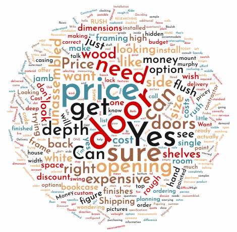
Utilizing Hotjar, we created a poll on our top 2 product pages that asked users, “Is there anything stopping you from making a purchase today?”

Being a customizable product with a hefty price tag, it’s not surprising that “price” was what stopped the majority of users from purchasing. Knowing this information and taking into consideration the other words we can see – expensive, depth, opening, unassembled, shelves, wood – we then had more information to address concerns. Now what?
Lower the price? That’s unrealistic and will negatively impact profitability.
Modify or improve the customization process? This could definitely improve the experience and lead to more purchases but will take quite a bit of development time and resources that do not currently exist.
Better align user expectations and improve the existing content? This is a quick adjustment that will provide clarity on what’s included in the price.
The Problem
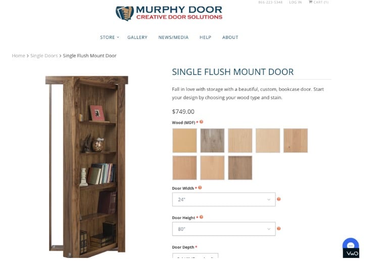
To reiterate, the problem is that the price is a hindrance to the purchase process. For additional context, it isn’t obvious that this price will fluctuate. You’ll notice on the page below that the price of this door is $749.00. However, this is only the starting price, which isn’t made clear to customers.

Once a customer begins to customize this door, the price goes up. We actually addressed this concern in a different manner on their previous site and saw a 46% lift in revenue just from changing the color of the price calculator. However, this change was primarily suggested in hopes of eliminating fear or alarm due to the high price tag.
The current concern is misaligned expectations. If they’re not expecting the price tag to fluctuate, of course the price is what stops them from purchasing. They’re probably expecting a door for $750 when in actuality, their customized door will end up costing $1000+.
The Solution
Customers need to know that $749 is the starting price. They also need to have a better understanding of what’s included within this price. Our solution addressed both.
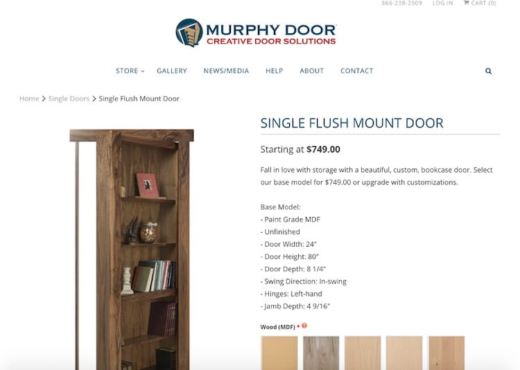
Instead of the price at the top of the page changing when a user customizes their door, this now says, “Starting at $749.00” and does not dynamically change. Keep in mind, the price near the “Add the Cart” button does still change so that users know the true price of the door before they add it.
In addition, the copy now says, “Select our base model for $749.00 or upgrade with customizations.” Below this is a list of all of the specifications included in the base model.

The Results
The results spoke volumes.
- 86.24% increase in revenue
- 48.25% increase in e-commerce conversion rate
- -24.23% decrease in bounce rate
- 26.16% increase in average order value
- 72.73% increase in phone calls
Notice we saw a large increase in phone calls as well. Phone calls are important because a lot of orders do come through this channel; however, you might have assumed that phone calls would decrease since this new content addresses their concerns. Though we can’t say for certain why phone calls jumped so drastically, we can assume it’s due to the emphasis we’re putting on product specifications such as door depth, jamb depth, etc, because these were already common inquiries. If more customers are taking time to customize and purchase, there will be more customers wanting to confirm what these specifications are referring to.
The reason this influx in phone calls was not concerning to us was because we received feedback from the sales team saying that this change to the content did improve their calls and customers were referencing this list and having fewer questions surrounding these details!
Final Thoughts
A simple change to the copy and product details resulted in $23K+ of additional revenue spanning four weeks. It was that simple.
By understanding the customers’ concerns, we were able to successfully address those concerns head-on. We were able to gather both quantitative and qualitative data to better understand just how impactful these changes were to the customers and their experience.
We altered their behavior with a simple change to the content.
Visit our complete CRO handbook to read more about the tools and resources you can use to learn more about the concerns of your users.


