As account managers we spend much of our time surrounded by data— percentages, rate stats, averages, raw numbers spilling around us like the cascading binary from The Matrix. And through sheer exposure to this sea of numerical information, we develop a foundational understanding of how PPC works.
However, the data that surrounds us isn’t comprised only of results. It holds patterns and relationships, hidden consistencies that have the potential to yield actionable and dramatic insights. Rooting out these insights is the daunting task of the ambitious account manager.
But the path to data-driven optimization nirvana is riddled with mirages…most notably the common error of mistaking a correlating relationship with a causal relationship.
The first step to avoid this mistake is to understand the difference between correlation and causation. There’s an inexhaustible amount of information publicly availably on the topic, but Tyler Vigen is my favorite for the hilarity with which he addresses the common misconception.
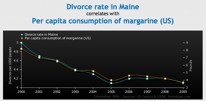
Below is just one of many graphs pulled from Tyler’s website, Spurious Correlations.
Holy cow, would you look at how closely it correlates? Looking at this information on a stacked line graph (exactly the way performance data is presented in the AdWords interface), it’d be awfully difficult not to assume a dependent relationship between the two bits of information.
And then you identify what the data represents: divorce rate in Maine versus per capita consumption of margarine in the United States. Granted, it doesn’t take too much of an imagination to envision a relationship between eating margarine by the pound and divorce, but it’s still evident that the 99% similar data contour is a coincidence. This is not to say that all correlations are coincidence, only that correlations can be coincidence.
Causation, by definition, cannot be coincidence. It implies that a relationship between two sets of data is causal, or dependent. For example, imagine you have a campaign limited by budget. You double the budget, and the clicks increase. The increase in spend has a causal relationship with the increase in clicks; the clicks are precisely what boosts spend.
Identifying a causal relationship between metrics in your accounts is absolutely a good way to approach optimizations. However, they’re few and far between, and when they do exist, they’re generally very obvious. As search engine marketers, it’s identifying the valuable correlating relationships versus the coincidental correlating relationships that’s important (and challenging).
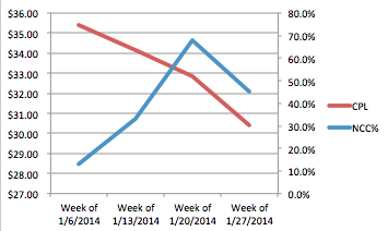
For example, I like analyzing non-converting cost (NCC%) versus CPL in my accounts (if you’re interested in learning how, check this out). I’ll often see something like this:
The relationship evinced in the graph— costs per lead are falling, meanwhile the percentage of keywords that are spending without converting is increasing— defies what conventional wisdom would lead us to believe. It stands to reason that there might be a relationship between non-converting spend and CPAs. However, were this relationship mistaken for a valuable correlating relationship, the optimization that it hypothetically informs is to further increase non-converting spend in order to decrease CPAs, which, when you think about it, makes absolutely no sense.
Which brings me to my point:
Don’t take the numbers at face value. Think about them.
Immersed in the avalanche of data that is AdWords, and looking for data-driven insights, it can be easy to forget about external factors. Competitor behavior. Seasonality. Google testing on the SERP. These are all outside elements that can impact your data. Being too quick to attribute fluctuations in performance to your optimizations is a common manifestation of mistaking correlation for causation.
This fallacy is called post hoc ergo propter hoc. Or, after it and therefore because of it.
I could expound on this, but why, when I could just let the winsome President Josiah Bartlet do it for me?
What it boils down to is isolating the signal from the noise— finding relevant, actionable information— the signal— in a venue where that type of data is camouflaged by sheer volume of numbers— the noise. In order to do this, once you identify a correlating relationship, think about all relevant factors (internal to the data, such as the formulas that yield the metric, and external) and make sure you aren’t being duped by a margarine consumption versus divorce rate style correlation!
(featured image by Beat Kühn/Flickr)


