When I talk to people in any industry about reporting, after I pause for the obligatory deep sigh, the most common response I get is, “there is just so much information.” We have all been there, drowning in a sea of numbers and not sure how to best answer the questions that have been asked of us.
If you have an AdWords account, you have probably seen the Reports tab, nestled between Opportunities and Tools. Google has spent some time refining this tool, attempting to make the interface more intuitive to the average user. They have made great strides and in this post, we will review how to create a report and give you ideas for the type of analysis you can do without ever leaving AdWords.
Create A Report
Once you are in the Reports section, you can click the red ‘Report’ button to see a list of 4 reporting options: Table, Line, Bar, and Pie.
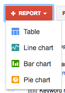
When you select the type of report you want to build, you will see that you can drag and drop performance metrics (Google calls these “tiles”) into the middle preview area (Google calls this “the canvas”). I feel like we are in a Bob Ross painting.
Here is a tip for selecting the type of report that you want to build if you want to look at a list of multiple performance metric points – go with a table. If you want to view changes in a performance metric over time or show 2 metrics and how they historically compare against each other, go with the line chart. When comparing different performance metrics over a period of time with wide changes in data, use the bar chart. Lastly, a pie chart is best used when trying to compare parts of a whole.
If you start pulling in the metrics and notice there is a discrepancy between what you see in AdWords and in the Reports tab, that is because there is a time lag in the data being pulled into the tool.
[bctt tweet=”A pie chart is best used when trying to compare parts of a whole.” username=”alkadumont”]
Be sure to use the report options that allow you to switch the type of report, date range, and data frequency:

You can also filter your report to look at specific campaigns, ad groups, keyword match types, campaigns that are live, conversion names, device type and several other filter options.

Lastly, save your work and send your fancy new reports to yourself or your team on a regular basis.
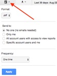
Now that we have the basics out of the way, let’s talk about some different types of reports you can create. Here are some ideas for reports you can build and send yourself on a recurring basis, to help keep you on top of any changes you need to make to your account.
Device Analysis
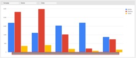
I have a few clients that have campaigns that sometimes perform better on mobile devices vs desktop and vice versa. Every quarter, I run a report to see that these assumptions are still the same and I implement bid modifiers to capitalize on visitor device preferences. In some cases, it makes sense to split underperforming device traffic into its own campaign or to shut it off completely. Here is an example of a Campaign by Device & Clicks Report:
For another client, I wanted to improve their mobile performance. A general device report showed that this client had an unusually high volume of traffic coming from mobile.
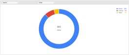
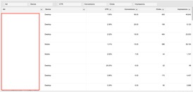
This staggering statistic made me want to find the best mobile ads in the account. I wanted to copy the best parts of these ads, so I could make sure all the campaigns that are missing out on this great mobile traffic get some new and improved mobile ads. Although the ad copy is missing in the image below, I was able to identify that a description line about the expert staff available to take calls, was the most common phrasing in ads that had high mobile clicks.
Other ideas for device reports include:
- Channel performance by device
- Shopping campaign performance by device
- Conversion types (downloads, contact forms, phone calls, purchases) by device
Budget Analysis
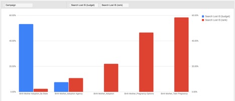
Keeping budget in line requires constant monitoring. A helpful report that I like to see on a quarterly basis is one that shows me search impression share due to budget and rank per campaign. This lets me know if there are opportunities to gain search impression share by adjusting budget and which campaigns need a deeper review of quality score, keyword relevance, and ad copy effectiveness.
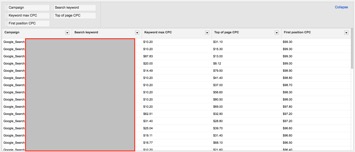
For all of my clients, I like to also make sure that I review the keyword level bids to see if there is a discrepancy between our max CPC and what Google has estimated are the top of page CPCs, first position CPCs and first-page CPCs. With this data, I can see if some keywords that have a history of converting that need more budget get them to the top position.
Some others for budget related reports include:
- Spend per hour of day vs conversions
- Campaign spend over time
- Spend by geographic region
The downsides of the report section are that you are not able to compare data to previous periods like you can in the campaign section. There are also some metrics and filters that cannot be combined. Nevertheless, being able to create these reports saves the time of manually creating pivots and having reports delivered to your email box can make your job as a data wrangler much easier.


