I’m going to run a scenario by you, let’s see if this sounds familiar:
“We launched display a few months ago, has this had an impact on our search traffic?”
“Is direct conversion volume affected by ___?”
Like Steve Urkel, you might be wondering…

What’s your next step in any of the above situations?
One option is to pull a simple report showing the appropriate metrics over time. However, can you really be sure this is telling the full story accurately? Let’s walk through an example scenario.
The Problem
This client launched some display campaigns to increase overall brand awareness and audience reach. For targeting, various combinations of contextual keywords, custom affinity audiences, and in-market audiences were used. Campaigns were launched on 6.14.17.
Did these campaigns influence branded paid search traffic and performance?
Finding a Solution
When we just look at the branded paid search campaign performance, we notice that impressions did increase about 4%, while clicks increased a whopping 42%.

Since there was a large increase in clicks, but impressions didn’t change drastically, this points to a change in ads or ad rotation.

Sure enough, ad rotation settings were changed to “optimize for conversions”, leading to an increase in CTR. This serves as a good reminder to think of all the ways your performance can be impacted by something as simple as a setting change.
So, how do we determine if the implementation of display campaigns caused an uptick in brand clicks, or if this changed ad rotation setting is the culprit? Let’s look at The GA Effect tool.
The GA Effect Tool
This is a useful tool built by Mark Edmondson, who has vast experience in the R programming language and Shiny, a web application framework used with R. When a user inputs their metrics, the app uses statistics along with seasonality and time to determine if the changes in performance were from pure chance, or if it’s a result of the event.
To use the GA Effect tool, simply authorize the app to access your Google Analytics account.
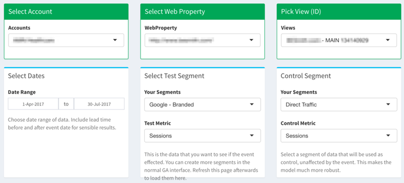
From there, adjust the settings pictured below.

Keep in mind that you should choose a segment and metric that was not affected by the event. For example, if your event is launching display campaigns, your control shouldn’t be paid traffic sessions.

The seasonality aspect is a very important one. If you leave the “None” bubble ticked (it is by default) this can give you very different final results. If you have weekly seasonality (Mon-Fri are high traffic days) or monthly seasonality, make sure you check the right bubble!
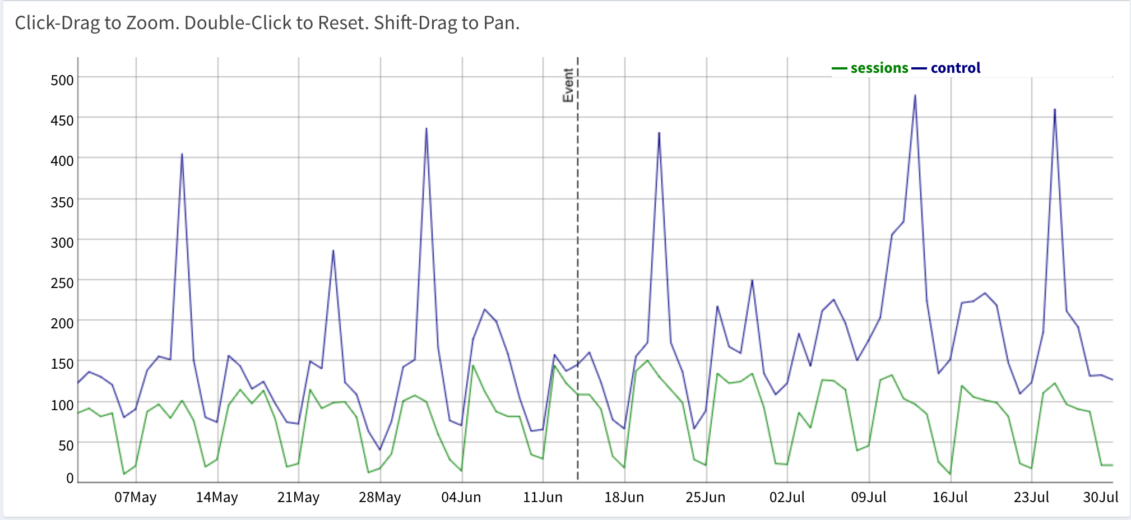
This will give you a graph of your test vs. control metrics, with a vertical line marking when the event happened. In this case, the event was the launch of display campaigns.

Next, you’ll navigate to the “Results” tab on the left-hand menu.
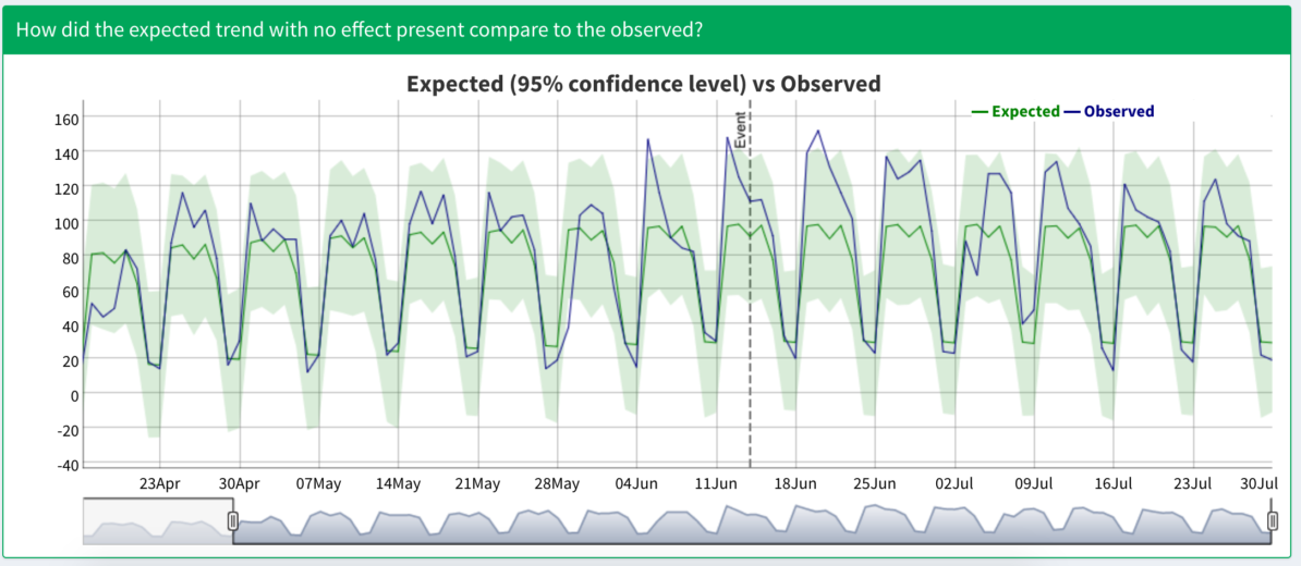
This is where you’ll see the results of your test and whether or not it is statistically significant. In our example case here, our results are indeed significant, with a roughly 18% estimated change on sessions from the event.

The graph shown gives you a range of expected values (shown in green) and the observed values (in purple).

Wrap Up
While it may seem simple (it’s very easy to implement!), this tool is very powerful for identifying trends and cause/effect in your account. Here are a few ideas to test out:
- Does changing your website structure affect SEO traffic?
- Does increasing overall PPC spend impact direct conversions?
- Did a change in landing page affect PPC conversion?
- Did a popular news story about the business affect total revenue?
Play around with the tool, but I’d recommend that you have a question in mind before you go digging for answers. Don’t just jump in blindly looking for cool trends. Think of an event that may have had an impact, decide what impact that would be, and go from there. Have fun and happy analyzing!


