I’ve spent a lot of time in this column deconstructing either bad Facebook ads, or good Facebook ads that could be made a lot better.
And I’d like to think that’s helpful, but at some point the question comes up: so are there any Facebook ads you like?
And in answer, I’m showcasing three ads that I’ve come across which I think do a fine job of capturing the viewers attention and effectively influencing them.
—
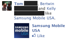
This ad from Samsung Mobile is a perfect match to their recent campaign to displace the iPhone as the “cool” phone of choice.
The more you see your friends and colleagues liking and adopting Samsung phones — especially ones that you know are Apple Computer users — the more you’re willing to consider looking at a Samsung phone yourself, and this ad perfectly captures the social nature of Facebook for helping that process along.
Nicely done, Samsung.
—
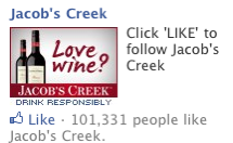
This Jacob’s Creek ad does a lot of things right.
Granted, the copy could use some major improvements, but here’s what I DO like about the ad:
First, the color of the image makes for a bold, attention-grabbing ad.
Second, the use of text within the ad is often a winning technique, and this ad does it brilliantly. Questions are known attention-getters, and really, who doesn’t like wine?
Well, some people might not like it, but then, those people definitely aren’t Jacob’s Creek customers, are they?
Do I think they’re going to get a bunch of people to “Like” their ad/brand? Not sure. 100K Likes doesn’t seem like too many in a nation of around 80 million wine drinkers. But I do think that the ad will build some brand familiarity, which can certainly help tip the odds in favor of someone deciding to try a bottle the next time they see the label while passing through the grocery store’s wine aisle.
—
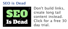
OK, like many people, I find the “____ is Dead” headline formula annoying. Partly because it’s overused, but mostly because it’s usually a flat-out lie — whatever they say is dead is always alive and kicking. Blogging isn’t dead. Social Media isn’t dead. TV advertising isn’t dead, etc.
But here’s the thing — the technique is used because it works! And this ad milks that to maximum effect by using the very effective text-as-image technique to make a stop-you-in-your-tracks statement.
And they further the effect by using an attention-grabbing lime green for “SEO.”
And, really, I think they are right in the fact that the days of “tricking Google” as part of your SEO strategy are more or less coming to an end, and they make that point clear in their body copy. Nice ad with a great closing Call-to-Action.
And there you have it, three well-done ads.


