Facebook allows for a breathtaking sophistication of targeting. With Facebook’s ads, you can make sure your ad gets seen by people of the right, sex, age, geography, marital status, parental status, interests, education, etc.
Of course, saying the wrong thing to the right person won’t get you any better results than reaching the wrong people to begin with. So your ad’s messaging has to be as targeted as the ad itself.
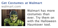
Most people understand this, but somehow people tend to change the copy without giving adequate thought to changing the image as well. Here’s a great example:
Now, this ad for Walmart does a lot of things right:
First, the ad is topical and relevant — it’s almost Halloween and many mom’s are indeed in search of a costume.
Second, the ad is targeted properly, as this was found on my wife’s page, meaning it was most likely targeted to moms.
So what does it do wrong?
I’d argue that the image doesn’t say the right things, and the messaging could be tweaked a bit more for the target audience.
And what are the right things: That Walmart can make Halloween costume shopping quick and EASY, with the emphasis on ease.
It’s late October. All the really motivated, let’s-have-the-best-costume-ever parents already have their kids costumes. So this ad should be speaking to mom’s who are time-pressed and still need a costume ASAP.
But what does the image say? The image shows a really complicated SFX-worthy costume, complete with make-up and stuff. The costume doesn’t look easy, that’s for sure.
Another point is that they are not rotating out images. If you can’t figure out from Facebook whether a parent has sons or daughters, rotate the images! Same thing with kids’ ages.
So how about multiple ads with pictures more along the lines of this:
Note how I’ve varied the age and gender of the kids in the picture and I’ve selected costumes that will most appeal to mother’s rather than those most appealing to kids per-se.
All of the costumes also look “come in a box” easy.
Now all you need to do is make the copy emphasize the ease:
Notice how I also leverage the local aspect of Walmart. Again, this is about last minute convenience!
But as much as it pains me to say this as a copywriter, the copy tweaks are less important than the imagery in the ad, because having the wrong gender or age of child pictured or having a too-complicated costume on display means the copy doesn’t even get read.
So… make sure you target your imagery as much as you target your ad!


